South Side is a Democratic stronghold. About 87% of voters here vote Democratic and 13% Republican.
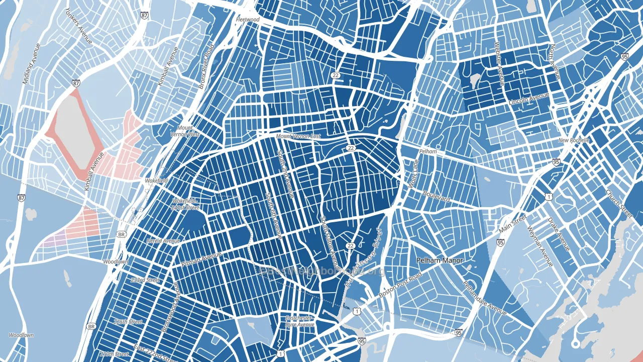
About 52% of adults in South Side typically vote, below the U.S. average of about 62%. Among adults in South Side, ~45% vote Democratic, ~7% Republican, and ~48% don't vote. The map below shows estimated turnout by block group.
How South Side compares
Among neighborhoods within 5 miles, South Side is the most Democratic-leaning.
South Side runs about 62 points more Democratic than New York as a whole.
Politics vary noticeably by block within South Side. The south side is the most Democratic-leaning (D+81) and the southeast side is the least Democratic-leaning (D+31), a spread of about 50 points.
Why South Side leans the way it does
This analysis examined 14,881 data points per neighborhood to find what predicts political lean and turnout. The items below are a few correlations that stood out for South Side, not a ranked or complete list of what matters most.
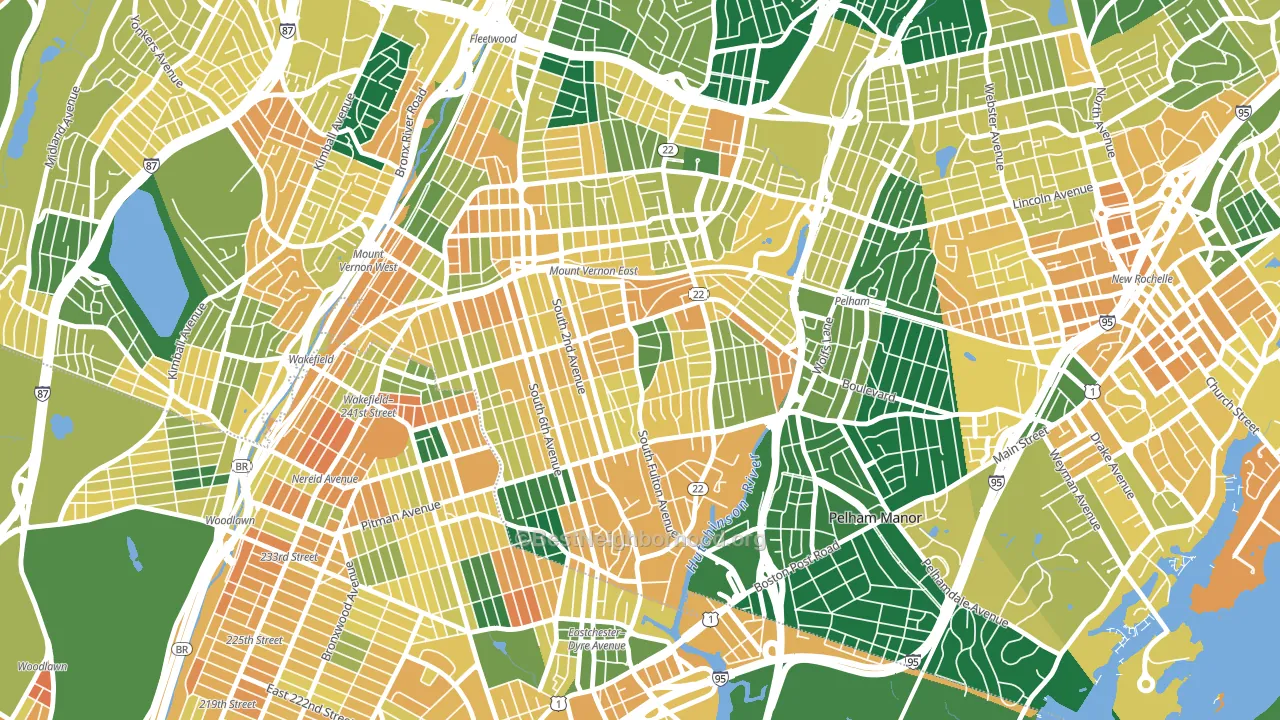
Dense areas vote Democratic. More than 99% of residents in South Side live in densely developed areas, about 64 points above the U.S. average of 36%. A high never-married share predicts Democratic voting, and about 50% of adults in South Side have never been married, above 82% of neighborhoods.
Population density and Democratic lean
Places with high population density tend to lean Democratic; South Side, Mount Vernon, NY sits in the top tenth nationally on this measure.
Why turnout in South Side looks the way it does
Crowded housing lines up with lower turnout. About 7% of homes in South Side have more than one occupant per room, above 86% of neighborhoods. Learn more about the findings and methodology on the political spectrum map.
Nearby Neighborhoods
- North Side, Mount Vernon, NY D+61
- Southeast Yonkers, Yonkers, NY D+11
- Wakefield-Williamsbridge, Bronx, NY D+73
- Eastchester, Bronx, NY D+63
- Lawrence Park, Bronxville, NY D+22
- Woodlawn, Bronx, NY D+26
- Country Club, Bronx, NY D+66
- Lincoln Park, Yonkers, NY D+6
- Baychester, Bronx, NY D+51
- Cedar Knolls, Bronxville, NY D+26
Neighborhoods with Similar Populations
- Montopolis, Austin, TX D+54
- Maplewood, Fall River, MA R+6
- Glencliff, Nashville, TN D+21
- Pioneer Park, Las Vegas, NV D+16
- Winter Hill, Somerville, MA D+65
- Windsor Park, Chicago, IL D+81
- Columbus Park, Worcester, MA D+29
- Carrick, Pittsburgh, PA D+18
- North Broadway, Newark, NJ D+32
- Hillsdale, San Mateo, CA D+50
Sources and methodology
Precinct-level voting records used to fit the model come from New York State Board of Elections, distributed by the Voting and Election Science Team. Demographic inputs come from the U.S. Census Bureau (ACS 5-year estimates and the 2020 Decennial Census). Health and environmental inputs come from the CDC (PLACES and the Environmental Justice Index). Land cover comes from the USGS and EPA. Election-day and lead-up weather come from PRISM 4km daily grids and the NOAA Global Historical Climatology Network. Mail-voting and election-administration patterns come from the MIT Election Lab's Survey of the Performance of American Elections. Block-group crime detail comes from CrimeGrade. Internet data and modeling support provided by ISPreports.org.
Modeling and analysis by the BestNeighborhood data science team. Full methodology and findings: political spectrum map.
Methodology reviewed by the BestNeighborhood data team. Last updated May 2026.