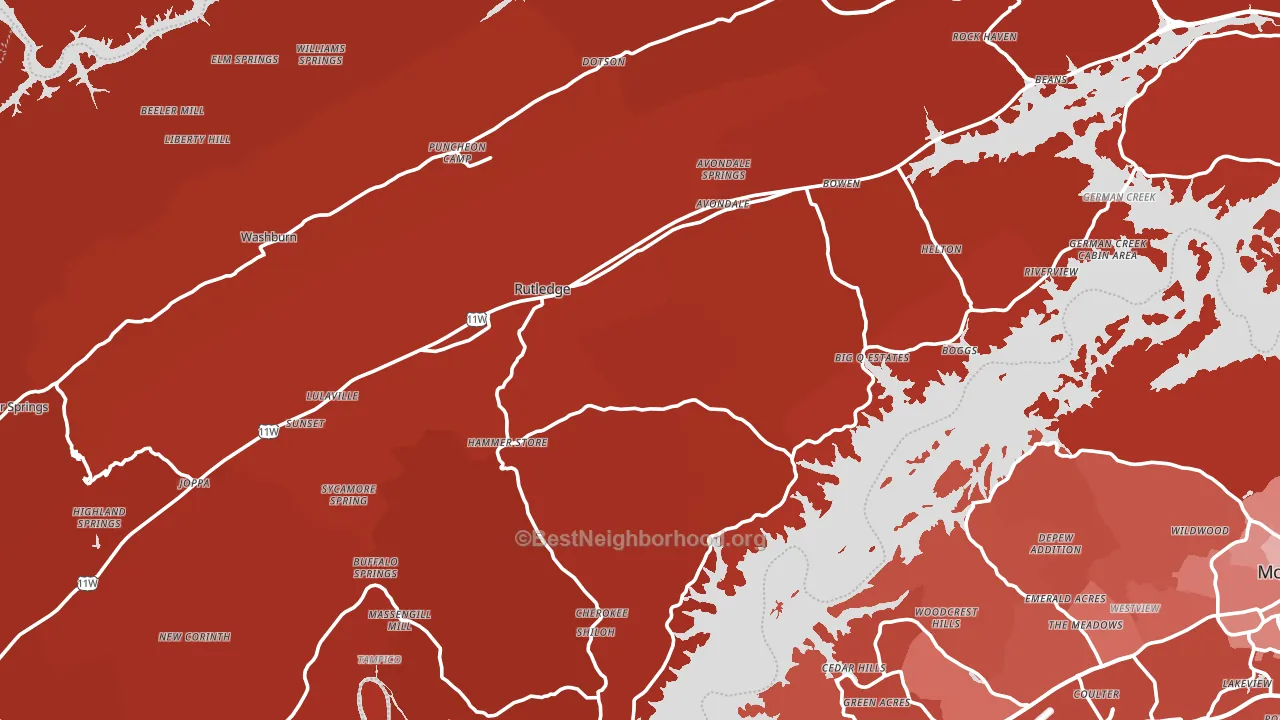
Grainger County is a Republican stronghold. About 14% of voters here vote Democratic and 86% Republican.
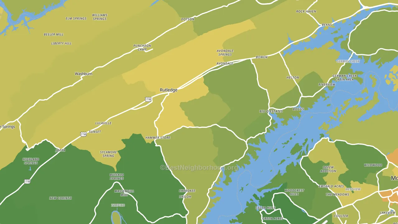
About 67% of adults in Grainger County typically vote, near the U.S. average of about 62%. Among adults in Grainger County, ~9% vote Democratic, ~58% Republican, and ~33% don't vote. The map below shows estimated turnout by block group.
How Grainger County compares
Among counties within 50 miles, Grainger County leans more Republican than 14 of 16 neighbors.
Grainger County runs about 41 points more Republican than Tennessee as a whole.
Why Grainger County leans the way it does
This analysis examined 14,881 data points per county to find what predicts political lean and turnout. The items below are a few correlations that stood out for Grainger County, not a ranked or complete list of what matters most.
Areas with a high white share and below-average college attainment vote Republican. In Grainger County, about 94% of residents are non-Hispanic white, about 21 points above the U.S. average of 72%; about 16% of adults hold a bachelor's degree, about 6 points below the Tennessee average of 22%. Rural areas vote Republican, and Grainger County sits in the bottom quarter on density (about 13%, below 76% of counties).
Paved land cover and Republican lean
Places with little paved surface tend to lean Republican; Grainger County, TN sits in the bottom quarter nationally on this measure. Paved ground does not change how people vote; it mostly reflects how urban and built-up a place is.
Why turnout in Grainger County looks the way it does
Turnout in Grainger County sits close to the national pattern. Routine healthcare access, homeownership, education, and food security all land near their national averages here. Learn more about the findings and methodology on the political spectrum map.
Nearby Counties
- Hamblen County, TN R+51
- Jefferson County, TN R+61
- Claiborne County, TN R+70
- Union County, TN R+70
- Hancock County, TN R+77
- Cocke County, TN R+65
- Sevier County, TN R+58
- Bell County, KY R+62
- Knox County, TN R+13
- Campbell County, TN R+65
Counties with Similar Populations
- Plaquemines Parish, LA R+27
- Washington County, MO R+63
- Winston County, AL R+82
- Juniata County, PA R+62
- Menominee County, MI R+30
- Seminole County, OK R+51
- Mingo County, WV R+71
- Roscommon County, MI R+26
- Curry County, OR R+11
- Antrim County, MI R+21
Sources and methodology
Precinct-level voting records used to fit the model come from Tennessee Secretary of State, Division of Elections, distributed by the Voting and Election Science Team. Demographic inputs come from the U.S. Census Bureau (ACS 5-year estimates and the 2020 Decennial Census). Health and environmental inputs come from the CDC (PLACES and the Environmental Justice Index). Land cover comes from the USGS and EPA. Election-day and lead-up weather come from PRISM 4km daily grids and the NOAA Global Historical Climatology Network. Mail-voting and election-administration patterns come from the MIT Election Lab's Survey of the Performance of American Elections. Block-group crime detail comes from CrimeGrade. Internet data and modeling support provided by ISPreports.org.
Modeling and analysis by the BestNeighborhood data science team. Full methodology and findings: political spectrum map.
Methodology reviewed by the BestNeighborhood data team. Last updated May 2026.