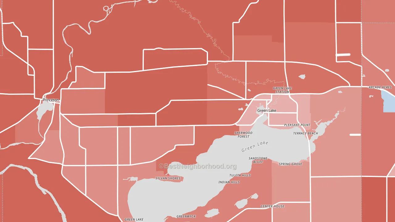
Green Lake County leans heavily Republican by roughly 34 points: about 33% of voters vote Democratic and 67% Republican.
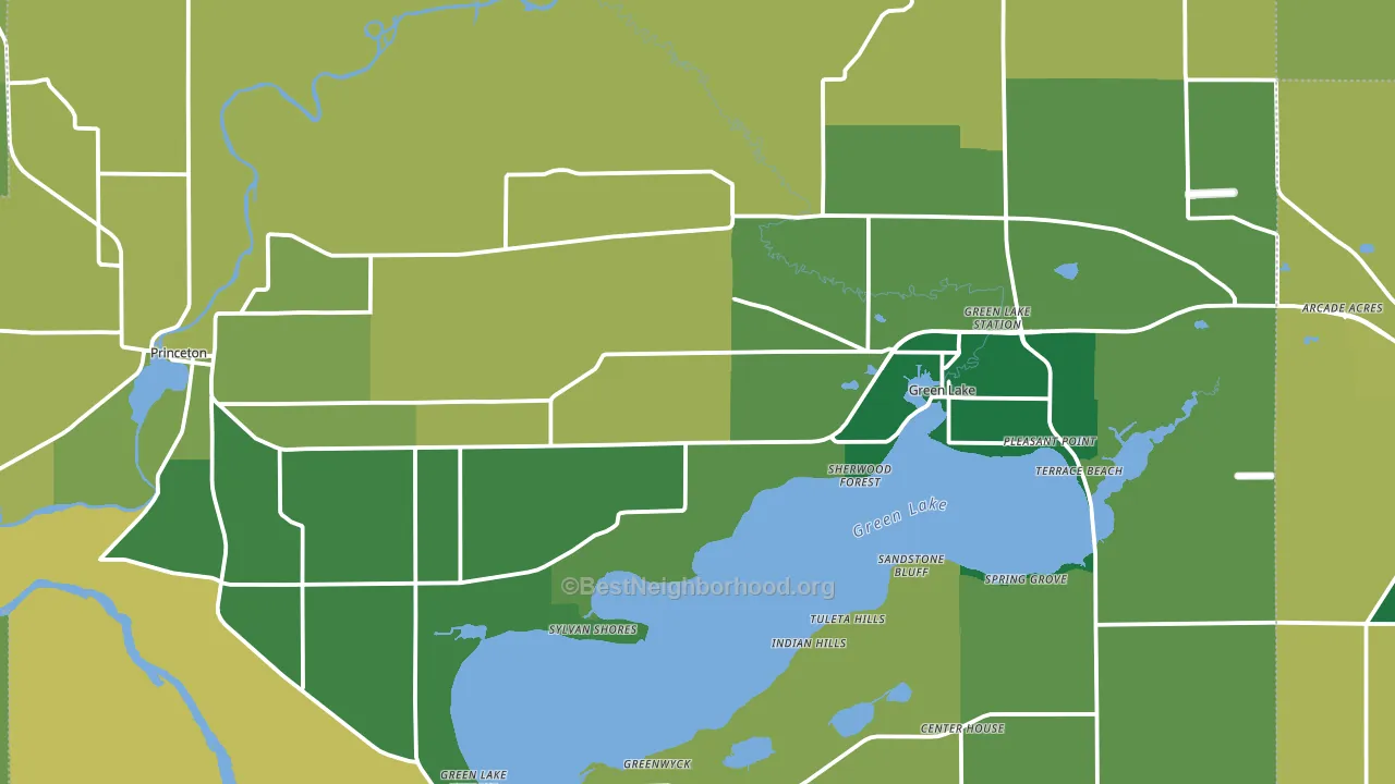
About 81% of adults in Green Lake County typically vote, above the U.S. average of about 62%. Among adults in Green Lake County, ~27% vote Democratic, ~55% Republican, and ~18% don't vote. The map below shows estimated turnout by block group.
How Green Lake County compares
Among counties within 50 miles, Green Lake County leans more Republican than 9 of 10 neighbors.
Green Lake County runs about 33 points more Republican than Wisconsin as a whole.
Politics vary noticeably by city within Green Lake County. The southeast side is the most Republican-leaning (R+56) and the east side is the least Republican-leaning (R+14), a spread of about 42 points.
Why Green Lake County leans the way it does
Density, race composition, education, and family structure all sit close to their national averages in Green Lake County. The lean here lands roughly where demographic data alone would predict.
Frequent mental distress and voter turnout
Places with a low frequent-mental-distress rate tend to turn out at a higher rate; Green Lake County, WI sits in the bottom quarter nationally on this measure. Reported mental distress does not drive turnout; it reflects economic and health conditions tied to voting.
Why turnout in Green Lake County looks the way it does
Areas with strong routine healthcare access turn out at higher rates. Green Lake County is in the top quarter nationally for routine-care measures such as insurance coverage, preventive screenings, and dental visits. The dental-visit rate here is about 64%, above 75% of counties. Learn more about the findings and methodology on the political spectrum map.
Nearby Counties
- Marquette County, WI R+36
- Waushara County, WI R+33
- Fond du Lac County, WI R+23
- Winnebago County, WI R+3
- Columbia County, WI R+17
- Dodge County, WI R+30
- Adams County, WI R+26
- Waupaca County, WI R+34
- Calumet County, WI R+23
- Outagamie County, WI R+13
Counties with Similar Populations
- Inyo County, CA R+4
- Humphreys County, TN R+60
- Butler County, AL R+13
- Ashley County, AR R+46
- Waseca County, MN R+32
- Perry County, MO R+62
- McIntosh County, OK R+55
- McDowell County, WV R+56
- Greene County, GA R+14
- Pickens County, AL R+21
Sources and methodology
Precinct-level voting records used to fit the model come from Wisconsin Elections Commission, distributed by the Voting and Election Science Team. Demographic inputs come from the U.S. Census Bureau (ACS 5-year estimates and the 2020 Decennial Census). Health and environmental inputs come from the CDC (PLACES and the Environmental Justice Index). Land cover comes from the USGS and EPA. Election-day and lead-up weather come from PRISM 4km daily grids and the NOAA Global Historical Climatology Network. Mail-voting and election-administration patterns come from the MIT Election Lab's Survey of the Performance of American Elections. Block-group crime detail comes from CrimeGrade. Internet data and modeling support provided by ISPreports.org.
Modeling and analysis by the BestNeighborhood data science team. Full methodology and findings: political spectrum map.
Methodology reviewed by the BestNeighborhood data team. Last updated May 2026.