Grider is a Democratic stronghold. About 91% of voters here vote Democratic and 9% Republican.
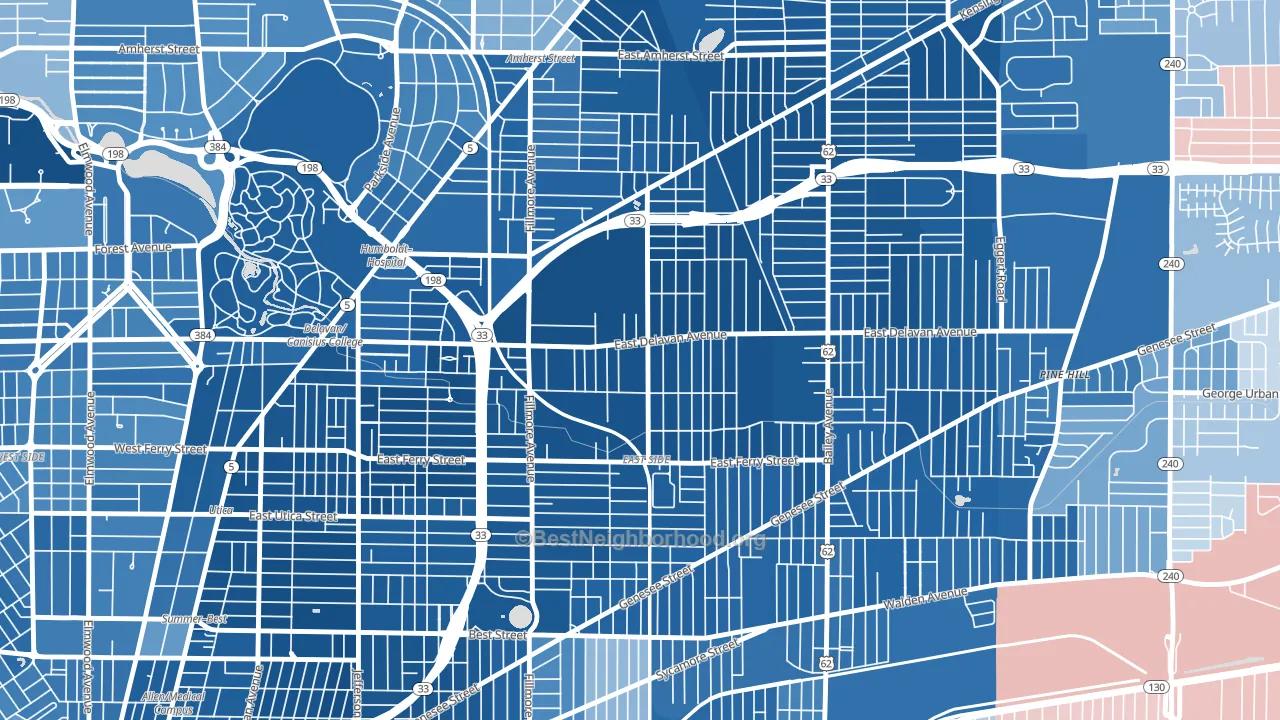
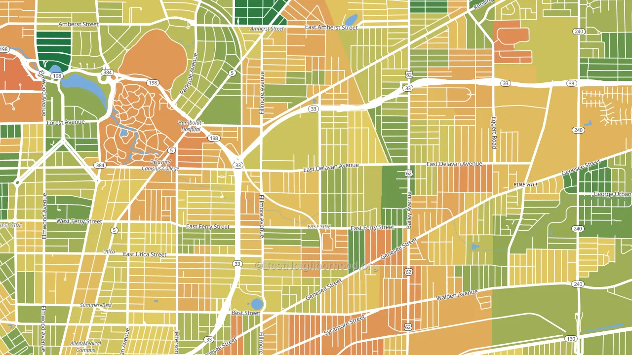
About 54% of adults in Grider typically vote, below the U.S. average of about 62%. Among adults in Grider, ~49% vote Democratic, ~5% Republican, and ~46% don't vote. The map below shows estimated turnout by block group.
How Grider compares
Among neighborhoods within 5 miles, Grider leans more Democratic than 34 of 36 neighbors.
Grider runs about 70 points more Democratic than New York as a whole.
Why Grider leans the way it does
This analysis examined 14,881 data points per neighborhood to find what predicts political lean and turnout. The items below are a few correlations that stood out for Grider, not a ranked or complete list of what matters most.
Dense areas vote Democratic. More than 99% of residents in Grider live in densely developed areas, about 64 points above the U.S. average of 36%. A high never-married share predicts Democratic voting, and about 54% of adults in Grider have never been married, above 87% of neighborhoods.
Preventive-care access and voter turnout
Places with limited routine preventive-care access tend to turn out at a lower rate; Grider, Buffalo, NY sits in the bottom quarter nationally on this measure. Dental visits do not drive turnout; the rate reflects income, insurance, and healthcare access, which line up with who votes.
Why turnout in Grider looks the way it does
Areas with high food insecurity turn out at lower rates. About 34% of adults in Grider report food insecurity, about 18 points above the U.S. average of 16%. Limited routine healthcare access lines up with lower turnout, and Grider sits in the bottom quarter on routine-care measures. Learn more about the findings and methodology on the political spectrum map.
Nearby Neighborhoods
- Mlk Park, Buffalo, NY D+79
- Genesee Moselle, Buffalo, NY D+70
- Leroy, Buffalo, NY D+73
- Hamlin Park, Buffalo, NY D+79
- Kenfield, Buffalo, NY D+79
- Kingsley, Buffalo, NY D+84
- Schiller Park, Buffalo, NY D+72
- Lasalle, Buffalo, NY D+78
- Broadway-Fillmore, Buffalo, NY D+47
- Kensington, Buffalo, NY D+76
Neighborhoods with Similar Populations
- El Camino, South San Francisco, CA D+43
- Weber, Iowa City, IA D+46
- Valencia, Newhall, CA Even
- Kamala Park, Oxnard, CA D+37
- Wallace Woods, Covington, KY D+13
- West Mesa, Albuquerque, NM D+24
- Clayton, Kansas City, MO D+9
- Warrendale, Waltham, MA D+38
- Highlands, Beaverton, OR D+38
- Gresham-Northwest, Gresham, OR D+24
Sources and methodology
Precinct-level voting records used to fit the model come from New York State Board of Elections, distributed by the Voting and Election Science Team. Demographic inputs come from the U.S. Census Bureau (ACS 5-year estimates and the 2020 Decennial Census). Health and environmental inputs come from the CDC (PLACES and the Environmental Justice Index). Land cover comes from the USGS and EPA. Election-day and lead-up weather come from PRISM 4km daily grids and the NOAA Global Historical Climatology Network. Mail-voting and election-administration patterns come from the MIT Election Lab's Survey of the Performance of American Elections. Block-group crime detail comes from CrimeGrade. Internet data and modeling support provided by ISPreports.org.
Modeling and analysis by the BestNeighborhood data science team. Full methodology and findings: political spectrum map.
Methodology reviewed by the BestNeighborhood data team. Last updated May 2026.