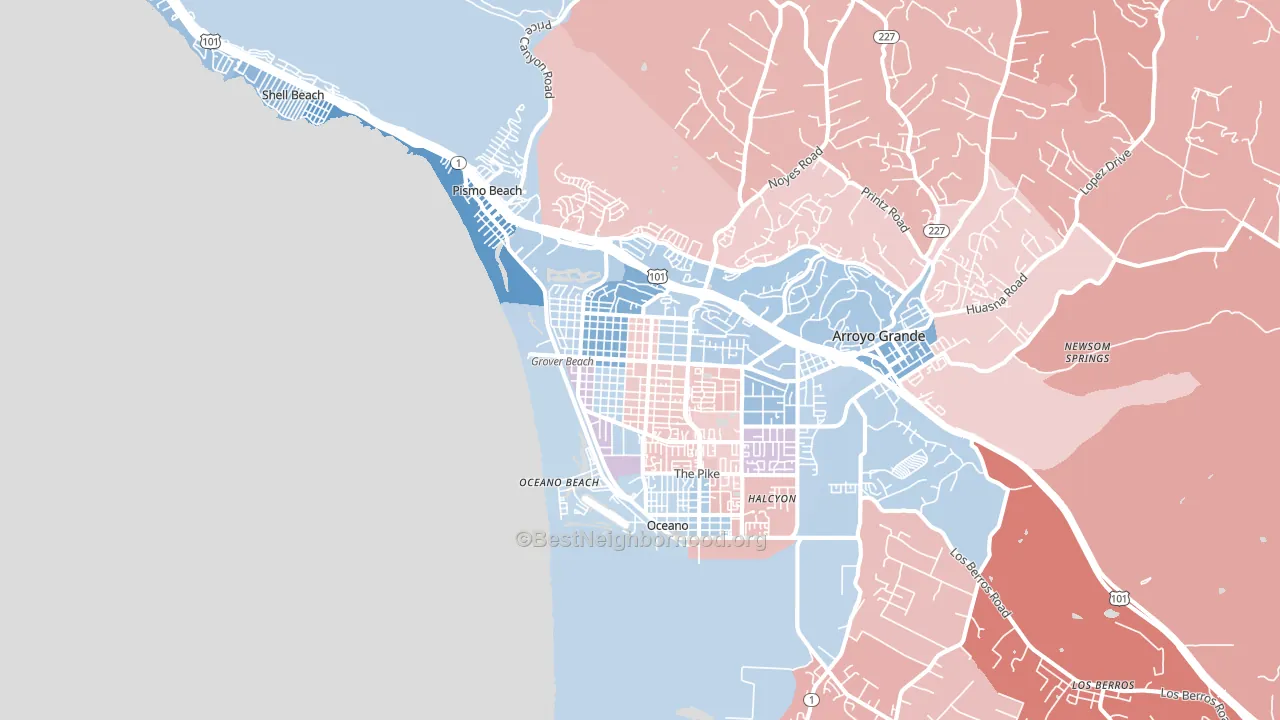
Grover Beach leans slightly Democratic by roughly 10 points: about 55% of voters vote Democratic and 45% Republican.
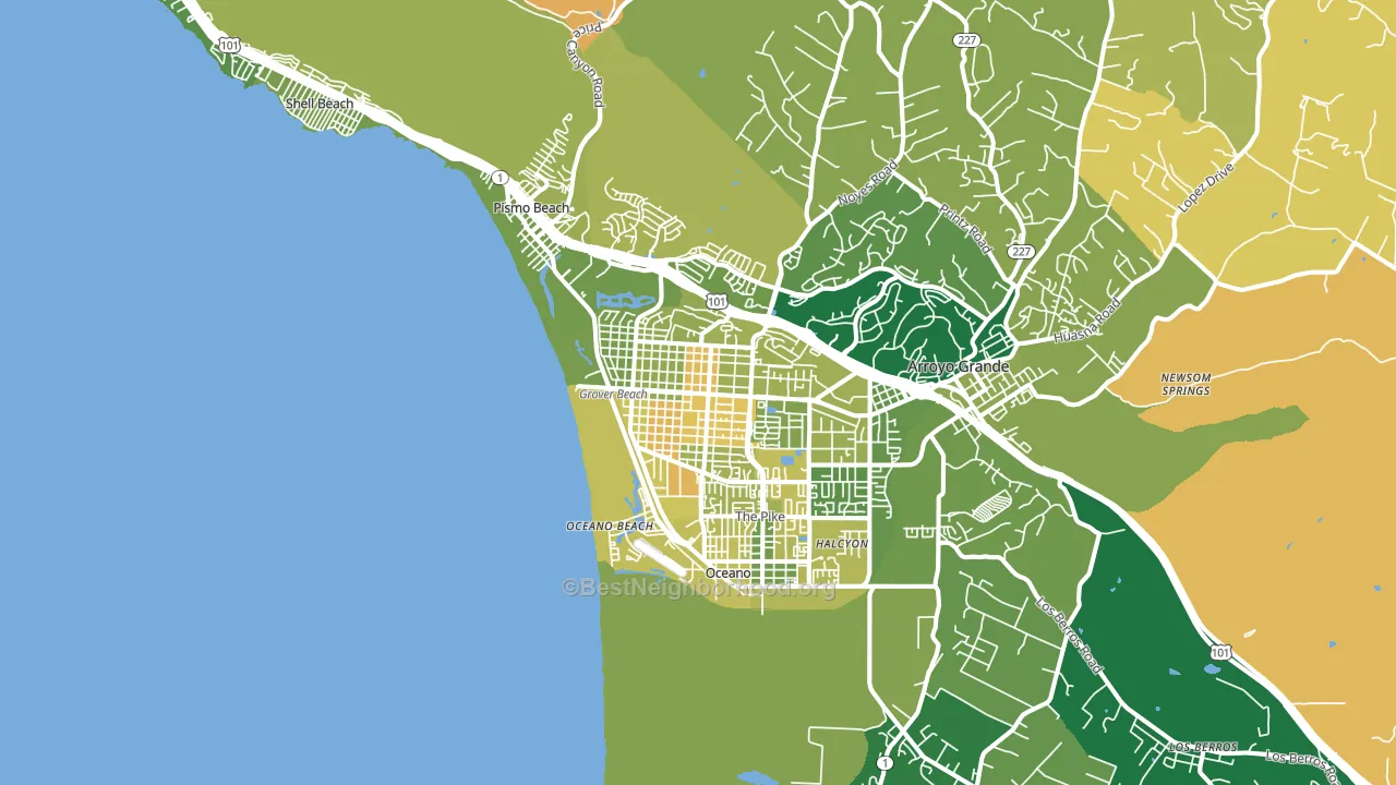
About 63% of adults in Grover Beach typically vote, near the U.S. average of about 62%. Among adults in Grover Beach, ~35% vote Democratic, ~28% Republican, and ~37% don't vote. The map below shows estimated turnout by block group.
How Grover Beach compares
Among cities within 25 miles, Grover Beach leans more Democratic than 14 of 22 neighbors.
Grover Beach runs about 11 points more Republican than California as a whole.
Why Grover Beach leans the way it does
This analysis examined 14,881 data points per city to find what predicts political lean and turnout. The items below are a few correlations that stood out for Grover Beach, not a ranked or complete list of what matters most.
Dense areas vote Democratic. About 95% of residents in Grover Beach live in densely developed areas, about 59 points above the U.S. average of 36%. High college attainment predicts Democratic voting, and Grover Beach sits in the top quarter (about 31%, above 75% of cities). A high never-married share predicts Democratic voting, and about 39% of adults in Grover Beach have never been married, above 93% of cities.
Population density and Democratic lean
Places with high population density tend to lean Democratic; Grover Beach, CA sits in the top tenth nationally on this measure.
Why turnout in Grover Beach looks the way it does
Turnout in Grover Beach sits close to the national pattern. Routine healthcare access, homeownership, education, and food security all land near their national averages here. Learn more about the findings and methodology on the political spectrum map.
Nearby Cities
- Oceano, CA D+9
- Arroyo Grande, CA D+3
- Pismo Beach, CA D+14
- Shell Beach, CA D+16
- Los Berros, CA R+19
- Halcyon, CA R+9
- Avila Beach, CA D+19
- Nipomo, CA R+10
- San Luis Obispo, CA D+39
- Guadalupe, CA D+15
Cities with Similar Populations
- Moss Bluff, LA R+62
- North Branch, MN R+30
- Solana Beach, CA D+25
- Groveport, OH D+4
- Fort Stockton, TX R+25
- Benton, LA R+58
- Forestville, MD D+82
- Gray, GA R+48
- Mount Vernon, VA D+36
- Skiatook, OK R+54
Sources and methodology
Precinct-level voting records used to fit the model come from California Secretary of State, Elections, distributed by the Voting and Election Science Team. Demographic inputs come from the U.S. Census Bureau (ACS 5-year estimates and the 2020 Decennial Census). Health and environmental inputs come from the CDC (PLACES and the Environmental Justice Index). Land cover comes from the USGS and EPA. Election-day and lead-up weather come from PRISM 4km daily grids and the NOAA Global Historical Climatology Network. Mail-voting and election-administration patterns come from the MIT Election Lab's Survey of the Performance of American Elections. Block-group crime detail comes from CrimeGrade. Internet data and modeling support provided by ISPreports.org.
Modeling and analysis by the BestNeighborhood data science team. Full methodology and findings: political spectrum map.
Methodology reviewed by the BestNeighborhood data team. Last updated May 2026.