Henry County leans heavily Republican by roughly 48 points: about 26% of voters vote Democratic and 74% Republican.
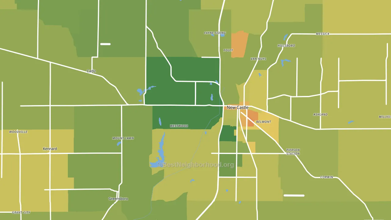
About 64% of adults in Henry County typically vote, near the U.S. average of about 62%. Among adults in Henry County, ~17% vote Democratic, ~47% Republican, and ~36% don't vote. The map below shows estimated turnout by block group.
How Henry County compares
Among counties within 50 miles, Henry County leans more Republican than 9 of 20 neighbors.
Henry County runs about 28 points more Republican than Indiana as a whole.
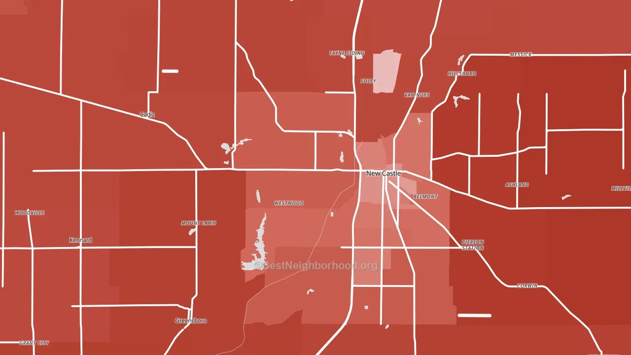
Politics vary noticeably by city within Henry County. The southeast side is the most Republican-leaning (R+62) and the north side is the least Republican-leaning (R+37), a spread of about 24 points.
Why Henry County leans the way it does
This analysis examined 14,881 data points per county to find what predicts political lean and turnout. The items below are a few correlations that stood out for Henry County, not a ranked or complete list of what matters most.
Areas with a high white share and below-average college attainment vote Republican. In Henry County, about 92% of residents are non-Hispanic white, about 20 points above the U.S. average of 72%; about 17% of adults hold a bachelor's degree, about 5 points below the Indiana average of 22%.
Population density and Democratic lean
Places with high population density tend to lean Democratic; Henry County, IN sits in the top quarter nationally on this measure.
Why turnout in Henry County looks the way it does
Turnout in Henry County sits close to the national pattern. Routine healthcare access, homeownership, education, and food security all land near their national averages here. Learn more about the findings and methodology on the political spectrum map.
Nearby Counties
- Delaware County, IN R+11
- Madison County, IN R+25
- Rush County, IN R+57
- Hancock County, IN R+36
- Fayette County, IN R+54
- Wayne County, IN R+31
- Randolph County, IN R+55
- Union County, IN R+58
- Shelby County, IN R+47
- Hamilton County, IN R+5
Counties with Similar Populations
- Edgecombe County, NC D+26
- Fremont County, CO R+25
- Atascosa County, TX R+37
- Vernon Parish, LA R+56
- Duplin County, NC R+23
- Burnet County, TX R+56
- Halifax County, NC D+22
- Henry County, IL R+24
- Dale County, AL R+43
- Tioga County, NY R+27
Sources and methodology
Precinct-level voting records used to fit the model come from Indiana Secretary of State, Elections, distributed by the Voting and Election Science Team. Demographic inputs come from the U.S. Census Bureau (ACS 5-year estimates and the 2020 Decennial Census). Health and environmental inputs come from the CDC (PLACES and the Environmental Justice Index). Land cover comes from the USGS and EPA. Election-day and lead-up weather come from PRISM 4km daily grids and the NOAA Global Historical Climatology Network. Mail-voting and election-administration patterns come from the MIT Election Lab's Survey of the Performance of American Elections. Block-group crime detail comes from CrimeGrade. Internet data and modeling support provided by ISPreports.org.
Modeling and analysis by the BestNeighborhood data science team. Full methodology and findings: political spectrum map.
Methodology reviewed by the BestNeighborhood data team. Last updated May 2026.