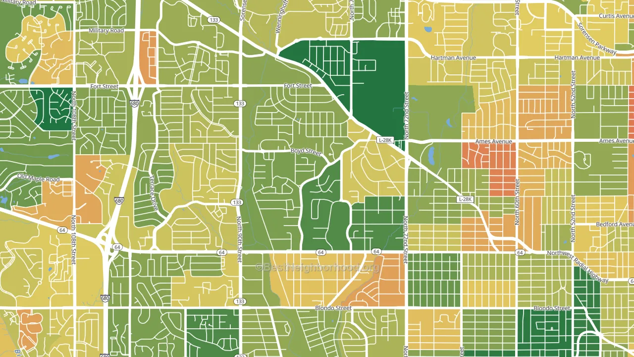
Keystone leans slightly Democratic by roughly 12 points: about 56% of voters vote Democratic and 44% Republican.
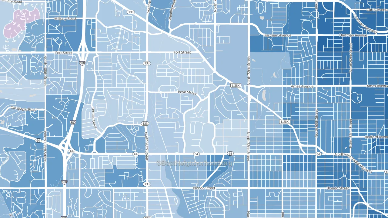
About 79% of adults in Keystone typically vote, above the U.S. average of about 62%. Among adults in Keystone, ~44% vote Democratic, ~35% Republican, and ~21% don't vote. The map below shows estimated turnout by block group.
How Keystone compares
Among neighborhoods within 5 miles, Keystone leans more Democratic than 1 of 7 neighbors.
Keystone runs about 33 points more Democratic than Nebraska as a whole. Nebraska leans Republican overall, while Keystone is one of the few Democratic-leaning pockets.
Why Keystone leans the way it does
This analysis examined 14,881 data points per neighborhood to find what predicts political lean and turnout. The items below are a few correlations that stood out for Keystone, not a ranked or complete list of what matters most.
Keystone votes against the grain of Nebraska. Nebraska leans Republican overall, while Keystone runs about 33 points more Democratic.
Park access and Democratic lean
Places with heavy park coverage tend to lean Democratic; Keystone, Omaha, NE sits above the national average on this measure. Park access does not change how people vote; it tends to track denser, higher-income areas.
Why turnout in Keystone looks the way it does
Turnout in Keystone sits close to the national pattern. Routine healthcare access, homeownership, education, and food security all land near their national averages here. Learn more about the findings and methodology on the political spectrum map.
Nearby Neighborhoods
- North Central Omaha, Omaha, NE D+24
- Benson, Omaha, NE D+41
- North Omaha, Omaha, NE D+41
- Central Omaha, Omaha, NE D+24
- Northwest Omaha, Omaha, NE D+10
- Aksarben-Elmwood Park, Omaha, NE D+36
- Miller Park Minne Lusa Area, Omaha, NE D+63
- Leavenworth, Omaha, NE D+51
- Jefferson Square, Omaha, NE D+43
- South Central Omaha, Omaha, NE D+15
Neighborhoods with Similar Populations
- The Eye, Detroit, MI D+70
- Orangetree, Naples, FL R+28
- Whitman-Mocine, Hayward, CA D+33
- Penns Beach, Pennsville, NJ R+29
- Floral Park, Santa Ana, CA D+26
- Highland, Billings, MT D+8
- Northbrook, Jackson, MS D+85
- Orchard Meadows, Mundelein, IL D+15
- Sunset Park, Tampa, FL R+18
- Crafton Heights, Pittsburgh, PA D+32
Sources and methodology
Precinct-level voting records used to fit the model come from Nebraska Secretary of State, Elections, distributed by the Voting and Election Science Team. Demographic inputs come from the U.S. Census Bureau (ACS 5-year estimates and the 2020 Decennial Census). Health and environmental inputs come from the CDC (PLACES and the Environmental Justice Index). Land cover comes from the USGS and EPA. Election-day and lead-up weather come from PRISM 4km daily grids and the NOAA Global Historical Climatology Network. Mail-voting and election-administration patterns come from the MIT Election Lab's Survey of the Performance of American Elections. Block-group crime detail comes from CrimeGrade. Internet data and modeling support provided by ISPreports.org.
Modeling and analysis by the BestNeighborhood data science team. Full methodology and findings: political spectrum map.
Methodology reviewed by the BestNeighborhood data team. Last updated May 2026.