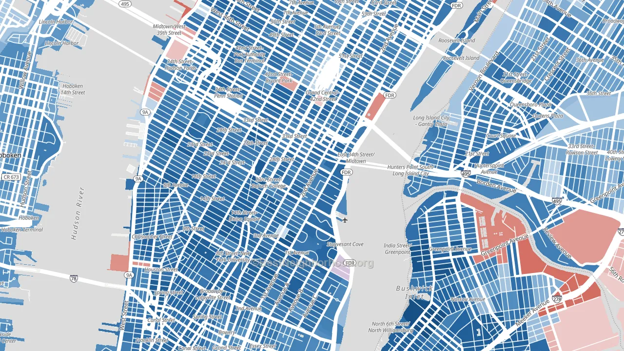
Kips Bay is a Democratic stronghold. About 81% of voters here vote Democratic and 19% Republican.
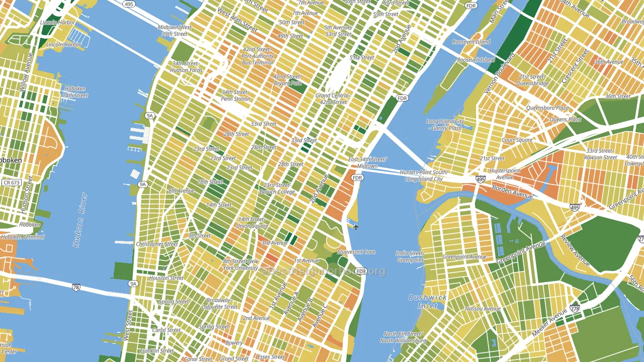
About 58% of adults in Kips Bay typically vote, near the U.S. average of about 62%. Among adults in Kips Bay, ~47% vote Democratic, ~11% Republican, and ~42% don't vote. The map below shows estimated turnout by block group.
How Kips Bay compares
Among neighborhoods within 5 miles, Kips Bay leans more Democratic than 28 of 51 neighbors.
Kips Bay runs about 50 points more Democratic than New York as a whole.
Why Kips Bay leans the way it does
This analysis examined 14,881 data points per neighborhood to find what predicts political lean and turnout. The items below are a few correlations that stood out for Kips Bay, not a ranked or complete list of what matters most.
Areas with high college attainment vote Democratic. About 73% of adults in Kips Bay hold a bachelor's degree, about 45 points above the U.S. average of 28%. A high never-married share predicts Democratic voting, and about 63% of adults in Kips Bay have never been married, above 95% of neighborhoods.
Paved land cover and Democratic lean
Places with extensive paved surfaces tend to lean Democratic; Kips Bay, Manhattan, NY sits in the top tenth nationally on this measure. Paved ground does not change how people vote; it mostly reflects how urban and built-up a place is.
Why turnout in Kips Bay looks the way it does
Renters vote less often than owners. About 79% of households in Kips Bay rent, about 54 points above the U.S. average of 25%. Strong routine healthcare access lines up with higher turnout, and Kips Bay sits in the top quarter on routine-care measures. Learn more about the findings and methodology on the political spectrum map.
Nearby Neighborhoods
- Gramercy, Manhattan, NY D+65
- Murray Hill, Manhattan, NY D+58
- Garment District, Manhattan, NY D+63
- East Village, Manhattan, NY D+65
- Chelsea, Manhattan, NY D+65
- Greenwich Village, Manhattan, NY D+71
- North Sutton Area, Manhattan, NY D+55
- Midtown, Manhattan, NY D+58
- West Village, Manhattan, NY D+68
- Clinton, Manhattan, NY D+64
Neighborhoods with Similar Populations
- Laurelton, Queens, NY D+82
- Deanwood, Washington, DC D+86
- North Side, Mount Vernon, NY D+61
- Southwest Arlington, Arlington, TX R+5
- Ashburn, Chicago, IL D+56
- Fresh Meadows, Queens, NY D+5
- Somerton, Philadelphia, PA R+15
- Active Bethel, Eugene, OR D+8
- Mililani Waipio Melemanu, Mililani, HI D+17
- Olney, Philadelphia, PA D+68
Sources and methodology
Precinct-level voting records used to fit the model come from New York State Board of Elections, distributed by the Voting and Election Science Team. Demographic inputs come from the U.S. Census Bureau (ACS 5-year estimates and the 2020 Decennial Census). Health and environmental inputs come from the CDC (PLACES and the Environmental Justice Index). Land cover comes from the USGS and EPA. Election-day and lead-up weather come from PRISM 4km daily grids and the NOAA Global Historical Climatology Network. Mail-voting and election-administration patterns come from the MIT Election Lab's Survey of the Performance of American Elections. Block-group crime detail comes from CrimeGrade. Internet data and modeling support provided by ISPreports.org.
Modeling and analysis by the BestNeighborhood data science team. Full methodology and findings: political spectrum map.
Methodology reviewed by the BestNeighborhood data team. Last updated May 2026.