Clinton is a Democratic stronghold. About 82% of voters here vote Democratic and 18% Republican.
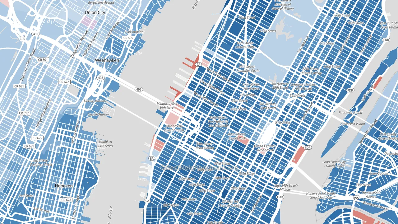
About 49% of adults in Clinton typically vote, below the U.S. average of about 62%. Among adults in Clinton, ~40% vote Democratic, ~9% Republican, and ~51% don't vote. The map below shows estimated turnout by block group.
How Clinton compares
Among neighborhoods within 5 miles, Clinton leans more Democratic than 28 of 42 neighbors.
Clinton runs about 52 points more Democratic than New York as a whole.
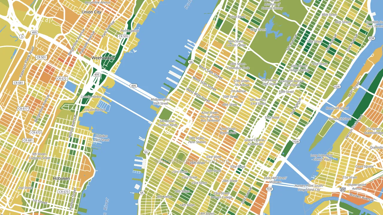
Politics vary noticeably by block within Clinton. The east side is the most Democratic-leaning (D+69) and the west side is the least Democratic-leaning (D+53), a spread of about 15 points.
Why Clinton leans the way it does
This analysis examined 14,881 data points per neighborhood to find what predicts political lean and turnout. The items below are a few correlations that stood out for Clinton, not a ranked or complete list of what matters most.
Areas with high college attainment vote Democratic. About 78% of adults in Clinton hold a bachelor's degree, about 49 points above the U.S. average of 28%. A high never-married share predicts Democratic voting, and about 65% of adults in Clinton have never been married, above 96% of neighborhoods.
Population density and Democratic lean
Places with high population density tend to lean Democratic; Clinton, Manhattan, NY sits in the top tenth nationally on this measure.
Why turnout in Clinton looks the way it does
Renters vote less often than owners. About 89% of households in Clinton rent, about 64 points above the U.S. average of 25%. High-crime urban areas turn out at lower rates, and Clinton sits in the top 15% on a violent-crime measure. Learn more about the findings and methodology on the political spectrum map.
Nearby Neighborhoods
- Theater District, Manhattan, NY D+63
- Garment District, Manhattan, NY D+63
- Midtown, Manhattan, NY D+58
- Chelsea, Manhattan, NY D+65
- Murray Hill, Manhattan, NY D+58
- Kips Bay, Manhattan, NY D+62
- North Sutton Area, Manhattan, NY D+55
- Gramercy, Manhattan, NY D+65
- West Village, Manhattan, NY D+68
- Greenwich Village, Manhattan, NY D+71
Neighborhoods with Similar Populations
- Paerdegat, Brooklyn, NY D+78
- Parkway Village-Oakhaven, Memphis, TN D+73
- Green Valley North, Henderson, NV D+10
- River Oaks-Kirby-Balmoral, Memphis, TN D+30
- Park, Stockton, CA D+26
- Kalihi-Palama, Honolulu, HI D+11
- Hyde Park, Los Angeles, CA D+70
- TCU-West Cliff, Fort Worth, TX D+6
- Financial District, Manhattan, NY D+58
- Charleston Heights, Las Vegas, NV D+15
Sources and methodology
Precinct-level voting records used to fit the model come from New York State Board of Elections, distributed by the Voting and Election Science Team. Demographic inputs come from the U.S. Census Bureau (ACS 5-year estimates and the 2020 Decennial Census). Health and environmental inputs come from the CDC (PLACES and the Environmental Justice Index). Land cover comes from the USGS and EPA. Election-day and lead-up weather come from PRISM 4km daily grids and the NOAA Global Historical Climatology Network. Mail-voting and election-administration patterns come from the MIT Election Lab's Survey of the Performance of American Elections. Block-group crime detail comes from CrimeGrade. Internet data and modeling support provided by ISPreports.org.
Modeling and analysis by the BestNeighborhood data science team. Full methodology and findings: political spectrum map.
Methodology reviewed by the BestNeighborhood data team. Last updated May 2026.