Lawndale leans heavily Democratic by roughly 40 points: about 70% of voters vote Democratic and 30% Republican.
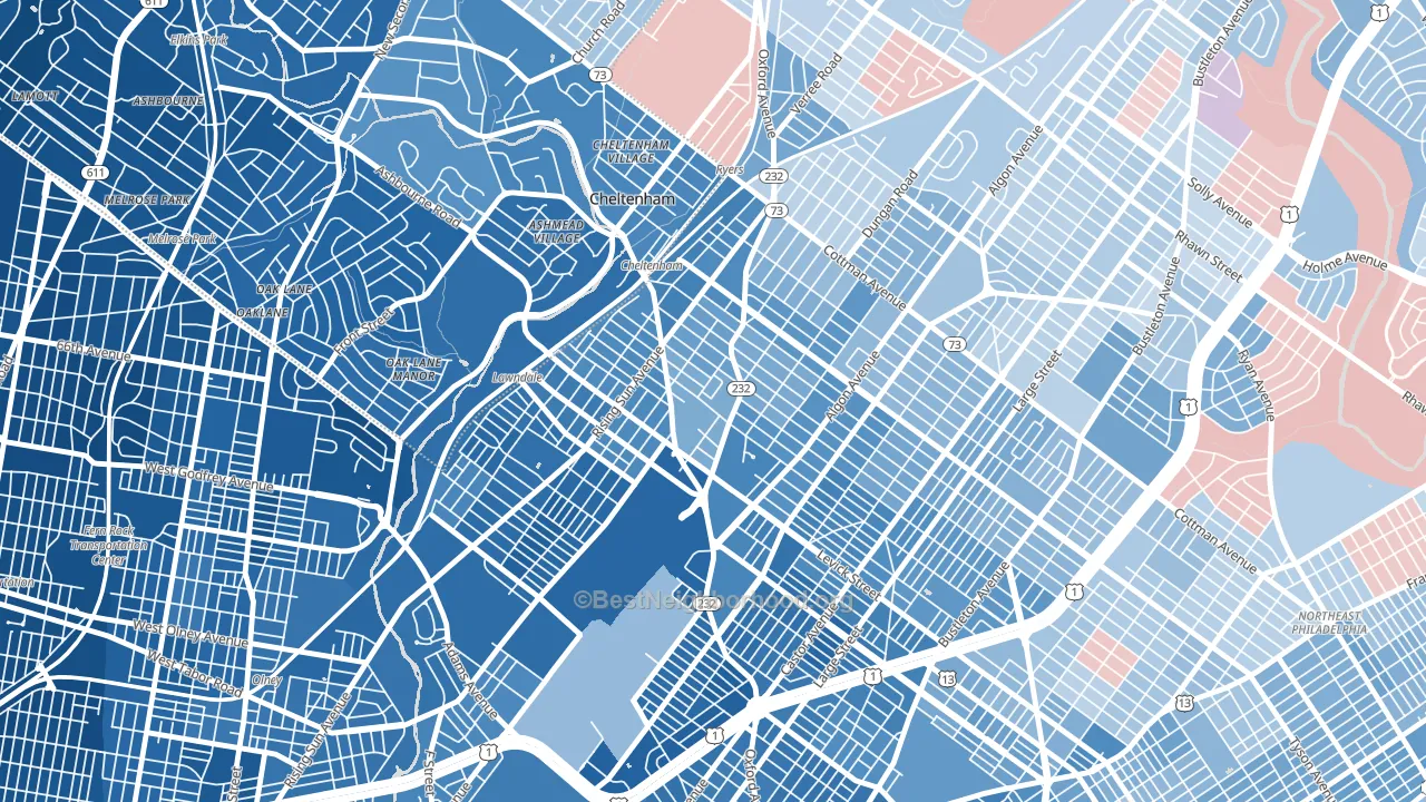
About 60% of adults in Lawndale typically vote, near the U.S. average of about 62%. Among adults in Lawndale, ~42% vote Democratic, ~18% Republican, and ~40% don't vote. The map below shows estimated turnout by block group.
How Lawndale compares
Among neighborhoods within 5 miles, Lawndale leans more Democratic than 8 of 22 neighbors.
Lawndale runs about 42 points more Democratic than Pennsylvania as a whole. Pennsylvania is roughly evenly split, and Lawndale sits clearly on the Democratic side.
Politics vary noticeably by block within Lawndale. The southwest side is the most Democratic-leaning (D+53) and the northeast side is the least Democratic-leaning (D+27), a spread of about 26 points.
Why Lawndale leans the way it does
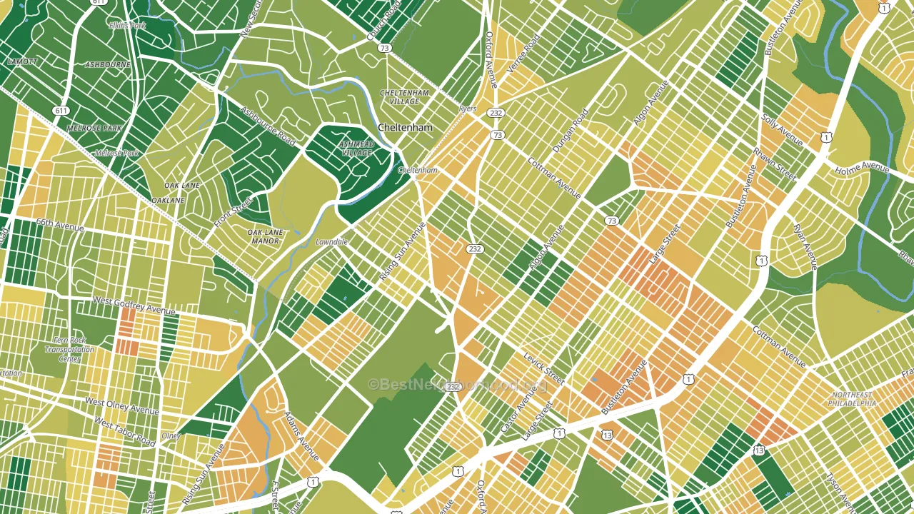
This analysis examined 14,881 data points per neighborhood to find what predicts political lean and turnout. The items below are a few correlations that stood out for Lawndale, not a ranked or complete list of what matters most.
Lawndale votes against the grain of Pennsylvania. Pennsylvania is roughly evenly split, while Lawndale runs about 42 points more Democratic. Density combined with diversity predicts Democratic voting, and non-Hispanic white share in Lawndale is about 28%, about 45 points below the U.S. average of 72%.
Population density and Democratic lean
Places with high population density tend to lean Democratic; Lawndale, Philadelphia, PA sits in the top tenth nationally on this measure.
Why turnout in Lawndale looks the way it does
Turnout in Lawndale sits close to the national pattern. Routine healthcare access, homeownership, education, and food security all land near their national averages here. Learn more about the findings and methodology on the political spectrum map.
Nearby Neighborhoods
- Lawncrest, Philadelphia, PA D+59
- Oxford Circle, Philadelphia, PA D+41
- Summerdale, Philadelphia, PA D+58
- Fox Chase-Burholme, Philadelphia, PA D+7
- Rhawnhurst, Philadelphia, PA D+8
- Olney, Philadelphia, PA D+68
- Mayfield, Philadelphia, PA D+9
- Frankford, Philadelphia, PA D+56
- Wissanoning, Philadelphia, PA D+30
- Juniata Park-Feltonville, Philadelphia, PA D+44
Neighborhoods with Similar Populations
- South 48th Street, Lincoln, NE D+20
- Fruitvale Station, Oakland, CA D+52
- College Hill, Providence, RI D+78
- McMurray-Huntingdon, Nashville, TN D+21
- Hillcrest, San Diego, CA D+61
- Cathedral Park, Portland, OR D+66
- Airport-Pines Road, Shreveport, LA D+47
- Cheltenham, Chicago, IL D+80
- Airport North, Orlando, FL D+21
- Northwest Akron, Akron, OH D+42
Sources and methodology
Precinct-level voting records used to fit the model come from Pennsylvania Department of State, Bureau of Elections, distributed by the Voting and Election Science Team. Demographic inputs come from the U.S. Census Bureau (ACS 5-year estimates and the 2020 Decennial Census). Health and environmental inputs come from the CDC (PLACES and the Environmental Justice Index). Land cover comes from the USGS and EPA. Election-day and lead-up weather come from PRISM 4km daily grids and the NOAA Global Historical Climatology Network. Mail-voting and election-administration patterns come from the MIT Election Lab's Survey of the Performance of American Elections. Block-group crime detail comes from CrimeGrade. Internet data and modeling support provided by ISPreports.org.
Modeling and analysis by the BestNeighborhood data science team. Full methodology and findings: political spectrum map.
Methodology reviewed by the BestNeighborhood data team. Last updated May 2026.