Cheltenham is a Democratic stronghold. About 90% of voters here vote Democratic and 10% Republican.
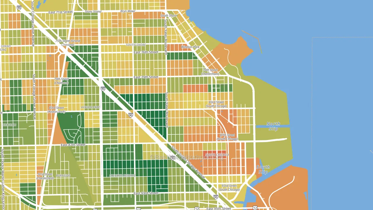
About 53% of adults in Cheltenham typically vote, below the U.S. average of about 62%. Among adults in Cheltenham, ~48% vote Democratic, ~5% Republican, and ~47% don't vote. The map below shows estimated turnout by block group.
How Cheltenham compares
Among neighborhoods within 5 miles, Cheltenham leans more Democratic than 5 of 26 neighbors.
Cheltenham runs about 69 points more Democratic than Illinois as a whole.
Politics vary noticeably by block within Cheltenham. The southwest side is the most Democratic-leaning (D+86) and the southeast side is the least Democratic-leaning (D+73), a spread of about 13 points.
Why Cheltenham leans the way it does
This analysis examined 14,881 data points per neighborhood to find what predicts political lean and turnout. The items below are a few correlations that stood out for Cheltenham, not a ranked or complete list of what matters most.
Areas with many never-married adults vote Democratic. About 58% of adults in Cheltenham have never been married, modestly above similar-sized neighborhoods (around 46%).
Population density and Democratic lean
Places with high population density tend to lean Democratic; Cheltenham, Chicago, IL sits in the top tenth nationally on this measure.
Why turnout in Cheltenham looks the way it does
Areas with high food insecurity turn out at lower rates. About 38% of adults in Cheltenham report food insecurity, about 22 points above the U.S. average of 16%. High-crime urban areas turn out at lower rates, and Cheltenham sits in the top 15% on a violent-crime measure. Learn more about the findings and methodology on the political spectrum map.
Nearby Neighborhoods
- South Chicago, Chicago, IL D+76
- The Bush, Chicago, IL D+68
- Windsor Park, Chicago, IL D+81
- Pill Hill, Chicago, IL D+85
- Calumet Heights, Chicago, IL D+85
- Avalon Park, Chicago, IL D+86
- South Shore, Chicago, IL D+83
- Essex, Chicago, IL D+82
- Italian Bowery, Chicago, IL D+82
- South Deering, Chicago, IL D+65
Neighborhoods with Similar Populations
- Airport North, Orlando, FL D+21
- Northwest Akron, Akron, OH D+42
- College Hill, Providence, RI D+78
- Lawndale, Philadelphia, PA D+40
- South 48th Street, Lincoln, NE D+20
- Fruitvale Station, Oakland, CA D+52
- McMurray-Huntingdon, Nashville, TN D+21
- Hillcrest, San Diego, CA D+61
- Cathedral Park, Portland, OR D+66
- Airport-Pines Road, Shreveport, LA D+47
Sources and methodology
Precinct-level voting records used to fit the model come from Illinois State Board of Elections, distributed by the Voting and Election Science Team. Demographic inputs come from the U.S. Census Bureau (ACS 5-year estimates and the 2020 Decennial Census). Health and environmental inputs come from the CDC (PLACES and the Environmental Justice Index). Land cover comes from the USGS and EPA. Election-day and lead-up weather come from PRISM 4km daily grids and the NOAA Global Historical Climatology Network. Mail-voting and election-administration patterns come from the MIT Election Lab's Survey of the Performance of American Elections. Block-group crime detail comes from CrimeGrade. Internet data and modeling support provided by ISPreports.org.
Modeling and analysis by the BestNeighborhood data science team. Full methodology and findings: political spectrum map.
Methodology reviewed by the BestNeighborhood data team. Last updated May 2026.