Lincoln County leans Republican by roughly 28 points: about 36% of voters vote Democratic and 64% Republican.
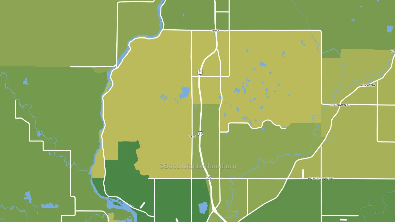
About 85% of adults in Lincoln County typically vote, above the U.S. average of about 62%. Among adults in Lincoln County, ~31% vote Democratic, ~54% Republican, and ~15% don't vote. The map below shows estimated turnout by block group.
How Lincoln County compares
Among counties within 50 miles, Lincoln County leans more Republican than 3 of 7 neighbors.
Lincoln County runs about 28 points more Republican than Wisconsin as a whole.
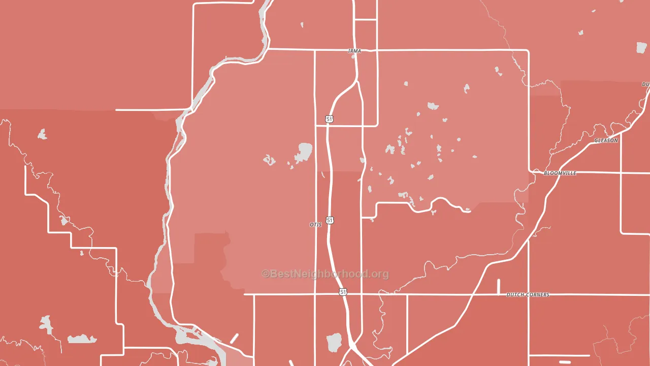
Politics vary noticeably by city within Lincoln County. The east side is the most Republican-leaning (R+39) and the south side is the least Republican-leaning (R+19), a spread of about 21 points.
Why Lincoln County leans the way it does
Density, race composition, education, and family structure all sit close to their national averages in Lincoln County. The lean here lands roughly where demographic data alone would predict.
Homeownership and voter turnout
Places with homeowner-heavy households tend to turn out at a higher rate; Lincoln County, WI sits in the top quarter nationally on this measure.
Why turnout in Lincoln County looks the way it does
Areas with strong routine healthcare access turn out at higher rates. Lincoln County is in the top quarter nationally for routine-care measures such as insurance coverage, preventive screenings, and dental visits. The dental-visit rate here is about 66%, about 6 points above the U.S. average of 60%. Learn more about the findings and methodology on the political spectrum map.
Nearby Counties
- Marathon County, WI R+17
- Langlade County, WI R+35
- Oneida County, WI R+18
- Taylor County, WI R+46
- Price County, WI R+36
- Forest County, WI R+33
- Vilas County, WI R+18
- Clark County, WI R+43
- Portage County, WI R+7
- Menominee County, WI D+59
Counties with Similar Populations
- Palo Pinto County, TX R+62
- Sanpete County, UT R+63
- Carroll County, TN R+58
- Cass County, TX R+56
- Copiah County, MS D+6
- Perry County, KY R+61
- Jones County, GA R+41
- Leflore County, MS D+53
- Codington County, SD R+42
- Custer County, OK R+49
Sources and methodology
Precinct-level voting records used to fit the model come from Wisconsin Elections Commission, distributed by the Voting and Election Science Team. Demographic inputs come from the U.S. Census Bureau (ACS 5-year estimates and the 2020 Decennial Census). Health and environmental inputs come from the CDC (PLACES and the Environmental Justice Index). Land cover comes from the USGS and EPA. Election-day and lead-up weather come from PRISM 4km daily grids and the NOAA Global Historical Climatology Network. Mail-voting and election-administration patterns come from the MIT Election Lab's Survey of the Performance of American Elections. Block-group crime detail comes from CrimeGrade. Internet data and modeling support provided by ISPreports.org.
Modeling and analysis by the BestNeighborhood data science team. Full methodology and findings: political spectrum map.
Methodology reviewed by the BestNeighborhood data team. Last updated May 2026.