Menominee County is a Democratic stronghold. About 80% of voters here vote Democratic and 20% Republican.
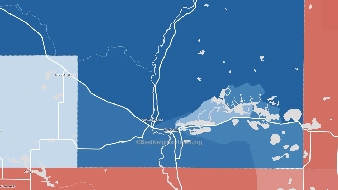
About 71% of adults in Menominee County typically vote, above the U.S. average of about 62%. Among adults in Menominee County, ~57% vote Democratic, ~14% Republican, and ~29% don't vote. The map below shows estimated turnout by block group.
How Menominee County compares
Among counties within 50 miles, Menominee County is the most Democratic-leaning.
Menominee County runs about 60 points more Democratic than Wisconsin as a whole. Wisconsin is roughly evenly split, and Menominee County sits clearly on the Democratic side.
Politics vary noticeably by city within Menominee County. The north side is the most Democratic-leaning (D+78) and the east side is the least Democratic-leaning (D+42), a spread of about 36 points.
Why Menominee County leans the way it does
This analysis examined 14,881 data points per county to find what predicts political lean and turnout. The items below are a few correlations that stood out for Menominee County, not a ranked or complete list of what matters most.
Menominee County votes against the grain of Wisconsin. Wisconsin is roughly evenly split, while Menominee County runs about 60 points more Democratic. A high never-married share predicts Democratic voting, and about 45% of adults in Menominee County have never been married, above 97% of counties.
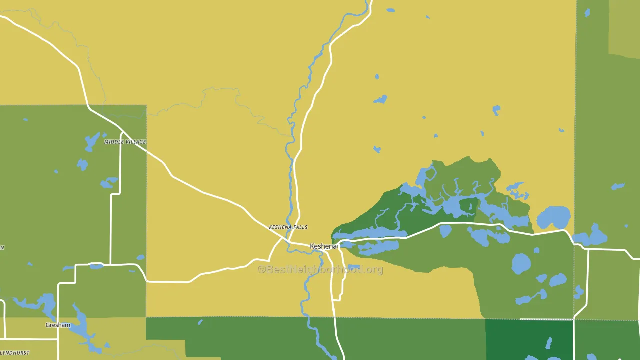
High-school completion and voter turnout
Places with high-school-completion-heavy adults tend to turn out at a higher rate; Menominee County, WI sits in the top quarter nationally on this measure.
Why turnout in Menominee County looks the way it does
Turnout in Menominee County sits close to the national pattern. Routine healthcare access, homeownership, education, and food security all land near their national averages here. Learn more about the findings and methodology on the political spectrum map.
Nearby Counties
- Shawano County, WI R+35
- Oconto County, WI R+40
- Langlade County, WI R+35
- Waupaca County, WI R+34
- Brown County, WI R+4
- Outagamie County, WI R+13
- Marinette County, WI R+34
- Forest County, WI R+33
- Portage County, WI R+7
- Marathon County, WI R+17
Counties with Similar Populations
- Custer County, ID R+52
- Barber County, KS R+69
- Kimble County, TX R+63
- Holt County, MO R+61
- Phillips County, MT R+52
- Deuel County, SD R+54
- Bath County, VA R+54
- Kittson County, MN R+34
- Marshall County, SD R+31
- Mora County, NM D+18
Sources and methodology
Precinct-level voting records used to fit the model come from Wisconsin Elections Commission, distributed by the Voting and Election Science Team. Demographic inputs come from the U.S. Census Bureau (ACS 5-year estimates and the 2020 Decennial Census). Health and environmental inputs come from the CDC (PLACES and the Environmental Justice Index). Land cover comes from the USGS and EPA. Election-day and lead-up weather come from PRISM 4km daily grids and the NOAA Global Historical Climatology Network. Mail-voting and election-administration patterns come from the MIT Election Lab's Survey of the Performance of American Elections. Block-group crime detail comes from CrimeGrade. Internet data and modeling support provided by ISPreports.org.
Modeling and analysis by the BestNeighborhood data science team. Full methodology and findings: political spectrum map.
Methodology reviewed by the BestNeighborhood data team. Last updated May 2026.