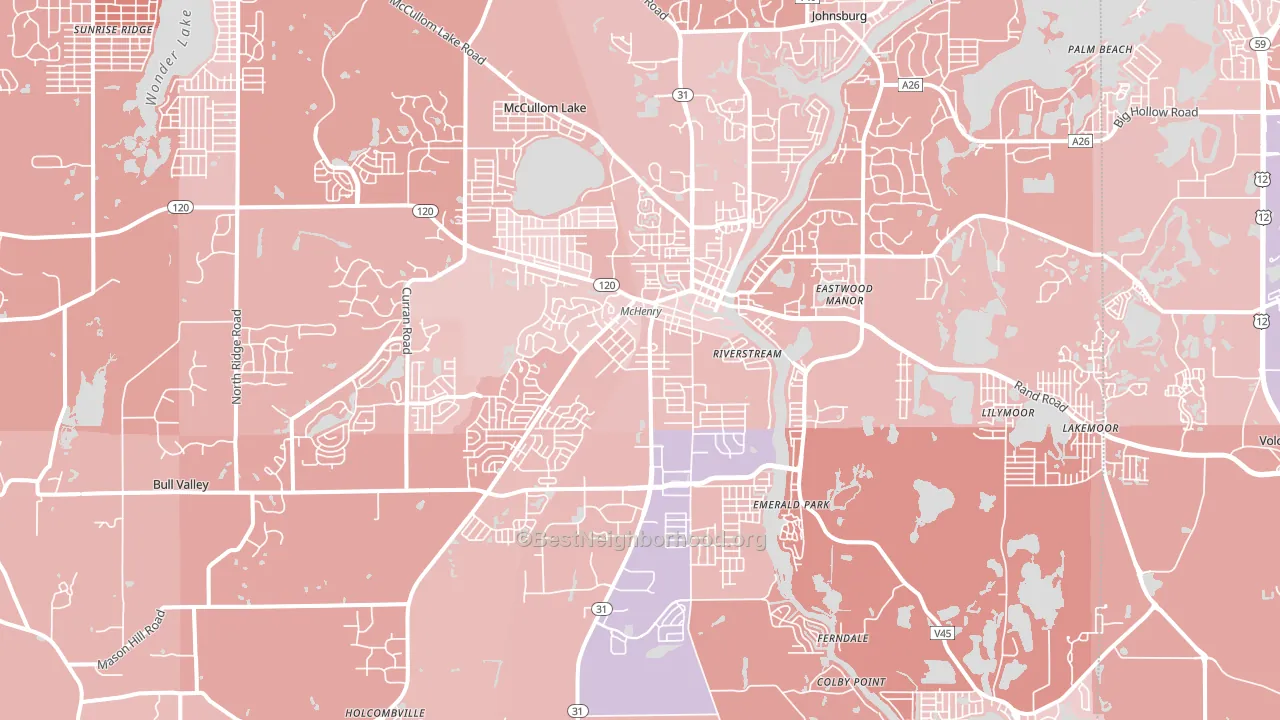
Mchenry leans slightly Republican by roughly 10 points: about 45% of voters vote Democratic and 55% Republican.
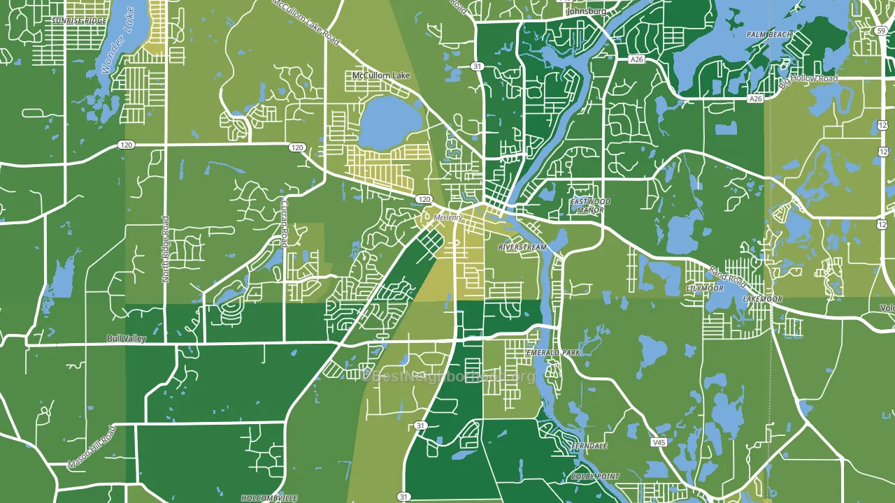
About 83% of adults in Mchenry typically vote, above the U.S. average of about 62%. Among adults in Mchenry, ~37% vote Democratic, ~46% Republican, and ~17% don't vote. The map below shows estimated turnout by block group.
How Mchenry compares
Among cities within 25 miles, Mchenry leans more Republican than 87 of 140 neighbors.
Mchenry runs about 21 points more Republican than Illinois as a whole. Illinois leans Democratic overall, while Mchenry is one of the few Republican-leaning pockets.
Why Mchenry leans the way it does
This analysis examined 14,881 data points per city to find what predicts political lean and turnout. The items below are a few correlations that stood out for Mchenry, not a ranked or complete list of what matters most.
Mchenry votes Republican even though it is densely developed (about 60%, well above the Illinois average of 33%). State and regional patterns outweigh the Democratic lean that density usually predicts here. Mchenry runs against the grain of Illinois, a Republican-leaning pocket in a Democratic-leaning state.
Preventive-care access and voter turnout
Places with strong routine preventive-care access tend to turn out at a higher rate; Mchenry, IL sits above the national average on this measure. Dental visits do not drive turnout; the rate reflects income, insurance, and healthcare access, which line up with who votes.
Why turnout in Mchenry looks the way it does
Turnout in Mchenry sits close to the national pattern. Routine healthcare access, homeownership, education, and food security all land near their national averages here. Learn more about the findings and methodology on the political spectrum map.
Nearby Cities
- McCullom Lake, IL R+12
- Holiday Hills, IL R+13
- Johnsburg, IL R+19
- Lakemoor, IL R+12
- Prairie Grove, IL R+10
- Bull Valley, IL R+16
- Ringwood, IL R+25
- Wonder Lake, IL R+17
- Pistakee Highlands, IL R+14
- Island Lake, IL R+8
Cities with Similar Populations
- Daphne, AL R+40
- Newhall, CA D+7
- Randolph, MA D+49
- Fairhope, AL R+49
- Inver Grove Heights, MN D+10
- Kinston, NC D+15
- University Place, WA D+29
- West Hills, CA D+16
- Farmers Branch, TX D+14
- El Mirage, AZ D+3
Sources and methodology
Precinct-level voting records used to fit the model come from Illinois State Board of Elections, distributed by the Voting and Election Science Team. Demographic inputs come from the U.S. Census Bureau (ACS 5-year estimates and the 2020 Decennial Census). Health and environmental inputs come from the CDC (PLACES and the Environmental Justice Index). Land cover comes from the USGS and EPA. Election-day and lead-up weather come from PRISM 4km daily grids and the NOAA Global Historical Climatology Network. Mail-voting and election-administration patterns come from the MIT Election Lab's Survey of the Performance of American Elections. Block-group crime detail comes from CrimeGrade. Internet data and modeling support provided by ISPreports.org.
Modeling and analysis by the BestNeighborhood data science team. Full methodology and findings: political spectrum map.
Methodology reviewed by the BestNeighborhood data team. Last updated May 2026.