Millbrook leans heavily Democratic by roughly 38 points: about 69% of voters vote Democratic and 31% Republican.
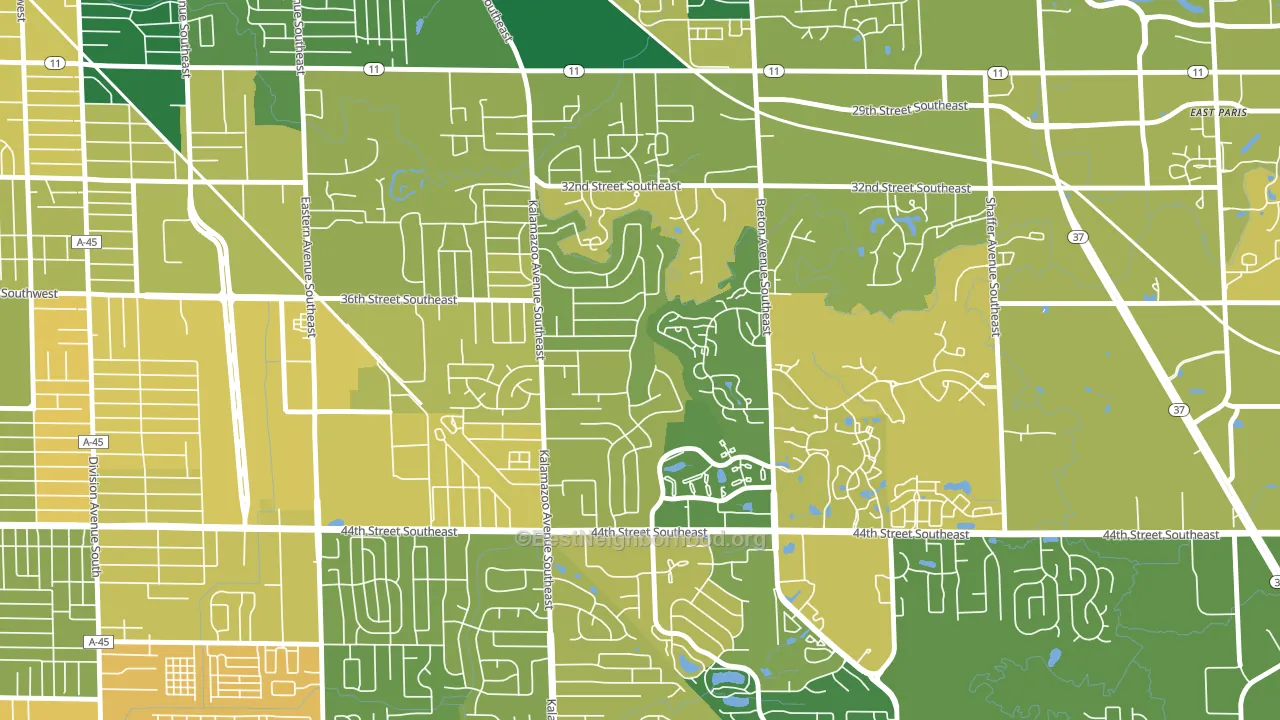
About 73% of adults in Millbrook typically vote, above the U.S. average of about 62%. Among adults in Millbrook, ~50% vote Democratic, ~23% Republican, and ~27% don't vote. The map below shows estimated turnout by block group.
How Millbrook compares
Among neighborhoods within 5 miles, Millbrook is the least Democratic-leaning.
Millbrook runs about 39 points more Democratic than Michigan as a whole. Michigan is roughly evenly split, and Millbrook sits clearly on the Democratic side.
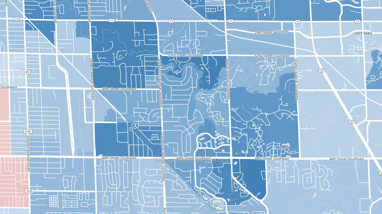
Politics vary noticeably by block within Millbrook. The southeast side is the most Democratic-leaning (D+44) and the east side is the least Democratic-leaning (D+27), a spread of about 16 points.
Why Millbrook leans the way it does
This analysis examined 14,881 data points per neighborhood to find what predicts political lean and turnout. The items below are a few correlations that stood out for Millbrook, not a ranked or complete list of what matters most.
Millbrook votes against the grain of Michigan. Michigan is roughly evenly split, while Millbrook runs about 39 points more Democratic.
Cancer-screening access and voter turnout
Places with high colon-cancer-screening access tend to turn out at a higher rate; Millbrook, Grand Rapids, MI sits in the top quarter nationally on this measure. Cancer screening does not drive turnout; it reflects income, insurance, and healthcare access.
Why turnout in Millbrook looks the way it does
Areas with strong routine healthcare access turn out at higher rates. Millbrook is in the top quarter nationally for routine-care measures such as insurance coverage, preventive screenings, and dental visits. The dental-visit rate here is about 63%. Learn more about the findings and methodology on the political spectrum map.
Nearby Neighborhoods
- Alger Heights, Grand Rapids, MI D+46
- South East End, Grand Rapids, MI D+54
- Garfield Park, Grand Rapids, MI D+48
- Fuller Avenue, Grand Rapids, MI D+71
- Madison Area, Grand Rapids, MI D+72
- South East Community, Grand Rapids, MI D+66
- Eastown, Grand Rapids, MI D+56
- Roosevelt Park, Grand Rapids, MI D+39
- East Hills, Grand Rapids, MI D+58
- Heritage Hill, Grand Rapids, MI D+61
Neighborhoods with Similar Populations
- Russell, Louisville, KY D+82
- Central, Raleigh, NC D+65
- South Tabor, Portland, OR D+71
- Cambria Heights, Queens, NY D+84
- East End, Boise, ID D+33
- Grandmont-Rosedale, Detroit, MI D+87
- Central Business District, Newark, NJ D+72
- Cattleman Square, San Antonio, TX D+35
- Crest Drive, Eugene, OR D+65
- Scenic Heights, Arvada, CO D+19
Sources and methodology
Precinct-level voting records used to fit the model come from Michigan Department of State, Elections, distributed by the Voting and Election Science Team. Demographic inputs come from the U.S. Census Bureau (ACS 5-year estimates and the 2020 Decennial Census). Health and environmental inputs come from the CDC (PLACES and the Environmental Justice Index). Land cover comes from the USGS and EPA. Election-day and lead-up weather come from PRISM 4km daily grids and the NOAA Global Historical Climatology Network. Mail-voting and election-administration patterns come from the MIT Election Lab's Survey of the Performance of American Elections. Block-group crime detail comes from CrimeGrade. Internet data and modeling support provided by ISPreports.org.
Modeling and analysis by the BestNeighborhood data science team. Full methodology and findings: political spectrum map.
Methodology reviewed by the BestNeighborhood data team. Last updated May 2026.