Mills County is a Republican stronghold. About 14% of voters here vote Democratic and 86% Republican.
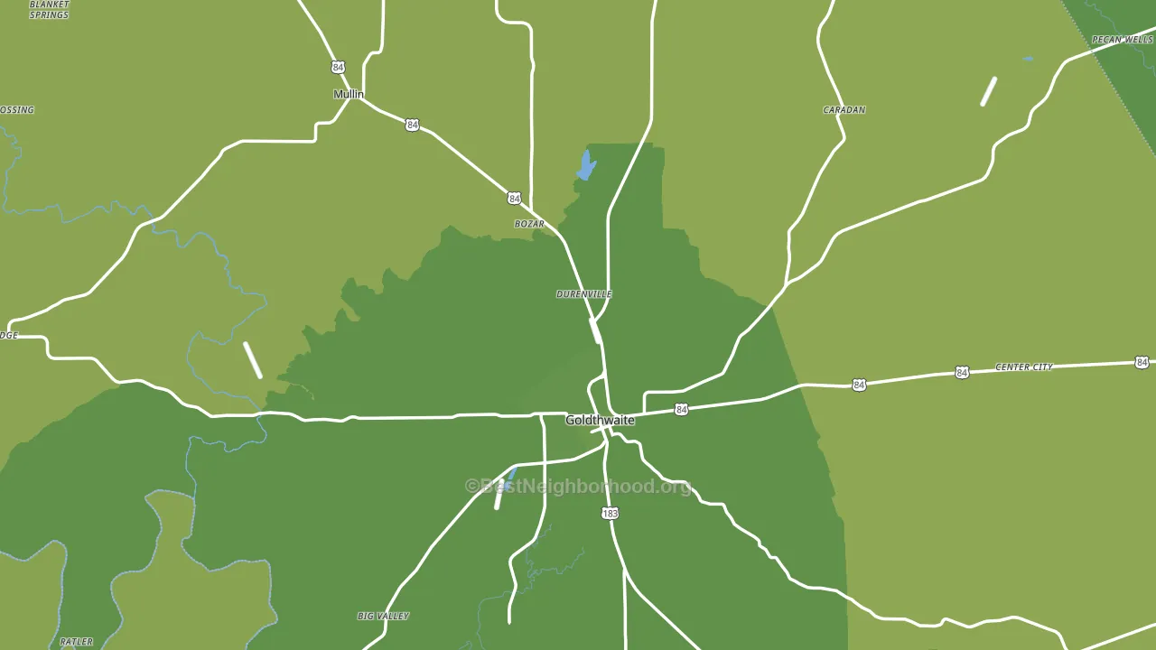
About 80% of adults in Mills County typically vote, above the U.S. average of about 62%. Among adults in Mills County, ~11% vote Democratic, ~69% Republican, and ~20% don't vote. The map below shows estimated turnout by block group.
How Mills County compares
Among counties within 50 miles, Mills County is the most Republican-leaning.
Mills County runs about 58 points more Republican than Texas as a whole.
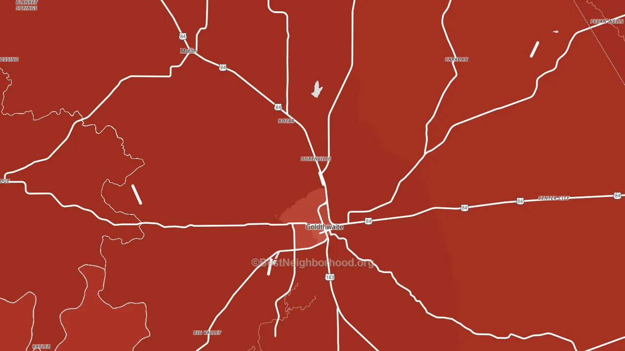
Politics vary noticeably by city within Mills County. The northwest side is the most Republican-leaning (R+79) and the south side is the least Republican-leaning (R+62), a spread of about 18 points.
Why Mills County leans the way it does
This analysis examined 14,881 data points per county to find what predicts political lean and turnout. The items below are a few correlations that stood out for Mills County, not a ranked or complete list of what matters most.
Areas with many family households vote Republican. About 72% of households in Mills County are family households, about 5 points above the U.S. average of 67%.
Park access and Republican lean
Places with low park coverage tend to lean Republican; Mills County, TX sits in the bottom tenth nationally on this measure. Park access does not change how people vote; it tends to track denser, higher-income areas.
Why turnout in Mills County looks the way it does
Homeowners vote more often than renters. About 81% of households in Mills County own their home, about 6 points above the Texas average of 75%. Limited routine healthcare access lines up with lower turnout, and Mills County sits in the bottom quarter on routine-care measures. Learn more about the findings and methodology on the political spectrum map.
Nearby Counties
- San Saba County, TX R+68
- Brown County, TX R+58
- Comanche County, TX R+65
- Hamilton County, TX R+69
- Lampasas County, TX R+55
- Coryell County, TX R+27
- McCulloch County, TX R+56
- Erath County, TX R+55
- Coleman County, TX R+63
- Llano County, TX R+56
Counties with Similar Populations
- Guadalupe County, NM Even
- Calhoun County, IL R+56
- Dewey County, OK R+78
- Wahkiakum County, WA R+19
- Lincoln County, NV R+66
- Hickman County, KY R+61
- Phillips County, CO R+53
- Adams County, ID R+57
- Mineral County, MT R+53
- Cameron County, PA R+47
Sources and methodology
Precinct-level voting records used to fit the model come from Texas Secretary of State, Elections Division, distributed by the Voting and Election Science Team. Demographic inputs come from the U.S. Census Bureau (ACS 5-year estimates and the 2020 Decennial Census). Health and environmental inputs come from the CDC (PLACES and the Environmental Justice Index). Land cover comes from the USGS and EPA. Election-day and lead-up weather come from PRISM 4km daily grids and the NOAA Global Historical Climatology Network. Mail-voting and election-administration patterns come from the MIT Election Lab's Survey of the Performance of American Elections. Block-group crime detail comes from CrimeGrade. Internet data and modeling support provided by ISPreports.org.
Modeling and analysis by the BestNeighborhood data science team. Full methodology and findings: political spectrum map.
Methodology reviewed by the BestNeighborhood data team. Last updated May 2026.