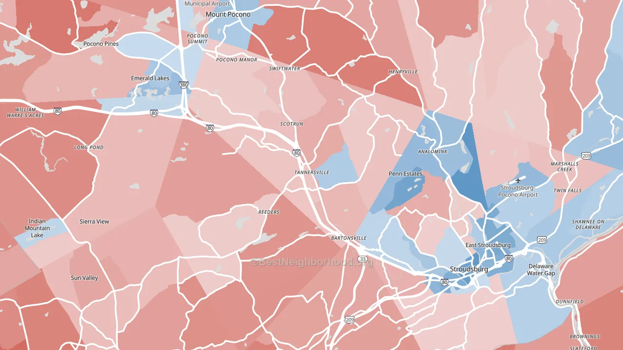
Monroe County is a true toss-up. About 50% of voters here vote Democratic and 50% Republican.
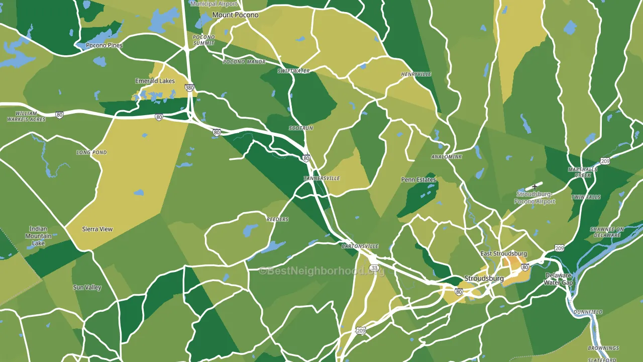
About 77% of adults in Monroe County typically vote, above the U.S. average of about 62%. Among adults in Monroe County, ~38% vote Democratic, ~39% Republican, and ~23% don't vote. The map below shows estimated turnout by block group.
How Monroe County compares
Among counties within 50 miles, Monroe County sits roughly in the middle of the political spectrum, with 4 neighbors leaning further in the place's direction and 8 leaning the other way.
Politically, Monroe County sits close to the rest of Pennsylvania.
Politics vary noticeably by city within Monroe County. The north side runs the most Democratic (D+21) and the southwest side runs the most Republican (R+27), a spread of about 48 points.
Why Monroe County leans the way it does
Density, race composition, education, and family structure all sit close to their national averages in Monroe County. The lean here lands roughly where demographic data alone would predict.
Preventive-care access and voter turnout
Places with strong routine preventive-care access tend to turn out at a higher rate; Monroe County, PA sits above the national average on this measure. Dental visits do not drive turnout; the rate reflects income, insurance, and healthcare access, which line up with who votes.
Why turnout in Monroe County looks the way it does
Homeowners vote more often than renters. About 80% of households in Monroe County own their home, about 5 points above the U.S. average of 75%. Learn more about the findings and methodology on the political spectrum map.
Nearby Counties
- Warren County, NJ R+16
- Northampton County, PA Even
- Carbon County, PA R+35
- Pike County, PA R+21
- Lehigh County, PA D+6
- Lackawanna County, PA Even
- Sussex County, NJ R+23
- Luzerne County, PA R+14
- Wayne County, PA R+36
- Hunterdon County, NJ R+6
Counties with Similar Populations
- Chittenden County, VT D+35
- Beaver County, PA R+19
- Pueblo County, CO Even
- Paulding County, GA R+20
- Greene County, OH R+17
- Aiken County, SC R+24
- Davidson County, NC R+36
- Kenton County, KY R+14
- Kenosha County, WI Even
- Wyandotte County, KS D+26
Sources and methodology
Precinct-level voting records used to fit the model come from Pennsylvania Department of State, Bureau of Elections, distributed by the Voting and Election Science Team. Demographic inputs come from the U.S. Census Bureau (ACS 5-year estimates and the 2020 Decennial Census). Health and environmental inputs come from the CDC (PLACES and the Environmental Justice Index). Land cover comes from the USGS and EPA. Election-day and lead-up weather come from PRISM 4km daily grids and the NOAA Global Historical Climatology Network. Mail-voting and election-administration patterns come from the MIT Election Lab's Survey of the Performance of American Elections. Block-group crime detail comes from CrimeGrade. Internet data and modeling support provided by ISPreports.org.
Modeling and analysis by the BestNeighborhood data science team. Full methodology and findings: political spectrum map.
Methodology reviewed by the BestNeighborhood data team. Last updated May 2026.