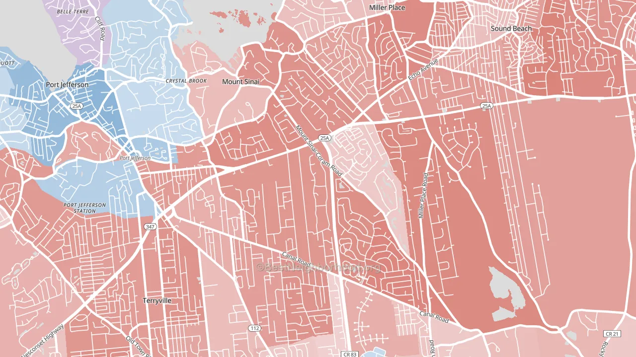
Mount Sinai leans Republican by roughly 24 points: about 38% of voters vote Democratic and 62% Republican.
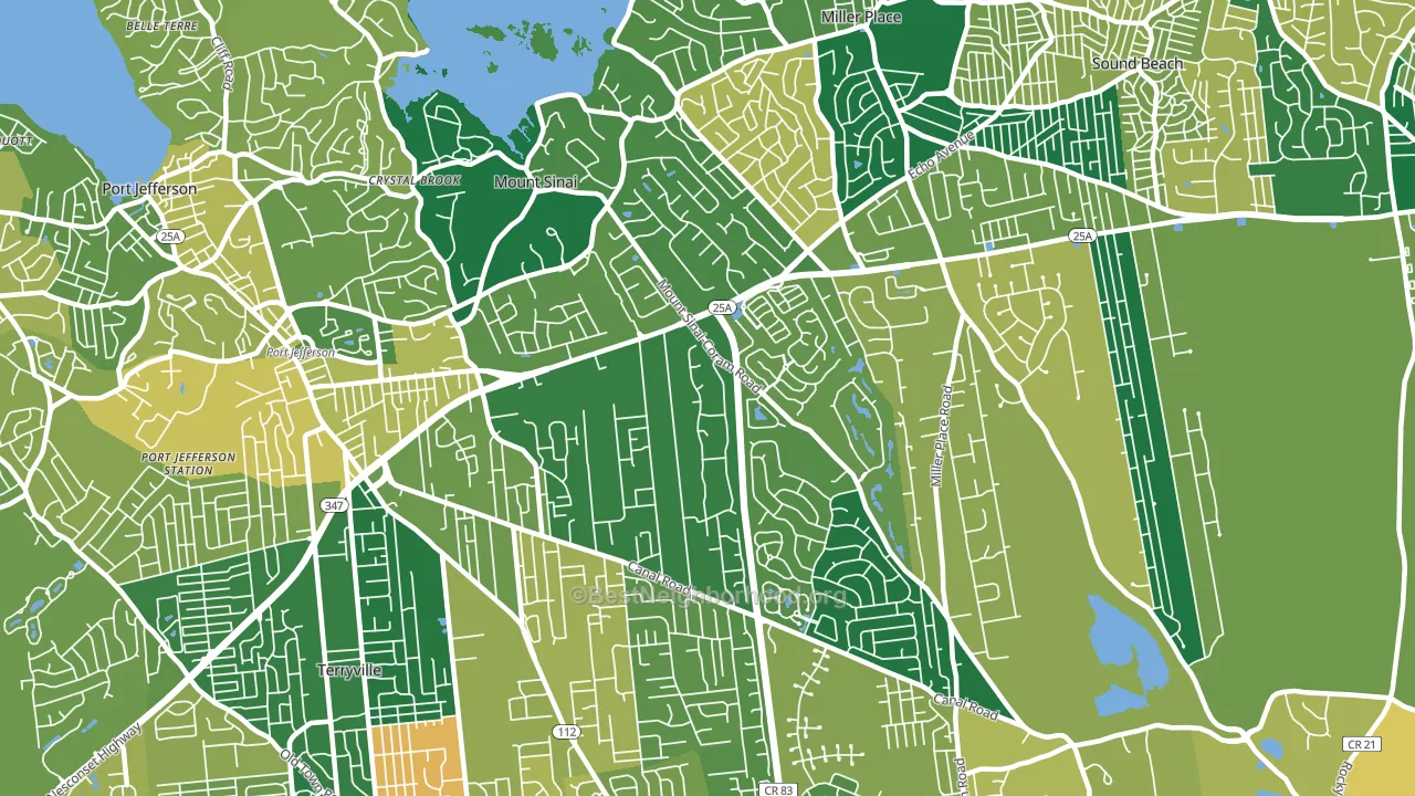
About 88% of adults in Mount Sinai typically vote, above the U.S. average of about 62%. Among adults in Mount Sinai, ~33% vote Democratic, ~55% Republican, and ~12% don't vote. The map below shows estimated turnout by block group.
How Mount Sinai compares
Among cities within 25 miles, Mount Sinai leans more Republican than 92 of 107 neighbors.
Mount Sinai runs about 37 points more Republican than New York as a whole. New York leans Democratic overall, while Mount Sinai is one of the few Republican-leaning pockets.
Politics vary noticeably by neighborhood within Mount Sinai. The southeast side is the most Republican-leaning (R+30) and the east side is the least Republican-leaning (R+12), a spread of about 18 points.
Why Mount Sinai leans the way it does
This analysis examined 14,881 data points per city to find what predicts political lean and turnout. The items below are a few correlations that stood out for Mount Sinai, not a ranked or complete list of what matters most.
Mount Sinai votes Republican even though it is densely developed (about 82%, far above the New York average of 36%). State and regional patterns outweigh the Democratic lean that density usually predicts here. A high family-household share predicts Republican voting, and about 81% of households in Mount Sinai are family households, above 92% of cities. Mount Sinai runs against the grain of New York, a Republican-leaning pocket in a Democratic-leaning state.
Cancer-screening access and voter turnout
Places with high colon-cancer-screening access tend to turn out at a higher rate; Mount Sinai, NY sits in the top tenth nationally on this measure. Cancer screening does not drive turnout; it reflects income, insurance, and healthcare access.
Why turnout in Mount Sinai looks the way it does
Areas with strong routine healthcare access turn out at higher rates. Mount Sinai is in the top quarter nationally for routine-care measures such as insurance coverage, preventive screenings, and dental visits. The dental-visit rate here is about 70%, about 10 points above the U.S. average of 60%. Homeowners vote more often than renters, and about 94% of households in Mount Sinai own their home, about 19 points above the U.S. average of 75%. Learn more about the findings and methodology on the political spectrum map.
Nearby Cities
- Miller Place, NY R+26
- Port Jefferson Station, NY R+15
- Port Jefferson, NY D+11
- Terryville, NY R+21
- Sound Beach, NY R+15
- Coram, NY Even
- Belle Terre, NY R+4
- Poquott, NY D+11
- Rocky Point, NY R+24
- Selden, NY R+20
Cities with Similar Populations
- Greatwood, TX R+20
- Burkburnett, TX R+56
- Dobbs Ferry, NY D+43
- Pacific, MO R+39
- Bishop, CA Even
- Stuarts Draft, VA R+46
- Largo, MD D+86
- Oxford, MA R+11
- Cheboygan, MI R+22
- Hailey, ID D+29
Sources and methodology
Precinct-level voting records used to fit the model come from New York State Board of Elections, distributed by the Voting and Election Science Team. Demographic inputs come from the U.S. Census Bureau (ACS 5-year estimates and the 2020 Decennial Census). Health and environmental inputs come from the CDC (PLACES and the Environmental Justice Index). Land cover comes from the USGS and EPA. Election-day and lead-up weather come from PRISM 4km daily grids and the NOAA Global Historical Climatology Network. Mail-voting and election-administration patterns come from the MIT Election Lab's Survey of the Performance of American Elections. Block-group crime detail comes from CrimeGrade. Internet data and modeling support provided by ISPreports.org.
Modeling and analysis by the BestNeighborhood data science team. Full methodology and findings: political spectrum map.
Methodology reviewed by the BestNeighborhood data team. Last updated May 2026.