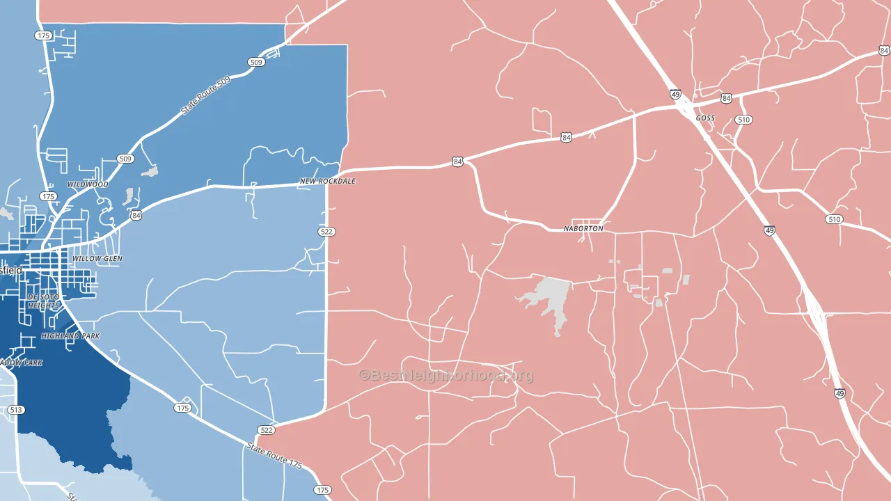
Naborton is a true toss-up. About 50% of voters here vote Democratic and 50% Republican.
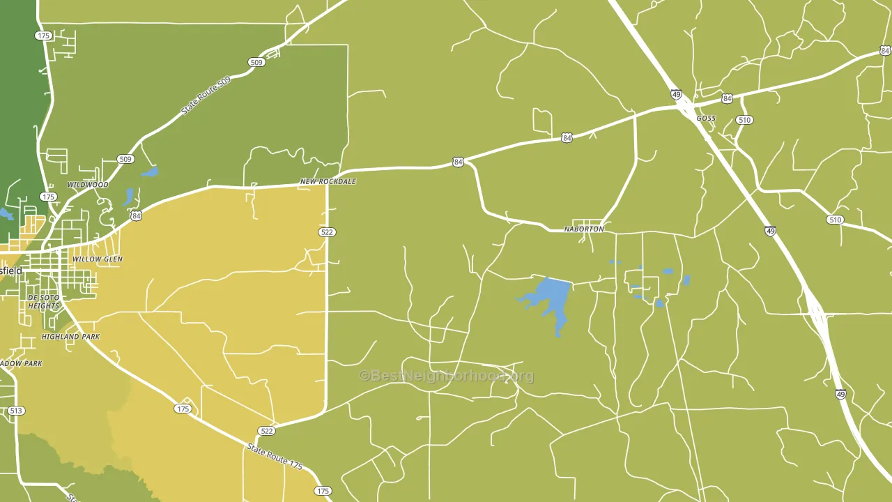
About 61% of adults in Naborton typically vote, near the U.S. average of about 62%. Among adults in Naborton, ~30% vote Democratic, ~31% Republican, and ~39% don't vote. The map below shows estimated turnout by block group.
How Naborton compares
Among cities within 25 miles, Naborton sits roughly in the middle of the political spectrum, with 42 neighbors leaning further in the place's direction and 9 leaning the other way.
Naborton runs about 22 points more Democratic than Louisiana as a whole. Louisiana leans Republican overall, while Naborton sits closer to the political middle.
Politics vary noticeably by neighborhood within Naborton. The west side runs the most Democratic (D+14) and the southwest side runs the most Republican (R+7), a spread of about 21 points.
Why Naborton leans the way it does
This analysis examined 14,881 data points per city to find what predicts political lean and turnout. The items below are a few correlations that stood out for Naborton, not a ranked or complete list of what matters most.
Naborton votes against the grain of Louisiana. Louisiana leans Republican overall, while Naborton runs about 22 points more Democratic.
Frequent mental distress and voter turnout
Places with a high frequent-mental-distress rate tend to turn out at a lower rate; Naborton, LA sits in the top tenth nationally on this measure. Reported mental distress does not drive turnout; it reflects economic and health conditions tied to voting.
Why turnout in Naborton looks the way it does
Areas with high food insecurity turn out at lower rates. About 34% of adults in Naborton report food insecurity, about 17 points above the U.S. average of 16%. Learn more about the findings and methodology on the political spectrum map.
Nearby Cities
- Carmel, LA R+2
- Mansfield, LA D+44
- South Mansfield, LA D+39
- Wemple, LA Even
- Grand Bayou, LA D+21
- Holly, LA R+14
- Pelican, LA R+19
- Kingston, LA R+21
- Catuna, LA R+52
Cities with Similar Populations
- Mount Lebanon, LA D+12
- Lyford, IN R+60
- West Franklin, IN R+40
- Sarles, ND R+48
- Helmer, ID R+54
- New Era, WV R+64
Sources and methodology
Precinct-level voting records used to fit the model come from Louisiana Secretary of State, Elections, distributed by the Voting and Election Science Team. Demographic inputs come from the U.S. Census Bureau (ACS 5-year estimates and the 2020 Decennial Census). Health and environmental inputs come from the CDC (PLACES and the Environmental Justice Index). Land cover comes from the USGS and EPA. Election-day and lead-up weather come from PRISM 4km daily grids and the NOAA Global Historical Climatology Network. Mail-voting and election-administration patterns come from the MIT Election Lab's Survey of the Performance of American Elections. Block-group crime detail comes from CrimeGrade. Internet data and modeling support provided by ISPreports.org.
Modeling and analysis by the BestNeighborhood data science team. Full methodology and findings: political spectrum map.
Methodology reviewed by the BestNeighborhood data team. Last updated May 2026.