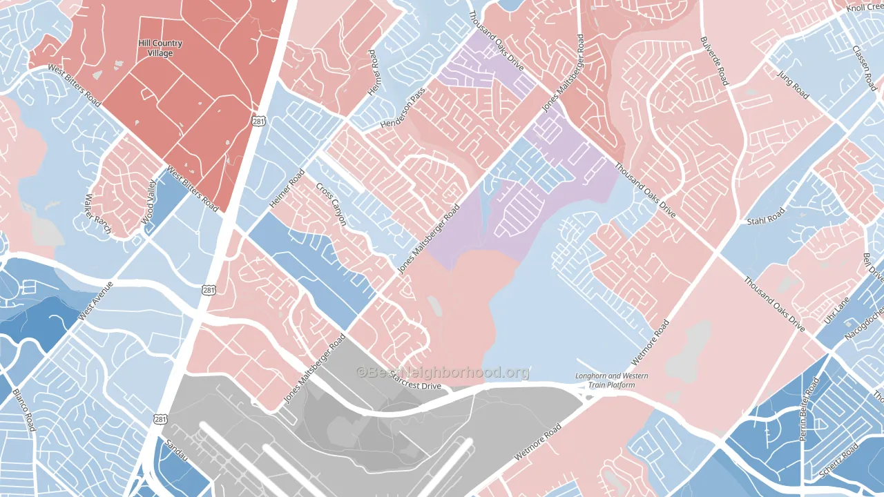
North Central Heritage is a true toss-up. About 50% of voters here vote Democratic and 50% Republican.
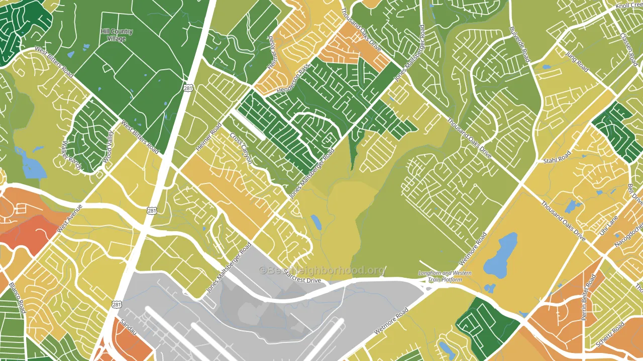
About 69% of adults in North Central Heritage typically vote, above the U.S. average of about 62%. Among adults in North Central Heritage, ~34% vote Democratic, ~35% Republican, and ~31% don't vote. The map below shows estimated turnout by block group.
How North Central Heritage compares
Among neighborhoods within 5 miles, North Central Heritage sits roughly in the middle of the political spectrum, with 15 neighbors leaning further in the place's direction and 4 leaning the other way.
North Central Heritage runs about 14 points more Democratic than Texas as a whole.
Why North Central Heritage leans the way it does
Density, race composition, education, and family structure all sit close to their national averages in North Central Heritage. The lean here lands roughly where demographic data alone would predict.
High-school completion, developed land, and voter turnout
Places that combine high-school-completion-heavy adults and a rural land-use pattern tend to turn out at a higher rate, as North Central Heritage, San Antonio, TX does.
Why turnout in North Central Heritage looks the way it does
Turnout in North Central Heritage sits close to the national pattern. Routine healthcare access, homeownership, education, and food security all land near their national averages here. Learn more about the findings and methodology on the political spectrum map.
Nearby Neighborhoods
- North Central Thousand Oaks, San Antonio, TX Even
- Thousand Oaks, San Antonio, TX D+6
- Oak Haven Heights, San Antonio, TX D+4
- Northern Hills, San Antonio, TX D+3
- The Hills of Park North, San Antonio, TX D+15
- Greater Harmony Hills, San Antonio, TX D+14
- Vista del Norte, San Antonio, TX D+4
- Mission Ridge, San Antonio, TX R+8
- Oakwell Farms, San Antonio, TX D+18
- Oak Park-Northwood, San Antonio, TX D+8
Neighborhoods with Similar Populations
- Wildwood Park, San Bernardino, CA D+14
- Villages at Rancho El Dorado, Silver Bell, AZ R+7
- Adams Hill, Glendale, CA D+25
- South Seminole Heights, Tampa, FL D+32
- West Market Square Historic District, Bangor, ME D+30
- Lakewood, Jacksonville, FL R+12
- Pleasant Run Farm, Cincinnati, OH D+33
- Lindsay Park, Milwaukee, WI D+69
- Geist, Indianapolis, IN Even
- Farm Hills, Redwood City, CA D+59
Sources and methodology
Precinct-level voting records used to fit the model come from Texas Secretary of State, Elections Division, distributed by the Voting and Election Science Team. Demographic inputs come from the U.S. Census Bureau (ACS 5-year estimates and the 2020 Decennial Census). Health and environmental inputs come from the CDC (PLACES and the Environmental Justice Index). Land cover comes from the USGS and EPA. Election-day and lead-up weather come from PRISM 4km daily grids and the NOAA Global Historical Climatology Network. Mail-voting and election-administration patterns come from the MIT Election Lab's Survey of the Performance of American Elections. Block-group crime detail comes from CrimeGrade. Internet data and modeling support provided by ISPreports.org.
Modeling and analysis by the BestNeighborhood data science team. Full methodology and findings: political spectrum map.
Methodology reviewed by the BestNeighborhood data team. Last updated May 2026.