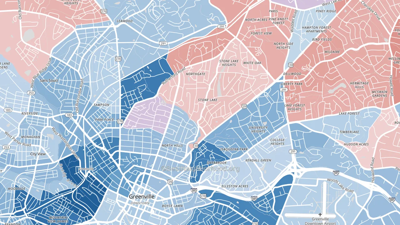
North Main leans slightly Democratic by roughly 6 points: about 53% of voters vote Democratic and 47% Republican.
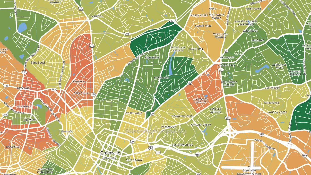
About 74% of adults in North Main typically vote, above the U.S. average of about 62%. Among adults in North Main, ~39% vote Democratic, ~35% Republican, and ~26% don't vote. The map below shows estimated turnout by block group.
How North Main compares
Among neighborhoods within 5 miles, North Main leans more Democratic than 2 of 5 neighbors.
North Main runs about 23 points more Democratic than South Carolina as a whole. South Carolina leans Republican overall, while North Main is one of the few Democratic-leaning pockets.
Politics vary noticeably by block within North Main. The southwest side runs the most Democratic (D+16) and the northeast side runs the most Republican (R+3), a spread of about 19 points.
Why North Main leans the way it does
This analysis examined 14,881 data points per neighborhood to find what predicts political lean and turnout. The items below are a few correlations that stood out for North Main, not a ranked or complete list of what matters most.
Areas with high college attainment vote Democratic. About 66% of adults in North Main hold a bachelor's degree, about 38 points above the U.S. average of 28%. North Main runs against the grain of South Carolina, a Democratic-leaning pocket in a Republican-leaning state.
Park access and Democratic lean
Places with heavy park coverage tend to lean Democratic; North Main, Greenville, SC sits in the top quarter nationally on this measure. Park access does not change how people vote; it tends to track denser, higher-income areas.
Why turnout in North Main looks the way it does
Areas with strong routine healthcare access turn out at higher rates. North Main is in the top quarter nationally for routine-care measures such as insurance coverage, preventive screenings, and dental visits. The dental-visit rate here is about 73%, about 13 points above the U.S. average of 60%. Learn more about the findings and methodology on the political spectrum map.
Nearby Neighborhoods
- Nicholtown, Greenville, SC D+64
- West End, Greenville, SC D+35
- Woodside Cotton Mill Historic District, Parker, SC D+36
- Augusta Street Area, Greenville, SC R+4
- Mayfair Estates, Taylors, SC R+18
- Oakley, Asheville, NC D+38
- Historic Montford, Asheville, NC D+72
- Steele Creek, Charlotte, NC D+44
- Yorkshire, Charlotte, NC D+29
- Harbor House, Charlotte, NC D+36
Neighborhoods with Similar Populations
- West Minnehaha, Vancouver, WA D+18
- Bowdoin Apartments, Malden, MA D+37
- Ball Square, Somerville, MA D+70
- West End, Cincinnati, OH D+75
- Northside, Fort Wayne, IN D+17
- Westwood Community-North, Tamarac, FL D+18
- North Avondale, Cincinnati, OH D+81
- The Avenues, York, PA D+30
- West Memorial, Katy, TX R+16
- Milton Upper Mills, Milton, MA D+67
Sources and methodology
Precinct-level voting records used to fit the model come from South Carolina State Election Commission, distributed by the Voting and Election Science Team. Demographic inputs come from the U.S. Census Bureau (ACS 5-year estimates and the 2020 Decennial Census). Health and environmental inputs come from the CDC (PLACES and the Environmental Justice Index). Land cover comes from the USGS and EPA. Election-day and lead-up weather come from PRISM 4km daily grids and the NOAA Global Historical Climatology Network. Mail-voting and election-administration patterns come from the MIT Election Lab's Survey of the Performance of American Elections. Block-group crime detail comes from CrimeGrade. Internet data and modeling support provided by ISPreports.org.
Modeling and analysis by the BestNeighborhood data science team. Full methodology and findings: political spectrum map.
Methodology reviewed by the BestNeighborhood data team. Last updated May 2026.