Steele Creek leans heavily Democratic by roughly 44 points: about 72% of voters vote Democratic and 28% Republican.
[sc name="abovemapcta"]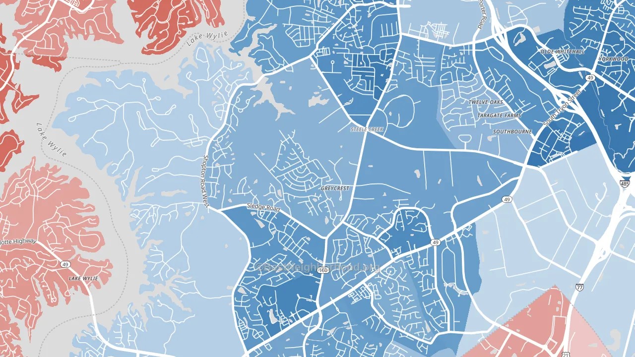 [bestneighborhood_map_controls]
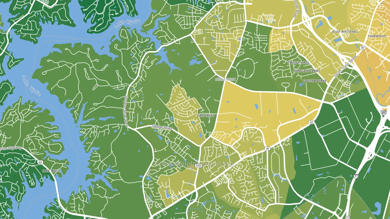
About 67% of adults in Steele Creek typically vote, near the U.S. average of about 62%. Among adults in Steele Creek, ~48% vote Democratic, ~19% Republican, and ~33% don't vote. The map below shows estimated turnout by block group.
 [bestneighborhood_map_controls]
How Steele Creek compares
Among neighborhoods within 5 miles, Steele Creek leans more Democratic than 4 of 6 neighbors.
Steele Creek runs about 47 points more Democratic than North Carolina as a whole. North Carolina leans Republican overall, while Steele Creek is one of the few Democratic-leaning pockets.
Politics vary noticeably by block within Steele Creek. The south side is the most Democratic-leaning (D+57) and the west side is the least Democratic-leaning (D+23), a spread of about 33 points.
Why Steele Creek leans the way it does
This analysis examined 14,881 data points per neighborhood to find what predicts political lean and turnout. The items below are a few correlations that stood out for Steele Creek, not a ranked or complete list of what matters most.
Steele Creek votes against the grain of North Carolina. North Carolina leans Republican overall, while Steele Creek runs about 47 points more Democratic.
Walkability and Republican lean
Places with a low walkability score tend to lean Republican; Steele Creek, Charlotte, NC sits in the bottom quarter nationally on this measure. A walkable street grid does not change how people vote; it mostly reflects how urban a place is.
Why turnout in Steele Creek looks the way it does
Turnout in Steele Creek sits close to the national pattern. Routine healthcare access, homeownership, education, and food security all land near their national averages here. Learn more about the findings and methodology on the political spectrum map.
[one_half]Nearby Neighborhoods
- Harbor House, Charlotte, NC D+36
- Yorkshire, Charlotte, NC D+29
- Griers Fork, Charlotte, NC D+28
- Westinghouse, Charlotte, NC D+51
- Olde Whitehall, Charlotte, NC D+43
- Yorkmount, Charlotte, NC D+47
- Eagle Lake, Charlotte, NC D+39
- Montclaire South, Charlotte, NC D+52
- Sterling, Charlotte, NC D+48
- Starmount Forest-Charlotte, Charlotte, NC D+40
Neighborhoods with Similar Populations
- Center Hill, Atlanta, GA D+87
- East Forest Park, Springfield, MA D+22
- Elmwood, Providence, RI D+39
- Reservoir Hill-Bolton Hill, Baltimore, MD D+82
- Vista Creek, Perris, CA D+22
- Aurora Highlands, Aurora, CO D+28
- Sherwood-Tualatin North, Sherwood, OR D+23
- Madisonville, Cincinnati, OH D+46
- Palm Heights, San Antonio, TX D+33
- Vineyard-Los Angeles, Glendale, CA D+18
Sources and methodology
Precinct-level voting records used to fit the model come from North Carolina State Board of Elections, distributed by the Voting and Election Science Team. Demographic inputs come from the U.S. Census Bureau (ACS 5-year estimates and the 2020 Decennial Census). Health and environmental inputs come from the CDC (PLACES and the Environmental Justice Index). Land cover comes from the USGS and EPA. Election-day and lead-up weather come from PRISM 4km daily grids and the NOAA Global Historical Climatology Network. Mail-voting and election-administration patterns come from the MIT Election Lab's Survey of the Performance of American Elections. Block-group crime detail comes from CrimeGrade. Internet data and modeling support provided by ISPreports.org.
Modeling and analysis by the BestNeighborhood data science team. Full methodology and findings: political spectrum map.
Methodology reviewed by the BestNeighborhood data team. Last updated May 2026.