North Patchogue leans Republican by roughly 20 points: about 40% of voters vote Democratic and 60% Republican.
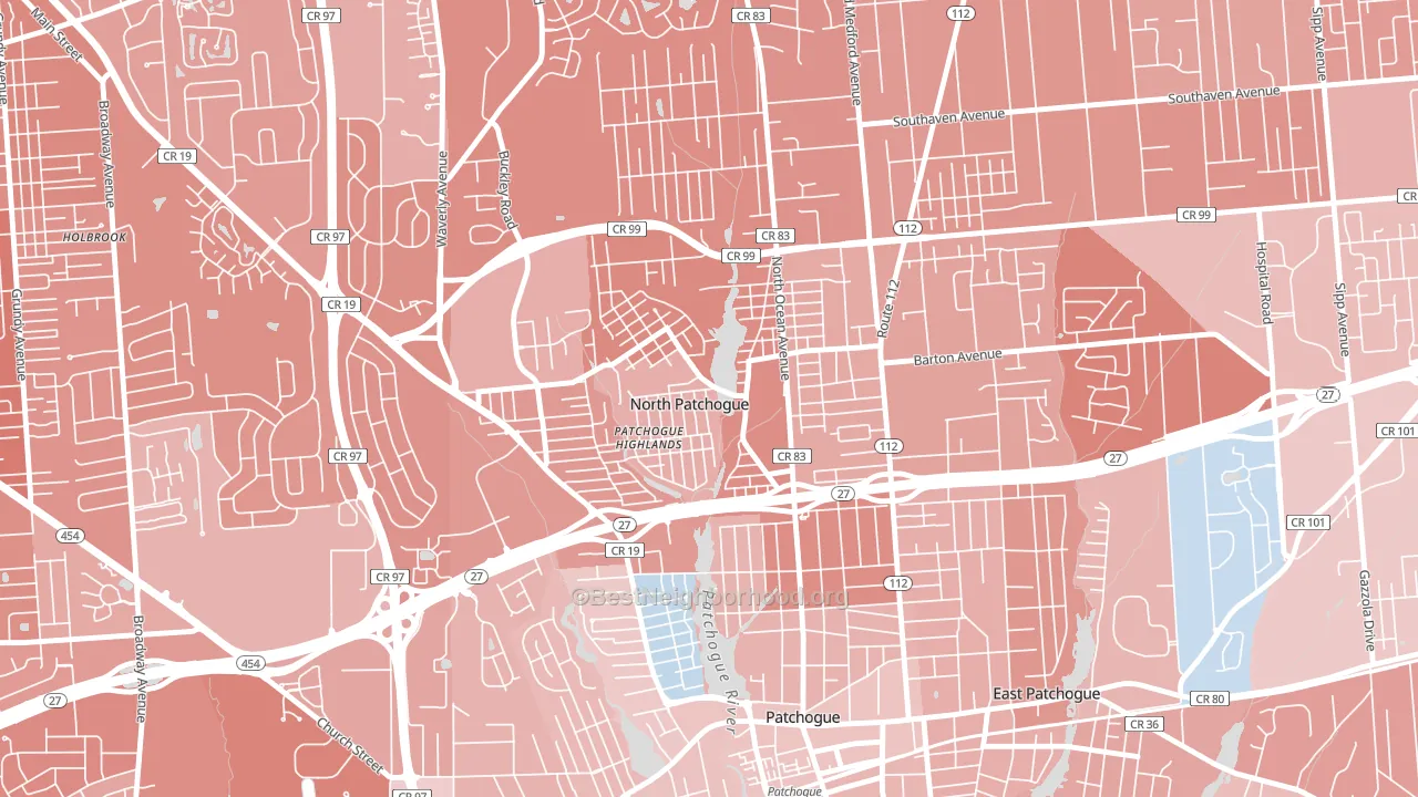
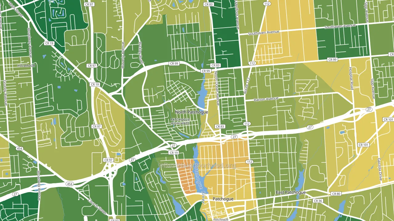
About 72% of adults in North Patchogue typically vote, above the U.S. average of about 62%. Among adults in North Patchogue, ~29% vote Democratic, ~43% Republican, and ~28% don't vote. The map below shows estimated turnout by block group.
How North Patchogue compares
Among cities within 25 miles, North Patchogue leans more Republican than 83 of 123 neighbors.
North Patchogue runs about 32 points more Republican than New York as a whole. New York leans Democratic overall, while North Patchogue is one of the few Republican-leaning pockets.
Why North Patchogue leans the way it does
This analysis examined 14,881 data points per city to find what predicts political lean and turnout. The items below are a few correlations that stood out for North Patchogue, not a ranked or complete list of what matters most.
North Patchogue votes Republican even though it is densely developed (about 95%, far above the New York average of 36%). State and regional patterns outweigh the Democratic lean that density usually predicts here. North Patchogue runs against the grain of New York, a Republican-leaning pocket in a Democratic-leaning state.
Population density and Democratic lean
Places with high population density tend to lean Democratic; North Patchogue, NY sits in the top tenth nationally on this measure.
Why turnout in North Patchogue looks the way it does
Homeowners vote more often than renters. About 91% of households in North Patchogue own their home, about 14 points above the New York average of 76%. Learn more about the findings and methodology on the political spectrum map.
Nearby Cities
- Patchogue, NY R+2
- Holtsville, NY R+28
- East Patchogue, NY R+13
- Blue Point, NY R+13
- Holbrook, NY R+26
- Bayport, NY R+19
- Medford, NY R+10
- North Bellport, NY D+17
- Farmingville, NY R+24
- Sayville, NY R+18
Cities with Similar Populations
- Ridgeville, SC R+20
- Walls, MS D+7
- Oneida, TN R+70
- Seymour, MO R+71
- Ebensburg, PA R+38
- Fair Plain, MI D+41
- Kalkaska, MI R+39
- Sunset, LA R+24
- Byron, IL R+26
- Berryville, VA R+17
Sources and methodology
Precinct-level voting records used to fit the model come from New York State Board of Elections, distributed by the Voting and Election Science Team. Demographic inputs come from the U.S. Census Bureau (ACS 5-year estimates and the 2020 Decennial Census). Health and environmental inputs come from the CDC (PLACES and the Environmental Justice Index). Land cover comes from the USGS and EPA. Election-day and lead-up weather come from PRISM 4km daily grids and the NOAA Global Historical Climatology Network. Mail-voting and election-administration patterns come from the MIT Election Lab's Survey of the Performance of American Elections. Block-group crime detail comes from CrimeGrade. Internet data and modeling support provided by ISPreports.org.
Modeling and analysis by the BestNeighborhood data science team. Full methodology and findings: political spectrum map.
Methodology reviewed by the BestNeighborhood data team. Last updated May 2026.