North San Jose leans heavily Democratic by roughly 40 points: about 70% of voters vote Democratic and 30% Republican.
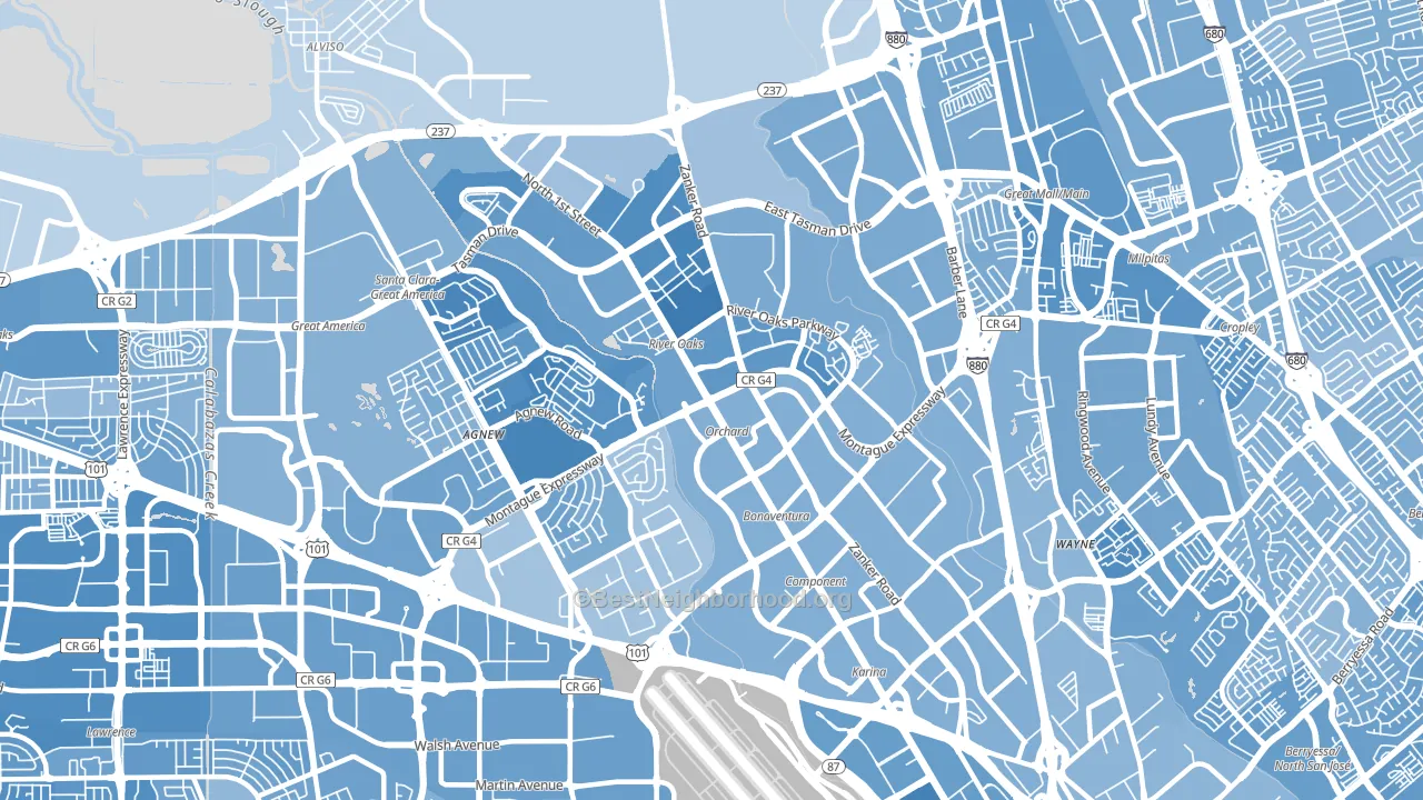
About 41% of adults in North San Jose typically vote, below the U.S. average of about 62%. Among adults in North San Jose, ~29% vote Democratic, ~12% Republican, and ~59% don't vote. The map below shows estimated turnout by block group.
How North San Jose compares
Among neighborhoods within 5 miles, North San Jose leans more Democratic than 6 of 9 neighbors.
North San Jose runs about 20 points more Democratic than California as a whole.
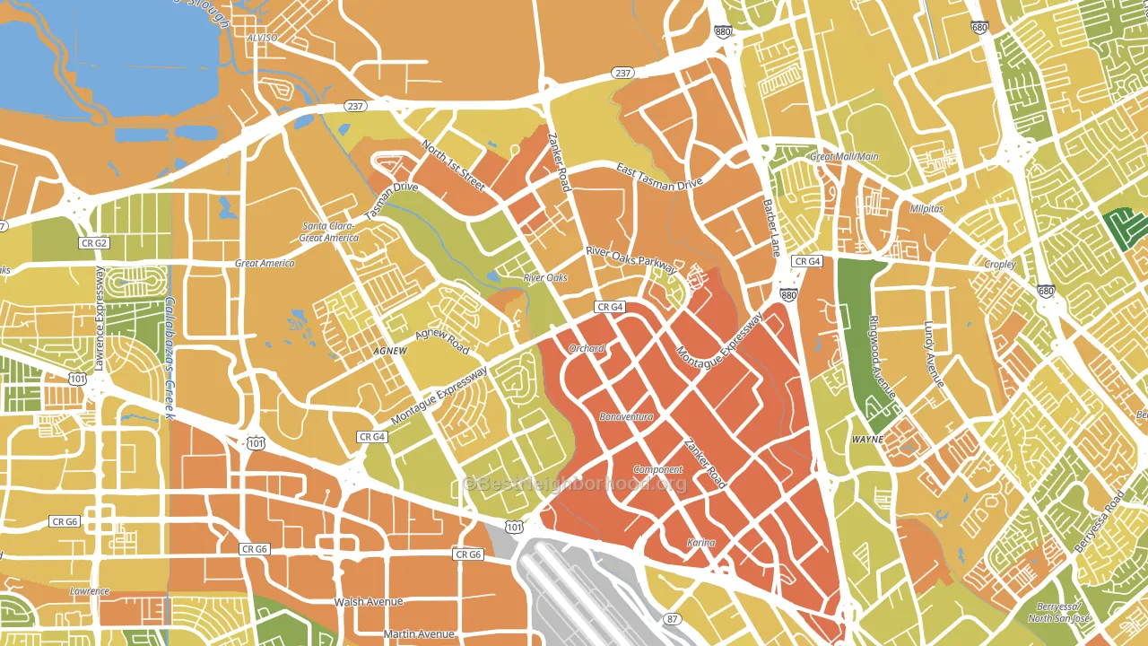
Politics vary noticeably by block within North San Jose. The southwest side is the most Democratic-leaning (D+61) and the northeast side is the least Democratic-leaning (D+29), a spread of about 32 points.
Why North San Jose leans the way it does
This analysis examined 14,881 data points per neighborhood to find what predicts political lean and turnout. The items below are a few correlations that stood out for North San Jose, not a ranked or complete list of what matters most.
Areas with high college attainment vote Democratic. About 73% of adults in North San Jose hold a bachelor's degree, about 45 points above the U.S. average of 28%.
Population density and Democratic lean
Places with high population density tend to lean Democratic; North San Jose, San Jose, CA sits in the top tenth nationally on this measure.
Why turnout in North San Jose looks the way it does
Renters vote less often than owners. About 79% of households in North San Jose rent, about 54 points above the U.S. average of 25%. Crowded housing lines up with lower turnout, and about 9% of homes in North San Jose have more than one occupant per room, above 88% of neighborhoods. Learn more about the findings and methodology on the political spectrum map.
Nearby Neighborhoods
- Lakewood, Sunnyvale, CA D+30
- North Valley, San Jose, CA D+27
- San Miguel, Sunnyvale, CA D+35
- Berryessa, San Jose, CA D+22
- Snail, Sunnyvale, CA D+33
- Rose Garden, San Jose, CA D+46
- Ponderosa Park, Sunnyvale, CA D+34
- Downtown San Jose, San Jose, CA D+47
- Lowlanders, Sunnyvale, CA D+42
- Burbank, San Jose, CA D+41
Neighborhoods with Similar Populations
- West Flagler, Miami, FL R+33
- Kings Bridge, Bronx, NY D+31
- River Oaks, Houston, TX D+11
- South Reno, Reno, NV D+3
- Wolf Creek, Dallas, TX D+72
- Highlands-Perkins, Baton Rouge, LA D+22
- Ocean Hill, Brooklyn, NY D+79
- Charlotte Gardens, Bronx, NY D+50
- South Lawndale, Chicago, IL D+41
- Berclair-Highland Heights, Memphis, TN D+23
Sources and methodology
Precinct-level voting records used to fit the model come from California Secretary of State, Elections, distributed by the Voting and Election Science Team. Demographic inputs come from the U.S. Census Bureau (ACS 5-year estimates and the 2020 Decennial Census). Health and environmental inputs come from the CDC (PLACES and the Environmental Justice Index). Land cover comes from the USGS and EPA. Election-day and lead-up weather come from PRISM 4km daily grids and the NOAA Global Historical Climatology Network. Mail-voting and election-administration patterns come from the MIT Election Lab's Survey of the Performance of American Elections. Block-group crime detail comes from CrimeGrade. Internet data and modeling support provided by ISPreports.org.
Modeling and analysis by the BestNeighborhood data science team. Full methodology and findings: political spectrum map.
Methodology reviewed by the BestNeighborhood data team. Last updated May 2026.