Park is a Democratic stronghold. About 90% of voters here vote Democratic and 10% Republican.
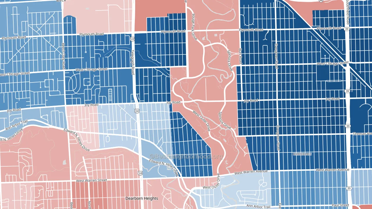
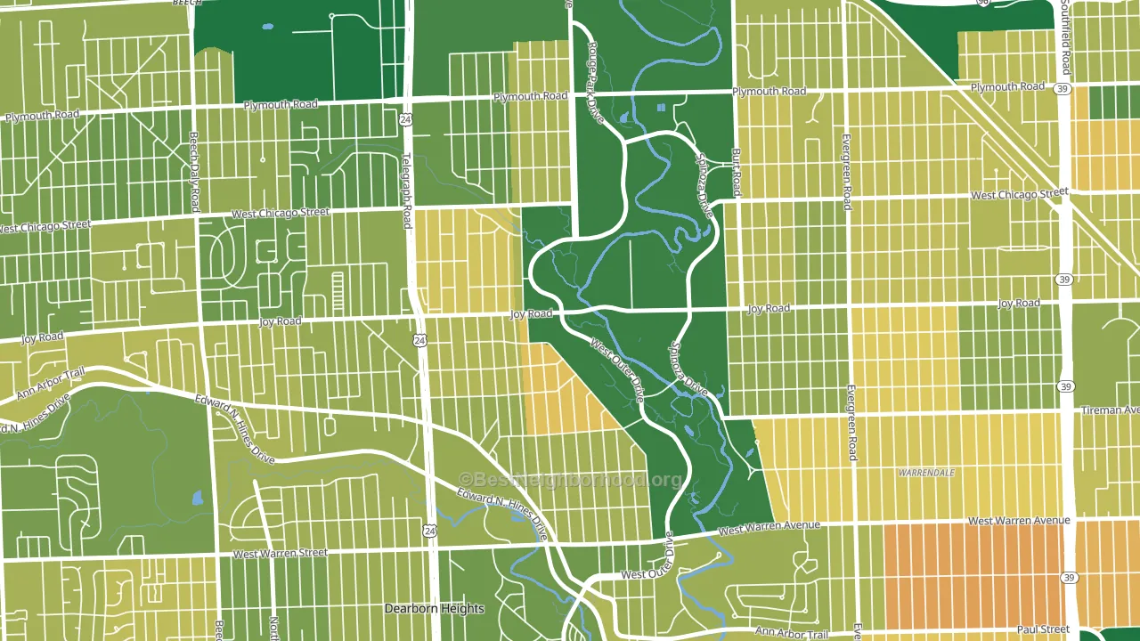
About 61% of adults in Park typically vote, near the U.S. average of about 62%. Among adults in Park, ~55% vote Democratic, ~6% Republican, and ~39% don't vote. The map below shows estimated turnout by block group.
How Park compares
Among neighborhoods within 5 miles, Park leans more Democratic than 6 of 22 neighbors.
Park runs about 80 points more Democratic than Michigan as a whole. Michigan is roughly evenly split, and Park sits clearly on the Democratic side.
Politics vary noticeably by block within Park. The north side is the most Democratic-leaning (D+87) and the southeast side is the least Democratic-leaning (D+72), a spread of about 15 points.
Why Park leans the way it does
This analysis examined 14,881 data points per neighborhood to find what predicts political lean and turnout. The items below are a few correlations that stood out for Park, not a ranked or complete list of what matters most.
Density combined with diversity predicts Democratic voting. Non-Hispanic white share in Park is about 21%, about 52 points below the U.S. average of 72%. A high never-married share predicts Democratic voting, and about 61% of adults in Park have never been married, above 93% of neighborhoods. Park runs against the grain of Michigan, a Democratic-leaning outlier in a roughly evenly split state.
Never-married share, developed land, and voter turnout
Places that combine a never-married-heavy adult population and a heavily developed built environment tend to turn out at a lower rate, as Park, Redford, MI does.
Why turnout in Park looks the way it does
Areas with high food insecurity turn out at lower rates. About 34% of adults in Park report food insecurity, about 18 points above the U.S. average of 16%. Learn more about the findings and methodology on the political spectrum map.
Nearby Neighborhoods
- Weatherby, Detroit, MI D+86
- Franklin Park, Detroit, MI D+87
- Castle Rouge, Detroit, MI D+82
- Warrendale, Detroit, MI D+61
- Garden View, Detroit, MI D+80
- Brightmoor, Detroit, MI D+82
- Grandale, Detroit, MI D+86
- Dearborn Hills, Dearborn, MI Even
- Rosedale Park, Detroit, MI D+88
- Schoolcraft Southfield, Detroit, MI D+88
Neighborhoods with Similar Populations
- Jefferson, Culver City, CA D+59
- Willow Creek, Kansas City, MO D+55
- Fairwood and Robandee, Kansas City, MO D+55
- Holly Hills, St. Louis, MO D+40
- Braun Station West, San Antonio, TX R+4
- Old Town Florissant, Florissant, MO D+30
- Wellington, Manassas, VA D+13
- Southwood, Richmond, VA D+37
- West Central, Fort Wayne, IN D+31
- Millview East, San Marcos, TX D+33
Sources and methodology
Precinct-level voting records used to fit the model come from Michigan Department of State, Elections, distributed by the Voting and Election Science Team. Demographic inputs come from the U.S. Census Bureau (ACS 5-year estimates and the 2020 Decennial Census). Health and environmental inputs come from the CDC (PLACES and the Environmental Justice Index). Land cover comes from the USGS and EPA. Election-day and lead-up weather come from PRISM 4km daily grids and the NOAA Global Historical Climatology Network. Mail-voting and election-administration patterns come from the MIT Election Lab's Survey of the Performance of American Elections. Block-group crime detail comes from CrimeGrade. Internet data and modeling support provided by ISPreports.org.
Modeling and analysis by the BestNeighborhood data science team. Full methodology and findings: political spectrum map.
Methodology reviewed by the BestNeighborhood data team. Last updated May 2026.