Piety Corner leans heavily Democratic by roughly 36 points: about 68% of voters vote Democratic and 32% Republican.
[sc name="abovemapcta"]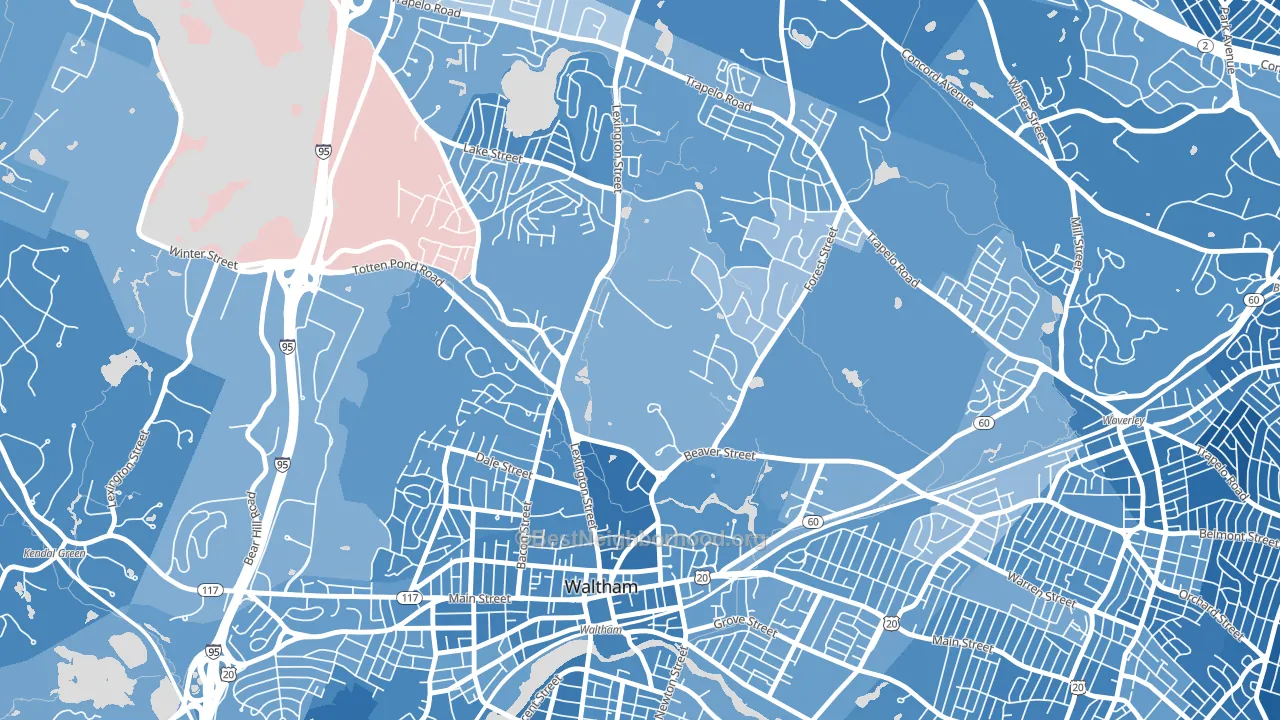 [bestneighborhood_map_controls]
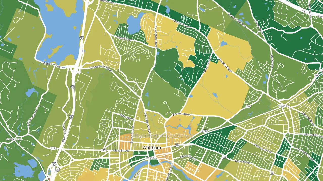
About 56% of adults in Piety Corner typically vote, below the U.S. average of about 62%. Among adults in Piety Corner, ~38% vote Democratic, ~18% Republican, and ~44% don't vote. The map below shows estimated turnout by block group.
 [bestneighborhood_map_controls]
How Piety Corner compares
Among neighborhoods within 5 miles, Piety Corner leans more Democratic than 2 of 21 neighbors.
Piety Corner runs about 12 points more Democratic than Massachusetts as a whole.
Politics vary noticeably by block within Piety Corner. The south side is the most Democratic-leaning (D+47) and the west side is the least Democratic-leaning (D+16), a spread of about 32 points.
Why Piety Corner leans the way it does
This analysis examined 14,881 data points per neighborhood to find what predicts political lean and turnout. The items below are a few correlations that stood out for Piety Corner, not a ranked or complete list of what matters most.
Areas with high college attainment vote Democratic. About 56% of adults in Piety Corner hold a bachelor's degree, about 28 points above the U.S. average of 28%. A high never-married share predicts Democratic voting, and about 57% of adults in Piety Corner have never been married, above 90% of neighborhoods.
Population density and Democratic lean
Places with high population density tend to lean Democratic; Piety Corner, Waltham, MA sits above the national average on this measure.
Why turnout in Piety Corner looks the way it does
Crowded housing lines up with lower turnout. About 6% of homes in Piety Corner have more than one occupant per room, above 82% of neighborhoods. Learn more about the findings and methodology on the political spectrum map.
[one_half]Nearby Neighborhoods
- The Lanes, Waltham, MA D+29
- North Waltham, Waltham, MA D+33
- Waltham Highlands, Waltham, MA D+43
- Lakeview, Waltham, MA D+41
- Bleachery, Waltham, MA D+42
- Bank Square, Waltham, MA D+50
- Warrendale, Waltham, MA D+38
- South Side, Waltham, MA D+59
- Bemis, Watertown Town, MA D+50
- Waverley Square, Belmont, MA D+62
Neighborhoods with Similar Populations
- Victorian Village, Columbus, OH D+60
- Downtown Newport News, Newport News, VA D+45
- North Redmond, Redmond, WA D+42
- Cushing Square, Belmont, MA D+67
- Rosedale, Kansas City, KS D+38
- Nobility Hill Historic District, Stoneham, MA D+27
- El Dorado Park, Long Beach, CA D+23
- Sandin Hills, San Bernardino, CA D+15
- Bridlemile, Portland, OR D+61
- Grant, Salem, OR D+35
Sources and methodology
Precinct-level voting records used to fit the model come from Massachusetts Secretary of the Commonwealth, Elections, distributed by the Voting and Election Science Team. Demographic inputs come from the U.S. Census Bureau (ACS 5-year estimates and the 2020 Decennial Census). Health and environmental inputs come from the CDC (PLACES and the Environmental Justice Index). Land cover comes from the USGS and EPA. Election-day and lead-up weather come from PRISM 4km daily grids and the NOAA Global Historical Climatology Network. Mail-voting and election-administration patterns come from the MIT Election Lab's Survey of the Performance of American Elections. Block-group crime detail comes from CrimeGrade. Internet data and modeling support provided by ISPreports.org.
Modeling and analysis by the BestNeighborhood data science team. Full methodology and findings: political spectrum map.
Methodology reviewed by the BestNeighborhood data team. Last updated May 2026.