Pike County leans Republican by roughly 16 points: about 42% of voters vote Democratic and 58% Republican.
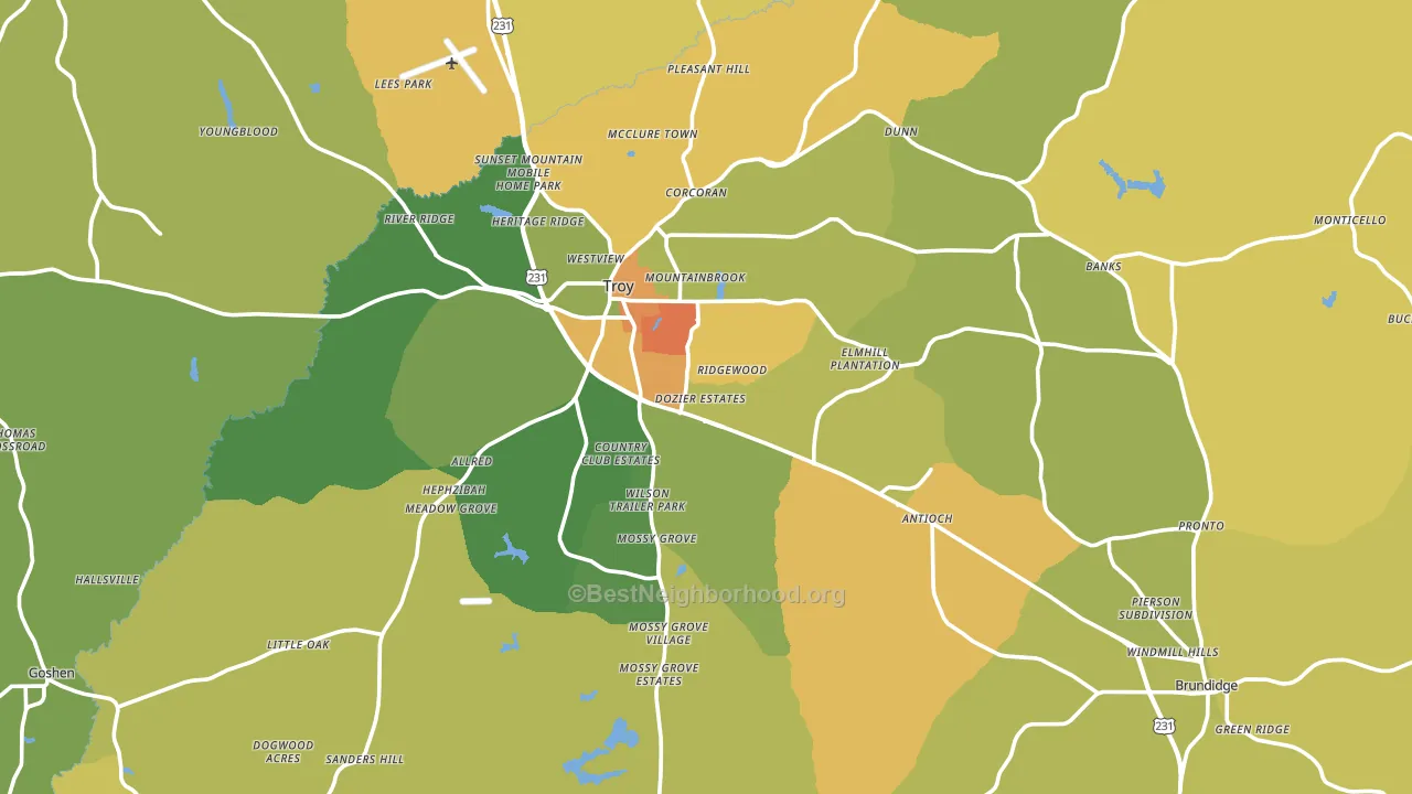
About 58% of adults in Pike County typically vote, near the U.S. average of about 62%. Among adults in Pike County, ~24% vote Democratic, ~34% Republican, and ~42% don't vote. The map below shows estimated turnout by block group.
How Pike County compares
Among counties within 50 miles, Pike County leans more Republican than 6 of 12 neighbors.
Pike County runs about 14 points more Democratic than Alabama as a whole.
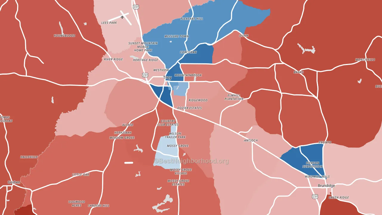
Politics vary noticeably by city within Pike County. The north side runs the most Democratic (D+18) and the southwest side runs the most Republican (R+61), a spread of about 79 points.
Why Pike County leans the way it does
This analysis examined 14,881 data points per county to find what predicts political lean and turnout. The items below are a few correlations that stood out for Pike County, not a ranked or complete list of what matters most.
Car-dependent areas vote Republican. About 85% of residents in Pike County drive to work alone, about 11 points above the U.S. average of 74%.
Park access and Republican lean
Places with low park coverage tend to lean Republican; Pike County, AL sits in the bottom tenth nationally on this measure. Park access does not change how people vote; it tends to track denser, higher-income areas.
Why turnout in Pike County looks the way it does
Renters vote less often than owners. About 42% of households in Pike County rent, about 17 points above the U.S. average of 25%. High food insecurity lines up with lower turnout, and about 24% of adults in Pike County report food insecurity, above 87% of counties. Learn more about the findings and methodology on the political spectrum map.
Nearby Counties
- Crenshaw County, AL R+54
- Bullock County, AL D+41
- Coffee County, AL R+46
- Dale County, AL R+43
- Barbour County, AL R+3
- Butler County, AL R+13
- Montgomery County, AL D+38
- Covington County, AL R+66
- Henry County, AL R+45
- Macon County, AL D+57
Counties with Similar Populations
- Gibson County, IN R+49
- Transylvania County, NC R+17
- Lafayette County, MO R+51
- Jasper County, TX R+54
- Hot Spring County, AR R+51
- Greenbrier County, WV R+47
- Jefferson County, WA D+45
- Lawrence County, AL R+63
- Jasper County, IN R+50
- Morgan County, IL R+25
Sources and methodology
Precinct-level voting records used to fit the model come from Alabama Secretary of State, Elections, distributed by the Voting and Election Science Team. Demographic inputs come from the U.S. Census Bureau (ACS 5-year estimates and the 2020 Decennial Census). Health and environmental inputs come from the CDC (PLACES and the Environmental Justice Index). Land cover comes from the USGS and EPA. Election-day and lead-up weather come from PRISM 4km daily grids and the NOAA Global Historical Climatology Network. Mail-voting and election-administration patterns come from the MIT Election Lab's Survey of the Performance of American Elections. Block-group crime detail comes from CrimeGrade. Internet data and modeling support provided by ISPreports.org.
Modeling and analysis by the BestNeighborhood data science team. Full methodology and findings: political spectrum map.
Methodology reviewed by the BestNeighborhood data team. Last updated May 2026.