Quitman County leans Republican by roughly 16 points: about 42% of voters vote Democratic and 58% Republican.
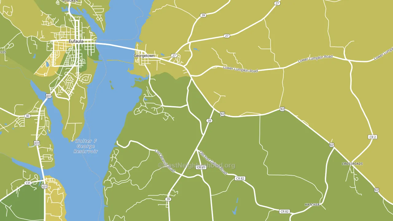
About 64% of adults in Quitman County typically vote, near the U.S. average of about 62%. Among adults in Quitman County, ~27% vote Democratic, ~37% Republican, and ~36% don't vote. The map below shows estimated turnout by block group.
How Quitman County compares
Among counties within 50 miles, Quitman County leans more Republican than 12 of 16 neighbors.
Quitman County runs about 14 points more Republican than Georgia as a whole.
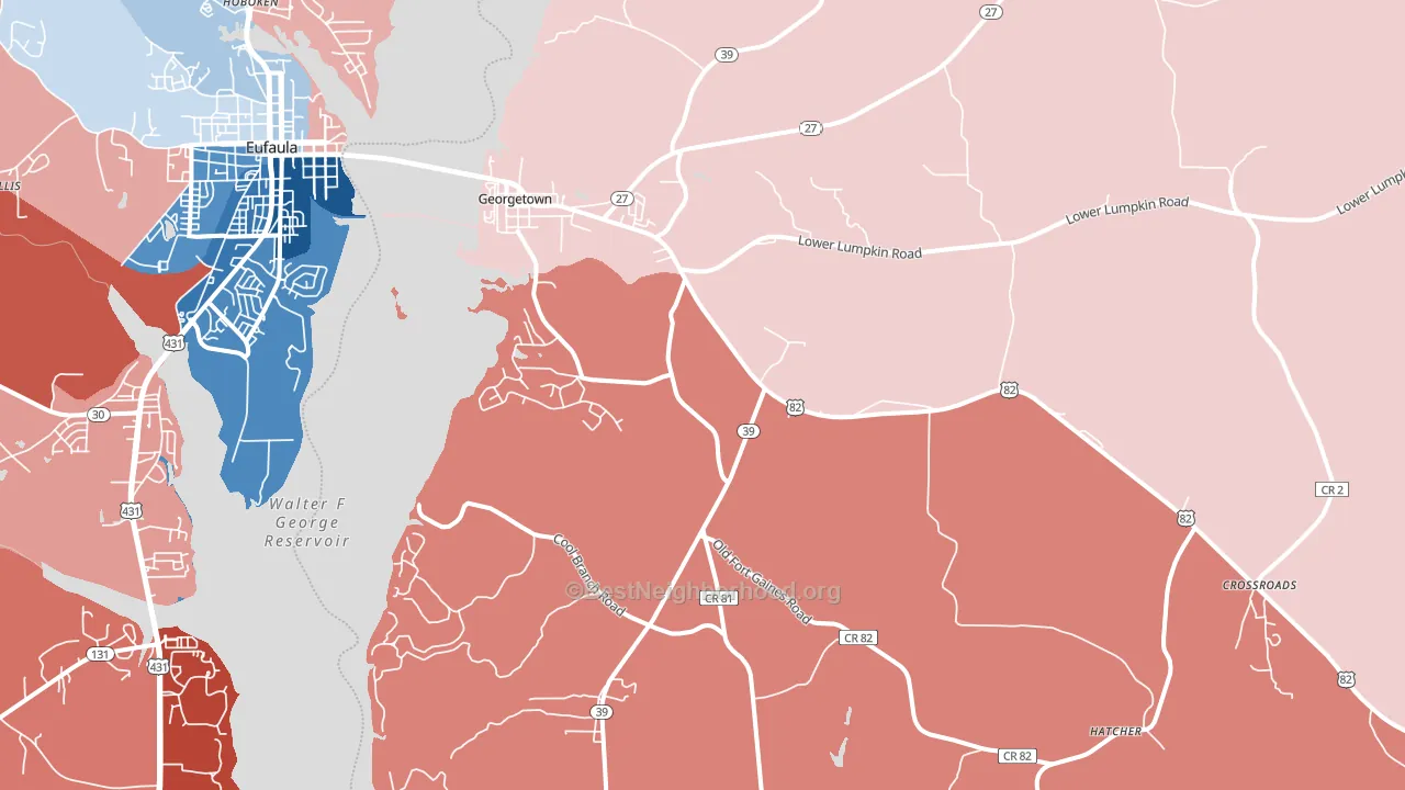
Politics vary noticeably by city within Quitman County. The north side runs the most Democratic (D+4) and the southwest side runs the most Republican (R+39), a spread of about 43 points.
Why Quitman County leans the way it does
This analysis examined 14,881 data points per county to find what predicts political lean and turnout. The items below are a few correlations that stood out for Quitman County, not a ranked or complete list of what matters most.
Rural areas vote Republican. About 5% of residents in Quitman County live in densely developed areas, about 21 points below the Georgia average of 26%. Low college attainment predicts Republican voting, and Quitman County sits in the bottom quarter (about 13%, below 96% of counties).
Walkability and Republican lean
Places with a low walkability score tend to lean Republican; Quitman County, GA sits in the bottom tenth nationally on this measure. A walkable street grid does not change how people vote; it mostly reflects how urban a place is.
Why turnout in Quitman County looks the way it does
Homeowners vote more often than renters. About 84% of households in Quitman County own their home, about 11 points above the Georgia average of 73%. Limited routine healthcare access lines up with lower turnout, and Quitman County sits in the bottom quarter on routine-care measures. Learn more about the findings and methodology on the political spectrum map.
Nearby Counties
- Barbour County, AL R+3
- Clay County, GA D+18
- Randolph County, GA D+3
- Stewart County, GA D+12
- Henry County, AL R+45
- Webster County, GA R+16
- Calhoun County, GA D+13
- Chattahoochee County, GA R+14
- Early County, GA R+6
- Russell County, AL D+6
Counties with Similar Populations
- Highland County, VA R+46
- Burke County, ND R+76
- Adams County, ND R+62
- Divide County, ND R+59
- Robertson County, KY R+61
- Renville County, ND R+65
- Greeley County, NE R+68
- Culberson County, TX R+18
- Garfield County, WA R+58
- Cimarron County, OK R+68
Sources and methodology
Precinct-level voting records used to fit the model come from Georgia Elections Division, distributed by the Voting and Election Science Team. Demographic inputs come from the U.S. Census Bureau (ACS 5-year estimates and the 2020 Decennial Census). Health and environmental inputs come from the CDC (PLACES and the Environmental Justice Index). Land cover comes from the USGS and EPA. Election-day and lead-up weather come from PRISM 4km daily grids and the NOAA Global Historical Climatology Network. Mail-voting and election-administration patterns come from the MIT Election Lab's Survey of the Performance of American Elections. Block-group crime detail comes from CrimeGrade. Internet data and modeling support provided by ISPreports.org.
Modeling and analysis by the BestNeighborhood data science team. Full methodology and findings: political spectrum map.
Methodology reviewed by the BestNeighborhood data team. Last updated May 2026.