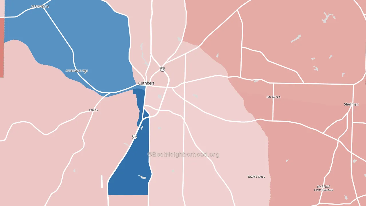
Randolph County is a true toss-up. About 52% of voters here vote Democratic and 48% Republican.
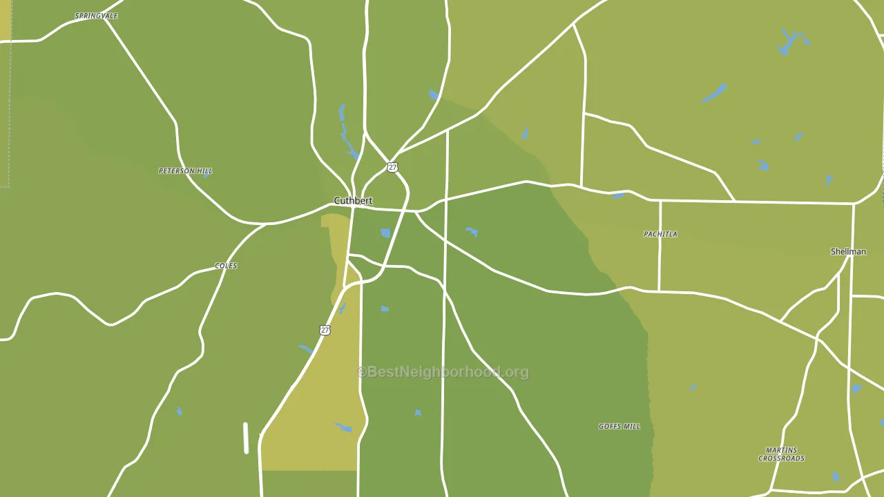
About 69% of adults in Randolph County typically vote, above the U.S. average of about 62%. Among adults in Randolph County, ~36% vote Democratic, ~33% Republican, and ~31% don't vote. The map below shows estimated turnout by block group.
How Randolph County compares
Among counties within 50 miles, Randolph County leans more Democratic than 11 of 18 neighbors.
Randolph County runs about 5 points more Democratic than Georgia as a whole.
Politics vary noticeably by city within Randolph County. The west side runs the most Democratic (D+27) and the northeast side runs the most Republican (R+29), a spread of about 56 points.
Why Randolph County leans the way it does
Density, race composition, education, and family structure all sit close to their national averages in Randolph County. The lean here lands roughly where demographic data alone would predict.
Preventive-care access and voter turnout
Places with limited routine preventive-care access tend to turn out at a lower rate; Randolph County, GA sits in the bottom tenth nationally on this measure. Dental visits do not drive turnout; the rate reflects income, insurance, and healthcare access, which line up with who votes.
Why turnout in Randolph County looks the way it does
Limited routine healthcare access lines up with lower turnout, and Randolph County sits in the bottom quarter on routine-care measures. Learn more about the findings and methodology on the political spectrum map.
Nearby Counties
- Calhoun County, GA D+13
- Clay County, GA D+18
- Terrell County, GA D+18
- Quitman County, GA R+17
- Stewart County, GA D+12
- Webster County, GA R+16
- Early County, GA R+6
- Barbour County, AL R+3
- Lee County, GA R+38
- Henry County, AL R+45
Counties with Similar Populations
- Norman County, MN R+27
- Treutlen County, GA R+35
- Moore County, TN R+69
- Henderson County, IL R+41
- Bottineau County, ND R+50
- Ellsworth County, KS R+56
- Howard County, NE R+64
- Bear Lake County, ID R+71
- Dallas County, AR R+18
- Saguache County, CO D+5
Sources and methodology
Precinct-level voting records used to fit the model come from Georgia Elections Division, distributed by the Voting and Election Science Team. Demographic inputs come from the U.S. Census Bureau (ACS 5-year estimates and the 2020 Decennial Census). Health and environmental inputs come from the CDC (PLACES and the Environmental Justice Index). Land cover comes from the USGS and EPA. Election-day and lead-up weather come from PRISM 4km daily grids and the NOAA Global Historical Climatology Network. Mail-voting and election-administration patterns come from the MIT Election Lab's Survey of the Performance of American Elections. Block-group crime detail comes from CrimeGrade. Internet data and modeling support provided by ISPreports.org.
Modeling and analysis by the BestNeighborhood data science team. Full methodology and findings: political spectrum map.
Methodology reviewed by the BestNeighborhood data team. Last updated May 2026.