Riverside South leans heavily Democratic by roughly 34 points: about 67% of voters vote Democratic and 33% Republican.
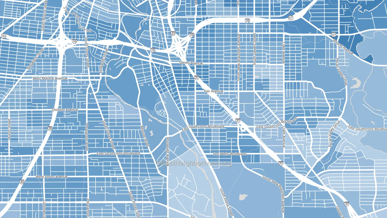
About 38% of adults in Riverside South typically vote, below the U.S. average of about 62%. Among adults in Riverside South, ~25% vote Democratic, ~13% Republican, and ~62% don't vote. The map below shows estimated turnout by block group.
How Riverside South compares
Among neighborhoods within 5 miles, Riverside South leans more Democratic than 10 of 26 neighbors.
Riverside South runs about 47 points more Democratic than Texas as a whole. Texas leans Republican overall, while Riverside South is one of the few Democratic-leaning pockets.
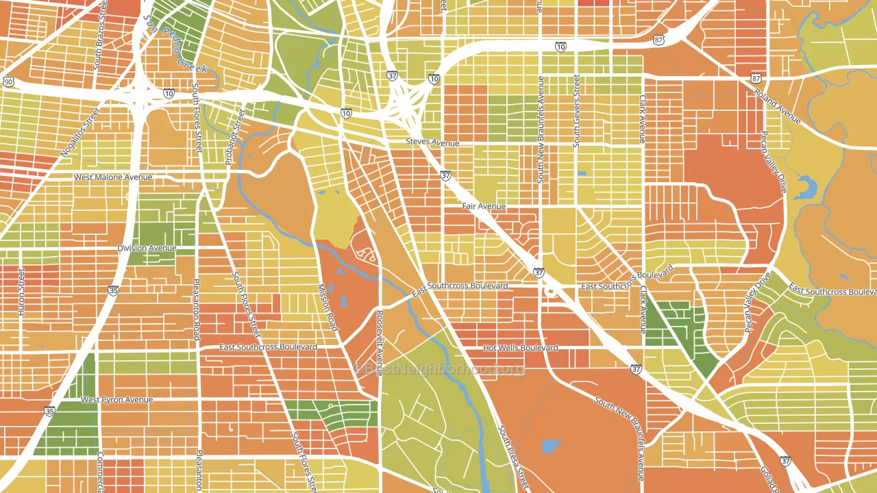
Politics vary noticeably by block within Riverside South. The northwest side is the most Democratic-leaning (D+43) and the east side is the least Democratic-leaning (D+30), a spread of about 14 points.
Why Riverside South leans the way it does
This analysis examined 14,881 data points per neighborhood to find what predicts political lean and turnout. The items below are a few correlations that stood out for Riverside South, not a ranked or complete list of what matters most.
Riverside South votes against the grain of Texas. Texas leans Republican overall, while Riverside South runs about 47 points more Democratic. Density combined with diversity predicts Democratic voting, and non-Hispanic white share in Riverside South is about 5%, about 67 points below the U.S. average of 72%.
Cancer-screening access and voter turnout
Places with low colon-cancer-screening access tend to turn out at a lower rate; Riverside South, San Antonio, TX sits in the bottom tenth nationally on this measure. Cancer screening does not drive turnout; it reflects income, insurance, and healthcare access.
Why turnout in Riverside South looks the way it does
Areas with limited routine healthcare access turn out at lower rates. Riverside South is in the bottom quarter nationally for routine-care measures such as insurance coverage, preventive screenings, and dental visits. The dental-visit rate here is about 42%, about 12 points below the Texas average of 54%. Low high-school completion lines up with lower turnout, and about 64% of adults in Riverside South have completed high school, below 97% of neighborhoods. High-crime urban areas turn out at lower rates, and Riverside South sits in the top 15% on a violent-crime measure. Learn more about the findings and methodology on the political spectrum map.
Nearby Neighborhoods
- Highland Park, San Antonio, TX D+34
- Mission San Jose, San Antonio, TX D+29
- Hot Wells, San Antonio, TX D+29
- Denver Heights, San Antonio, TX D+41
- Sunny Slope, San Antonio, TX D+35
- Highland Hills, San Antonio, TX D+25
- Lone Star, San Antonio, TX D+36
- Arena District, San Antonio, TX D+44
- Palm Heights, San Antonio, TX D+33
- Collins Gardens, San Antonio, TX D+36
Neighborhoods with Similar Populations
- South Cottonwood Acres, Murray, UT D+20
- West Wood, Dayton, OH D+87
- Albright, Buffalo, NY D+59
- Bucyrus Commercial Historical District, Bucyrus, OH R+40
- Northwest Wilmington, Wilmington, DE D+75
- Cottage Park, Mobile, AL R+38
- Hillcrest, Dayton, OH D+68
- Highland, Oakland, CA D+52
- Trowbridge Square, Sandy Springs, GA D+62
- Florida Shores, Edgewater, FL R+34
Sources and methodology
Precinct-level voting records used to fit the model come from Texas Secretary of State, Elections Division, distributed by the Voting and Election Science Team. Demographic inputs come from the U.S. Census Bureau (ACS 5-year estimates and the 2020 Decennial Census). Health and environmental inputs come from the CDC (PLACES and the Environmental Justice Index). Land cover comes from the USGS and EPA. Election-day and lead-up weather come from PRISM 4km daily grids and the NOAA Global Historical Climatology Network. Mail-voting and election-administration patterns come from the MIT Election Lab's Survey of the Performance of American Elections. Block-group crime detail comes from CrimeGrade. Internet data and modeling support provided by ISPreports.org.
Modeling and analysis by the BestNeighborhood data science team. Full methodology and findings: political spectrum map.
Methodology reviewed by the BestNeighborhood data team. Last updated May 2026.