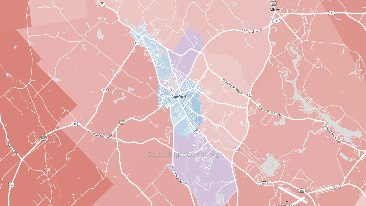
Sanford is a true toss-up. About 48% of voters here vote Democratic and 52% Republican. These figures are model estimates: Maine did not have precinct-level voting records available for training, so the numbers above come from demographic and health features rather than local ground truth.
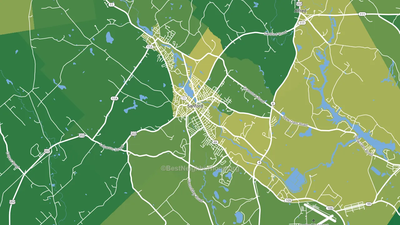
About 68% of adults in Sanford typically vote, above the U.S. average of about 62%. Among adults in Sanford, ~33% vote Democratic, ~35% Republican, and ~32% don't vote. The map below shows estimated turnout by block group.
How Sanford compares
Among cities within 25 miles, Sanford leans more Republican than 28 of 88 neighbors.
Sanford runs about 11 points more Republican than Maine as a whole.
Politics vary noticeably by neighborhood within Sanford. The northeast side runs the most Democratic (D+3) and the southwest side runs the most Republican (R+16), a spread of about 19 points.
Why Sanford leans the way it does
Density, race composition, education, and family structure all sit close to their national averages in Sanford. None of them point strongly toward either party.
Population density and Democratic lean
Places with high population density tend to lean Democratic; Sanford, ME sits in the top tenth nationally on this measure.
Why turnout in Sanford looks the way it does
Turnout in Sanford sits close to the national pattern. Routine healthcare access, homeownership, education, and food security all land near their national averages here. Learn more about the findings and methodology on the political spectrum map.
Nearby Cities
- Springvale, ME R+3
- South Sanford, ME R+18
- East Lebanon, ME R+32
- North Lebanon, ME R+35
- North Alfred, ME R+21
- Alfred Mills, ME R+25
- Emery Mills, ME R+20
- Tatnic, ME R+23
- Alfred, ME R+22
- Wells Branch, ME R+4
Cities with Similar Populations
- Dover, PA R+39
- Destrehan, LA R+34
- Haverstraw, NY D+17
- Raymondville, TX R+3
- Annville, PA R+31
- Verde Village, AZ R+14
- Belle Mead, NJ D+25
- Mount Vernon, IN R+40
- Beebe, AR R+58
- North St. Paul, MN D+18
Sources and methodology
Precinct-level voting records used to fit the model come from Maine Secretary of State, Bureau of Corporations Elections and Commissions, distributed by the Voting and Election Science Team. Demographic inputs come from the U.S. Census Bureau (ACS 5-year estimates and the 2020 Decennial Census). Health and environmental inputs come from the CDC (PLACES and the Environmental Justice Index). Land cover comes from the USGS and EPA. Election-day and lead-up weather come from PRISM 4km daily grids and the NOAA Global Historical Climatology Network. Mail-voting and election-administration patterns come from the MIT Election Lab's Survey of the Performance of American Elections. Block-group crime detail comes from CrimeGrade. Internet data and modeling support provided by ISPreports.org.
Modeling and analysis by the BestNeighborhood data science team. ME did not have precinct-level voting records available for training, so the figures here come from extrapolation across demographic, health, and land-use features rather than local ground truth. Full methodology and findings: political spectrum map.
Methodology reviewed by the BestNeighborhood data team. Last updated May 2026.