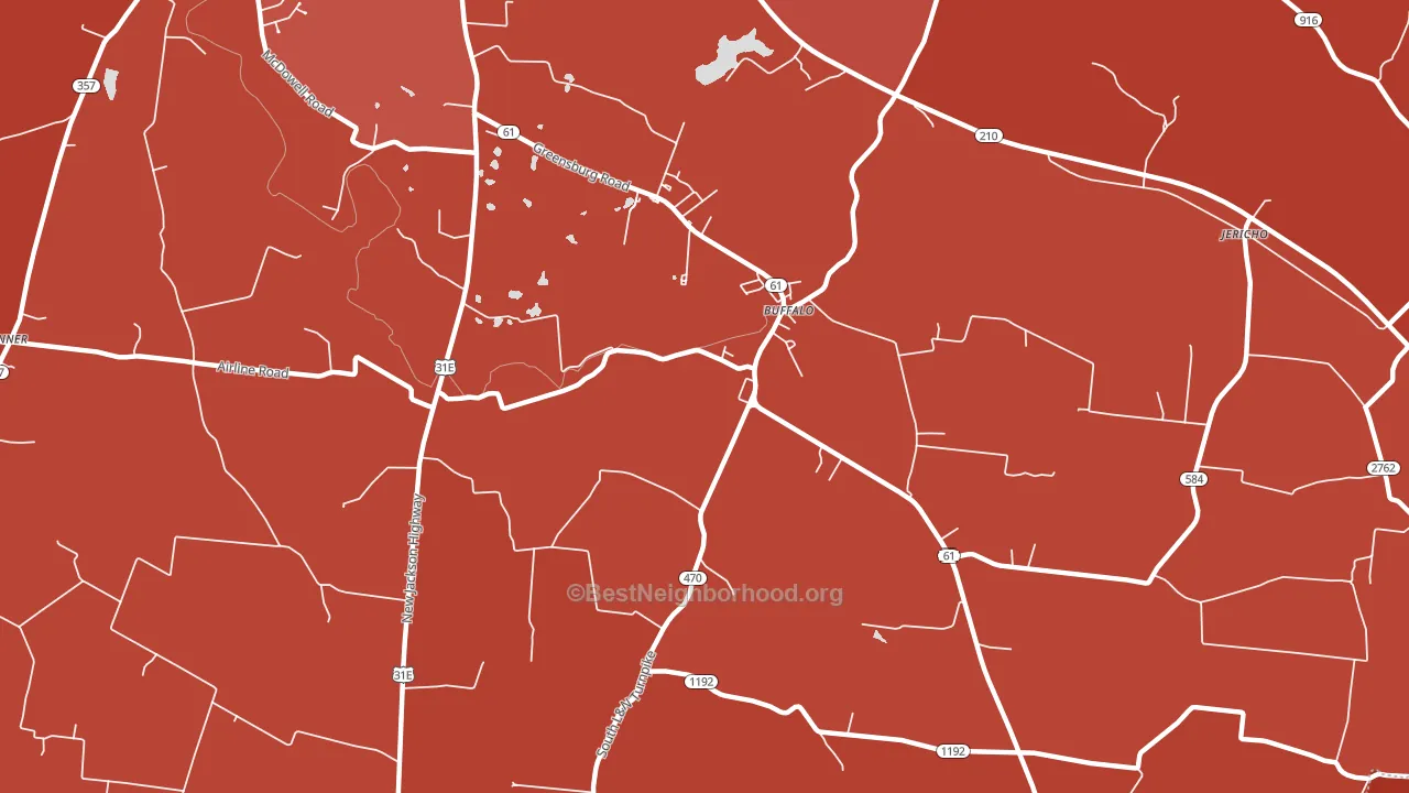
South Buffalo is a Republican stronghold. About 19% of voters here vote Democratic and 81% Republican.
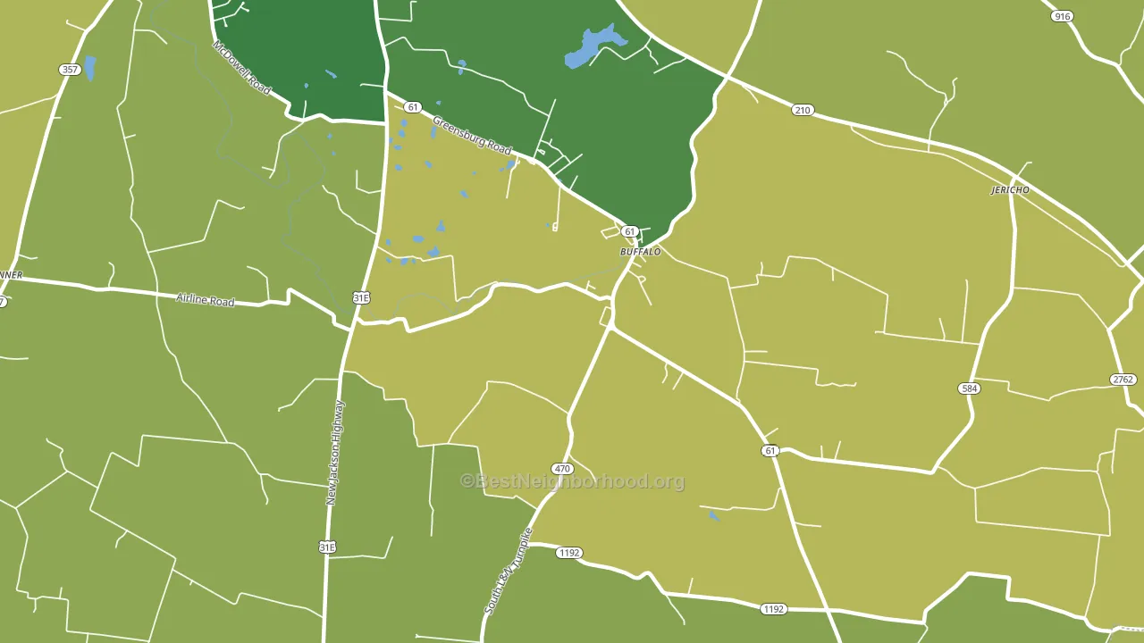
About 67% of adults in South Buffalo typically vote, near the U.S. average of about 62%. Among adults in South Buffalo, ~13% vote Democratic, ~54% Republican, and ~33% don't vote. The map below shows estimated turnout by block group.
How South Buffalo compares
Among cities within 25 miles, South Buffalo leans more Republican than 34 of 76 neighbors.
South Buffalo runs about 32 points more Republican than Kentucky as a whole.
Why South Buffalo leans the way it does
This analysis examined 14,881 data points per city to find what predicts political lean and turnout. The items below are a few correlations that stood out for South Buffalo, not a ranked or complete list of what matters most.
Car-dependent areas vote Republican. About 92% of residents in South Buffalo drive to work alone, about 18 points above the U.S. average of 74%. A high family-household share predicts Republican voting, and about 79% of households in South Buffalo are family households, above 88% of cities.
Never-married share and voter turnout
Places with a low never-married share tend to turn out at a higher rate; South Buffalo, KY sits in the bottom quarter nationally on this measure.
Why turnout in South Buffalo looks the way it does
Turnout in South Buffalo sits close to the national pattern. Routine healthcare access, homeownership, education, and food security all land near their national averages here. Learn more about the findings and methodology on the political spectrum map.
Nearby Cities
- Jericho, KY R+62
- Buffalo, KY R+63
- Hodgenville, KY R+51
- Mount Sherman, KY R+67
- Tanner, KY R+66
- Magnolia, KY R+67
- Linwood, KY R+70
- White City, KY R+61
- Tonieville, KY R+55
- Sonora, KY R+65
Cities with Similar Populations
- Spring Valley Village, TX Even
- East Benton, PA R+24
- Scalf, KY R+73
- Plain View, VA R+35
- Canyon, MN R+9
- Wonalancet, NH R+6
- Wishart, MO R+64
- Togo, TX R+66
- Alum Bridge, WV R+67
- Lissie, TX R+31
Sources and methodology
Precinct-level voting records used to fit the model come from Kentucky State Board of Elections, distributed by the Voting and Election Science Team. Demographic inputs come from the U.S. Census Bureau (ACS 5-year estimates and the 2020 Decennial Census). Health and environmental inputs come from the CDC (PLACES and the Environmental Justice Index). Land cover comes from the USGS and EPA. Election-day and lead-up weather come from PRISM 4km daily grids and the NOAA Global Historical Climatology Network. Mail-voting and election-administration patterns come from the MIT Election Lab's Survey of the Performance of American Elections. Block-group crime detail comes from CrimeGrade. Internet data and modeling support provided by ISPreports.org.
Modeling and analysis by the BestNeighborhood data science team. Full methodology and findings: political spectrum map.
Methodology reviewed by the BestNeighborhood data team. Last updated May 2026.