South Kenner is a true toss-up. About 48% of voters here vote Democratic and 52% Republican.
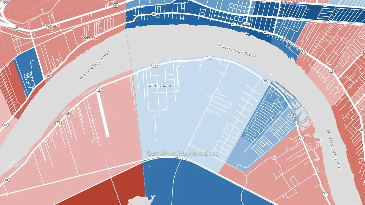
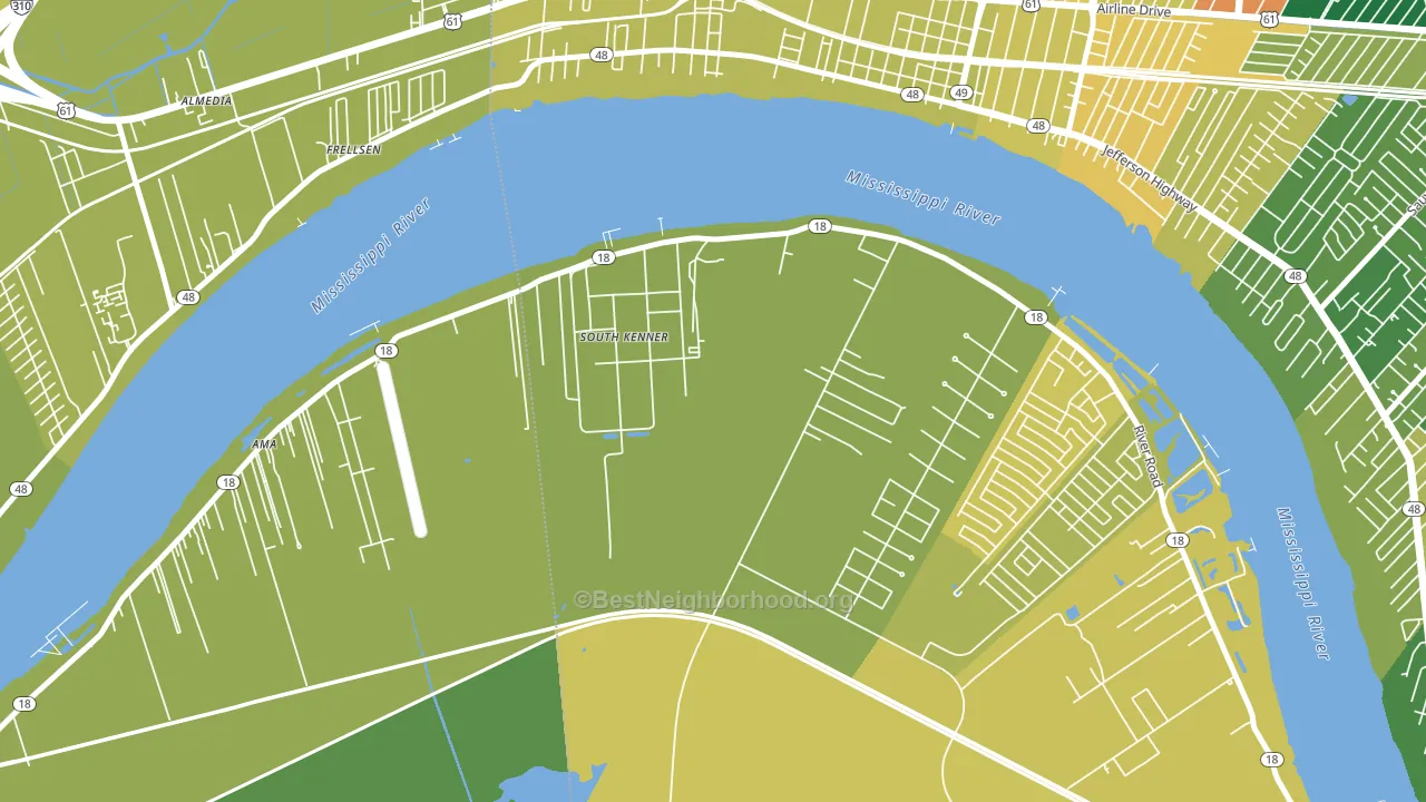
About 59% of adults in South Kenner typically vote, near the U.S. average of about 62%. Among adults in South Kenner, ~28% vote Democratic, ~31% Republican, and ~41% don't vote. The map below shows estimated turnout by block group.
How South Kenner compares
Among cities within 25 miles, South Kenner leans more Republican than 24 of 56 neighbors.
South Kenner runs about 18 points more Democratic than Louisiana as a whole.
Why South Kenner leans the way it does
Density, race composition, education, and family structure all sit close to their national averages in South Kenner. The lean here lands roughly where demographic data alone would predict.
Developed land, local retail density, and voter turnout
Places that combine a heavily developed built environment and sparse local retail within a mile tend to turn out at a lower rate, as South Kenner, LA does.
Why turnout in South Kenner looks the way it does
Areas with high food insecurity turn out at lower rates. About 31% of adults in South Kenner report food insecurity, about 15 points above the U.S. average of 16%. Limited routine healthcare access lines up with lower turnout, and South Kenner sits in the bottom quarter on routine-care measures. Learn more about the findings and methodology on the political spectrum map.
Nearby Cities
- Ama, LA R+9
- Waggaman, LA D+42
- River Ridge, LA R+20
- St. Rose, LA D+21
- Harahan, LA R+29
- Kennedy Heights, LA D+21
- Kenner, LA Even
- Avondale, LA D+8
- Metairie, LA R+14
- Jefferson, LA D+7
Cities with Similar Populations
- Selbyville, WV R+69
- Scarce Grease, AL R+80
- Flomot, TX R+86
- Seven Rivers, NM R+75
- Glendale, IL R+58
- Peacock, TX R+72
- San Jose, AZ R+47
- Sandy Hook, MO R+64
- Oglesville, MO R+71
- Oak Point, NY R+39
Sources and methodology
Precinct-level voting records used to fit the model come from Louisiana Secretary of State, Elections, distributed by the Voting and Election Science Team. Demographic inputs come from the U.S. Census Bureau (ACS 5-year estimates and the 2020 Decennial Census). Health and environmental inputs come from the CDC (PLACES and the Environmental Justice Index). Land cover comes from the USGS and EPA. Election-day and lead-up weather come from PRISM 4km daily grids and the NOAA Global Historical Climatology Network. Mail-voting and election-administration patterns come from the MIT Election Lab's Survey of the Performance of American Elections. Block-group crime detail comes from CrimeGrade. Internet data and modeling support provided by ISPreports.org.
Modeling and analysis by the BestNeighborhood data science team. Full methodology and findings: political spectrum map.
Methodology reviewed by the BestNeighborhood data team. Last updated May 2026.