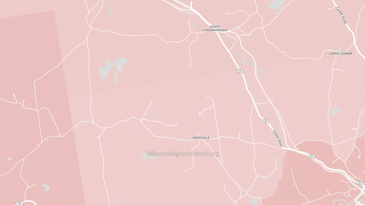
South Lyndeboro leans slightly Republican by roughly 6 points: about 47% of voters vote Democratic and 53% Republican. These figures are model estimates: New Hampshire did not have precinct-level voting records available for training, so the numbers above come from demographic and health features rather than local ground truth.
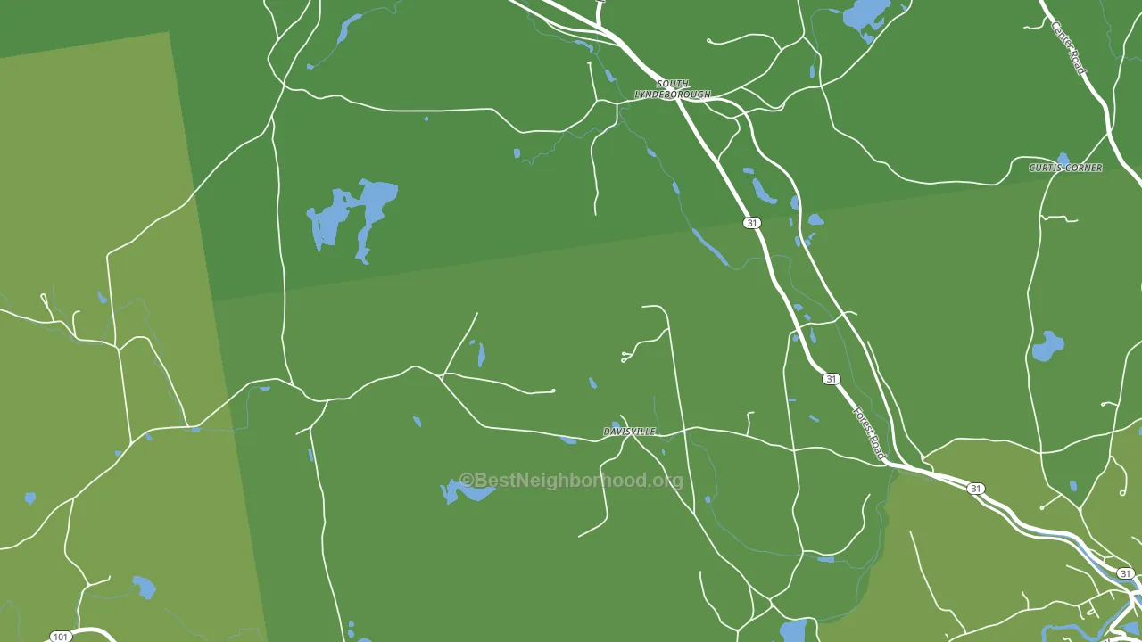
About 83% of adults in South Lyndeboro typically vote, above the U.S. average of about 62%. Among adults in South Lyndeboro, ~39% vote Democratic, ~44% Republican, and ~17% don't vote. The map below shows estimated turnout by block group.
How South Lyndeboro compares
Among cities within 25 miles, South Lyndeboro leans more Republican than 65 of 100 neighbors.
South Lyndeboro runs about 8 points more Republican than New Hampshire as a whole.
Why South Lyndeboro leans the way it does
This analysis examined 14,881 data points per city to find what predicts political lean and turnout. The items below are a few correlations that stood out for South Lyndeboro, not a ranked or complete list of what matters most.
Areas with many family households vote Republican. About 77% of households in South Lyndeboro are family households, about 11 points above the U.S. average of 67%.
Cancer-screening access and voter turnout
Places with high colon-cancer-screening access tend to turn out at a higher rate; South Lyndeboro, NH sits in the top tenth nationally on this measure. Cancer screening does not drive turnout; it reflects income, insurance, and healthcare access.
Why turnout in South Lyndeboro looks the way it does
Areas with strong routine healthcare access turn out at higher rates. South Lyndeboro is in the top quarter nationally for routine-care measures such as insurance coverage, preventive screenings, and dental visits. The dental-visit rate here is about 69%, about 9 points above the U.S. average of 60%. Homeowners vote more often than renters, and about 92% of households in South Lyndeboro own their home, about 17 points above the U.S. average of 75%. Learn more about the findings and methodology on the political spectrum map.
Nearby Cities
- Lyndeborough, NH R+6
- Wilton, NH R+4
- Temple, NH Even
- Mont Vernon, NH R+4
- Greenfield, NH R+20
- North Brookline, NH R+7
- Milford, NH D+3
- Sharon, NH Even
- Greenville, NH R+15
- Peterborough, NH D+29
Cities with Similar Populations
- Hornertown, TN R+71
- Zurich, KS R+76
- Burr Oak, IA R+35
- So-Hi, AZ R+52
- Kirkmansville, KY R+68
- Pritchett, CO R+77
- Falling Spring, WV R+61
- Sherman, KY R+62
- Orange Heights, FL R+38
- Lorado, WV R+73
Sources and methodology
Precinct-level voting records used to fit the model come from New Hampshire Secretary of State, Elections Division, distributed by the Voting and Election Science Team. Demographic inputs come from the U.S. Census Bureau (ACS 5-year estimates and the 2020 Decennial Census). Health and environmental inputs come from the CDC (PLACES and the Environmental Justice Index). Land cover comes from the USGS and EPA. Election-day and lead-up weather come from PRISM 4km daily grids and the NOAA Global Historical Climatology Network. Mail-voting and election-administration patterns come from the MIT Election Lab's Survey of the Performance of American Elections. Block-group crime detail comes from CrimeGrade. Internet data and modeling support provided by ISPreports.org.
Modeling and analysis by the BestNeighborhood data science team. NH did not have precinct-level voting records available for training, so the figures here come from extrapolation across demographic, health, and land-use features rather than local ground truth. Full methodology and findings: political spectrum map.
Methodology reviewed by the BestNeighborhood data team. Last updated May 2026.