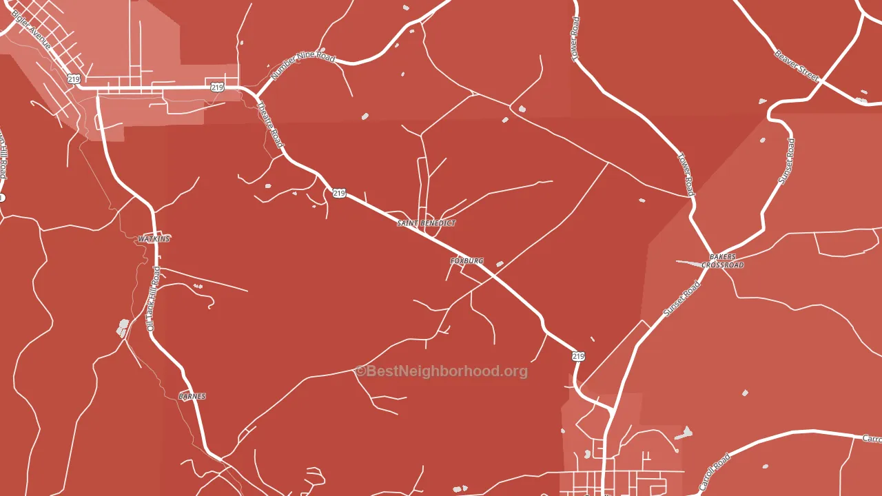
St. Benedict is a Republican stronghold. About 21% of voters here vote Democratic and 79% Republican.
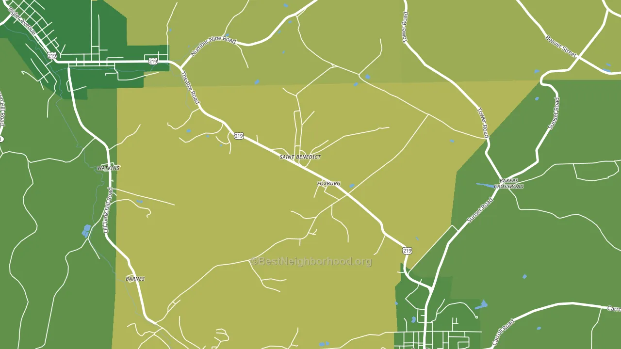
About 67% of adults in St. Benedict typically vote, near the U.S. average of about 62%. Among adults in St. Benedict, ~14% vote Democratic, ~53% Republican, and ~33% don't vote. The map below shows estimated turnout by block group.
How St. Benedict compares
Among cities within 25 miles, St. Benedict leans more Republican than 69 of 158 neighbors.
St. Benedict runs about 56 points more Republican than Pennsylvania as a whole.
Why St. Benedict leans the way it does
This analysis examined 14,881 data points per city to find what predicts political lean and turnout. The items below are a few correlations that stood out for St. Benedict, not a ranked or complete list of what matters most.
Areas with a high white share and below-average college attainment vote Republican. In St. Benedict, about 97% of residents are non-Hispanic white, about 25 points above the U.S. average of 72%; about 12% of adults hold a bachelor's degree, about 13 points below the Pennsylvania average of 26%. Car-dependent areas vote Republican, and about 87% of residents in St. Benedict drive to work alone, above 88% of cities.
Preventive-care access and voter turnout
Places with strong routine preventive-care access tend to turn out at a higher rate; St. Benedict, PA sits above the national average on this measure. Dental visits do not drive turnout; the rate reflects income, insurance, and healthcare access, which line up with who votes.
Why turnout in St. Benedict looks the way it does
Homeowners vote more often than renters. About 93% of households in St. Benedict own their home, about 14 points above the Pennsylvania average of 79%. Learn more about the findings and methodology on the political spectrum map.
Nearby Cities
- Carrolltown, PA R+50
- Elmora, PA R+60
- Spangler, PA R+60
- Hastings, PA R+52
- Northern Cambria, PA R+47
- Marsteller, PA R+63
- Patton, PA R+49
- Barnesboro, PA R+60
- Eckenrode Mill, PA R+52
- Plattsville, PA R+62
Cities with Similar Populations
- Fernwood, ID R+67
- Pine, TX R+58
- Teresita, OK R+50
- Dunmor, KY R+65
- Lothair, GA R+37
- Ramey, PA R+61
- Kunkle, PA R+27
- South Wolfeboro, NH R+14
- Lamont, IA R+42
- Liberty Center, IN R+70
Sources and methodology
Precinct-level voting records used to fit the model come from Pennsylvania Department of State, Bureau of Elections, distributed by the Voting and Election Science Team. Demographic inputs come from the U.S. Census Bureau (ACS 5-year estimates and the 2020 Decennial Census). Health and environmental inputs come from the CDC (PLACES and the Environmental Justice Index). Land cover comes from the USGS and EPA. Election-day and lead-up weather come from PRISM 4km daily grids and the NOAA Global Historical Climatology Network. Mail-voting and election-administration patterns come from the MIT Election Lab's Survey of the Performance of American Elections. Block-group crime detail comes from CrimeGrade. Internet data and modeling support provided by ISPreports.org.
Modeling and analysis by the BestNeighborhood data science team. Full methodology and findings: political spectrum map.
Methodology reviewed by the BestNeighborhood data team. Last updated May 2026.