St. Libory is a Republican stronghold. About 22% of voters here vote Democratic and 78% Republican.
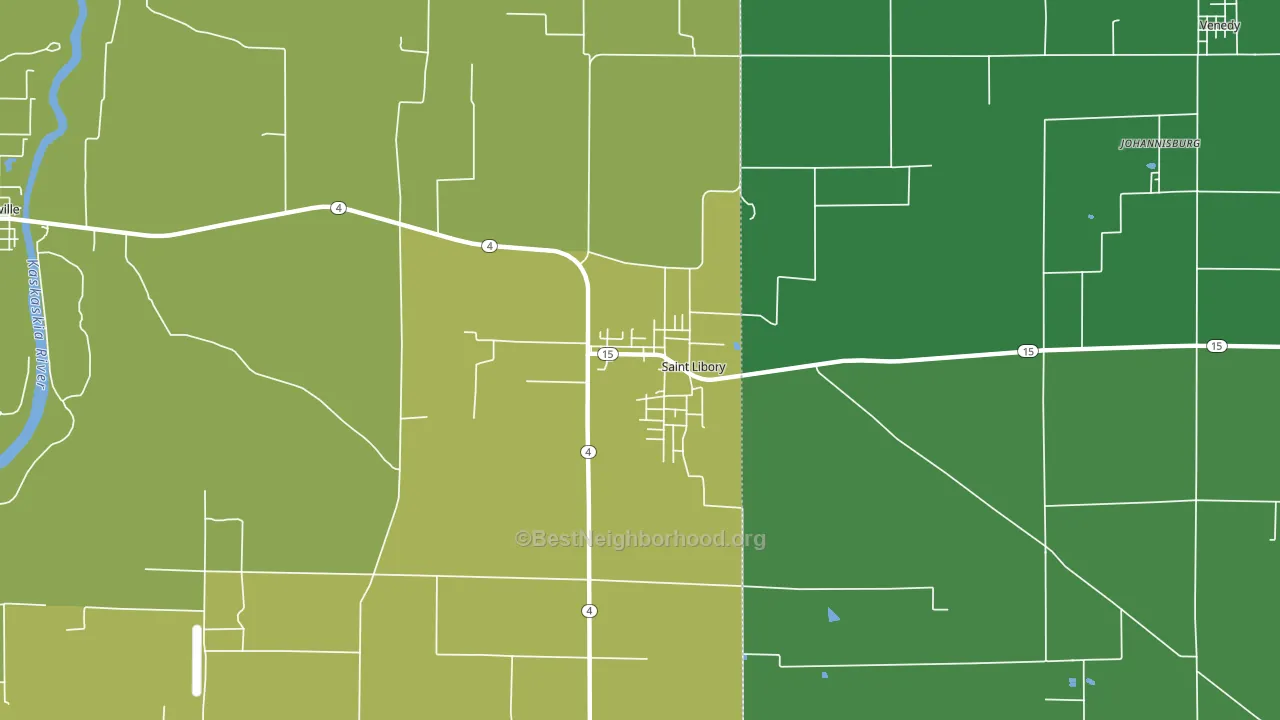
About 69% of adults in St. Libory typically vote, above the U.S. average of about 62%. Among adults in St. Libory, ~15% vote Democratic, ~54% Republican, and ~31% don't vote. The map below shows estimated turnout by block group.
How St. Libory compares
Among cities within 25 miles, St. Libory leans more Republican than 45 of 67 neighbors.
St. Libory runs about 68 points more Republican than Illinois as a whole. Illinois leans Democratic overall, while St. Libory is one of the few Republican-leaning pockets.
Why St. Libory leans the way it does
This analysis examined 14,881 data points per city to find what predicts political lean and turnout. The items below are a few correlations that stood out for St. Libory, not a ranked or complete list of what matters most.
Areas with a high white share and below-average college attainment vote Republican. In St. Libory, about 98% of residents are non-Hispanic white, about 26 points above the U.S. average of 72%; about 14% of adults hold a bachelor's degree, about 12 points below the Illinois average of 27%. Car-dependent areas vote Republican, and about 86% of residents in St. Libory drive to work alone, above 85% of cities. St. Libory runs against the grain of Illinois, a Republican-leaning pocket in a Democratic-leaning state.
Homeownership and voter turnout
Places with homeowner-heavy households tend to turn out at a higher rate; St. Libory, IL sits in the top tenth nationally on this measure.
Why turnout in St. Libory looks the way it does
Homeowners vote more often than renters. About 94% of households in St. Libory own their home, about 14 points above the Illinois average of 80%. Learn more about the findings and methodology on the political spectrum map.
Nearby Cities
- Fayetteville, IL R+56
- Stone Church, IL R+60
- Lenzburg, IL R+57
- Venedy, IL R+58
- New Memphis, IL R+54
- Lively Grove, IL R+59
- Old Marissa, IL R+55
- Marissa, IL R+56
- Clarmin, IL R+57
- Addieville, IL R+60
Cities with Similar Populations
- Reading, KS R+52
- Elrod, NC R+13
- South Union, KY R+58
- Duke Center, PA R+59
- Walla Walla East, WA R+23
- Frankford, MO R+67
- Mount Carmel, MS D+25
- McGuffey, OH R+64
- McHenry, KY R+61
- Fulton, IN R+60
Sources and methodology
Precinct-level voting records used to fit the model come from Illinois State Board of Elections, distributed by the Voting and Election Science Team. Demographic inputs come from the U.S. Census Bureau (ACS 5-year estimates and the 2020 Decennial Census). Health and environmental inputs come from the CDC (PLACES and the Environmental Justice Index). Land cover comes from the USGS and EPA. Election-day and lead-up weather come from PRISM 4km daily grids and the NOAA Global Historical Climatology Network. Mail-voting and election-administration patterns come from the MIT Election Lab's Survey of the Performance of American Elections. Block-group crime detail comes from CrimeGrade. Internet data and modeling support provided by ISPreports.org.
Modeling and analysis by the BestNeighborhood data science team. Full methodology and findings: political spectrum map.
Methodology reviewed by the BestNeighborhood data team. Last updated May 2026.