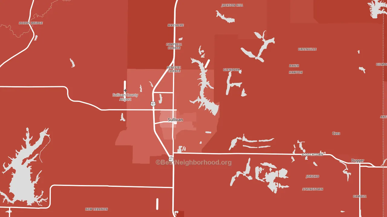
Sullivan County leans heavily Republican by roughly 48 points: about 26% of voters vote Democratic and 74% Republican.
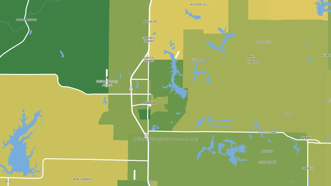
About 65% of adults in Sullivan County typically vote, near the U.S. average of about 62%. Among adults in Sullivan County, ~17% vote Democratic, ~48% Republican, and ~35% don't vote. The map below shows estimated turnout by block group.
How Sullivan County compares
Among counties within 50 miles, Sullivan County leans more Republican than 5 of 19 neighbors.
Sullivan County runs about 30 points more Republican than Indiana as a whole.
Politics vary noticeably by city within Sullivan County. The east side is the most Republican-leaning (R+62) and the south side is the least Republican-leaning (R+17), a spread of about 44 points.
Why Sullivan County leans the way it does
This analysis examined 14,881 data points per county to find what predicts political lean and turnout. The items below are a few correlations that stood out for Sullivan County, not a ranked or complete list of what matters most.
Areas with low college attainment vote Republican. About 14% of adults in Sullivan County hold a bachelor's degree, about 8 points below the Indiana average of 22%.
Population density and Democratic lean
Places with high population density tend to lean Democratic; Sullivan County, IN sits above the national average on this measure.
Why turnout in Sullivan County looks the way it does
Turnout in Sullivan County sits close to the national pattern. Learn more about the findings and methodology on the political spectrum map.
Nearby Counties
- Crawford County, IL R+50
- Greene County, IN R+55
- Vigo County, IN R+12
- Clark County, IL R+53
- Knox County, IN R+41
- Clay County, IN R+52
- Daviess County, IN R+59
- Lawrence County, IL R+47
- Owen County, IN R+57
- Edgar County, IL R+50
Counties with Similar Populations
- Buena Vista County, IA R+21
- Worth County, GA R+49
- Bandera County, TX R+59
- Ogemaw County, MI R+40
- Washington County, NE R+42
- Dodge County, MN R+31
- Carroll County, IA R+44
- Pointe Coupee Parish, LA R+25
- Conway County, AR R+47
- Perry County, IL R+49
Sources and methodology
Precinct-level voting records used to fit the model come from Indiana Secretary of State, Elections, distributed by the Voting and Election Science Team. Demographic inputs come from the U.S. Census Bureau (ACS 5-year estimates and the 2020 Decennial Census). Health and environmental inputs come from the CDC (PLACES and the Environmental Justice Index). Land cover comes from the USGS and EPA. Election-day and lead-up weather come from PRISM 4km daily grids and the NOAA Global Historical Climatology Network. Mail-voting and election-administration patterns come from the MIT Election Lab's Survey of the Performance of American Elections. Block-group crime detail comes from CrimeGrade. Internet data and modeling support provided by ISPreports.org.
Modeling and analysis by the BestNeighborhood data science team. Full methodology and findings: political spectrum map.
Methodology reviewed by the BestNeighborhood data team. Last updated May 2026.