The Island is a true toss-up. About 51% of voters here vote Democratic and 49% Republican.
[sc name="abovemapcta"]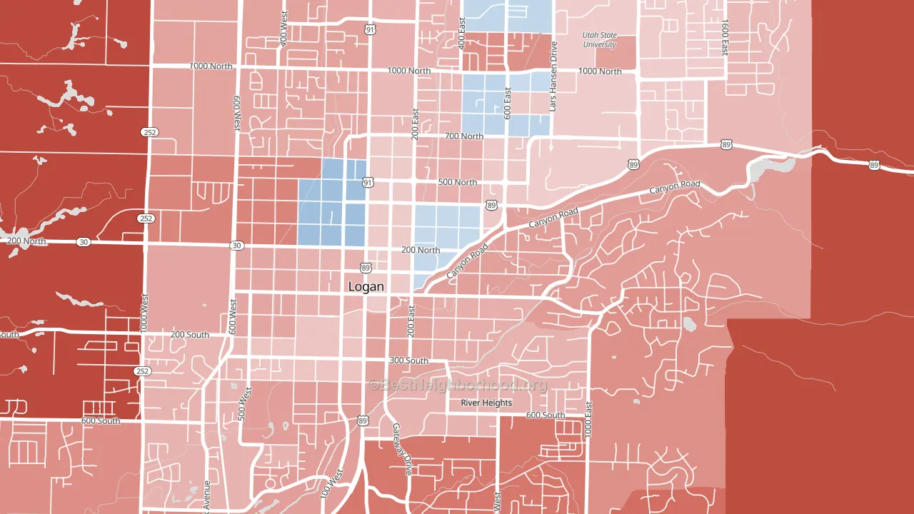 [bestneighborhood_map_controls]
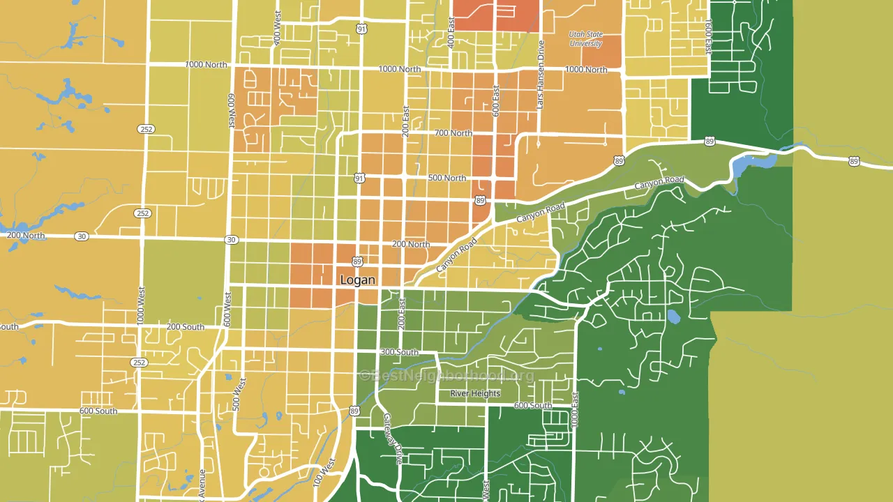
About 50% of adults in The Island typically vote, below the U.S. average of about 62%. Among adults in The Island, ~25% vote Democratic, ~25% Republican, and ~50% don't vote. The map below shows estimated turnout by block group.
 [bestneighborhood_map_controls]
How The Island compares
The Island runs about 23 points more Democratic than Utah as a whole. Utah leans Republican overall, while The Island sits closer to the political middle.
Politics vary noticeably by block within The Island. The northwest side runs the most Democratic (D+12) and the east side runs the most Republican (R+10), a spread of about 22 points.
Why The Island leans the way it does
This analysis examined 14,881 data points per neighborhood to find what predicts political lean and turnout. The items below are a few correlations that stood out for The Island, not a ranked or complete list of what matters most.
The Island votes against the grain of Utah. Utah leans Republican overall, while The Island runs about 23 points more Democratic.
Cancer-screening access and voter turnout
Places with low colon-cancer-screening access tend to turn out at a lower rate; The Island, Logan, UT sits in the bottom quarter nationally on this measure. Cancer screening does not drive turnout; it reflects income, insurance, and healthcare access.
Why turnout in The Island looks the way it does
Renters vote less often than owners. About 72% of households in The Island rent, about 47 points above the U.S. average of 25%. Learn more about the findings and methodology on the political spectrum map.
[one_half]Nearby Neighborhoods
- 25th Street, Ogden, UT D+13
- Westpointe, Salt Lake City, UT D+22
- Rose Park, Salt Lake City, UT D+30
- Capitol Hill, Salt Lake City, UT D+52
- The Avenues, Salt Lake City, UT D+64
- Fairpark, Salt Lake City, UT D+40
- Jordan Meadows, Salt Lake City, UT D+30
- Downtown, Salt Lake City, UT D+48
- Central City, Salt Lake City, UT D+60
- Poplar Grove, Salt Lake City, UT D+34
Neighborhoods with Similar Populations
- Ingrams Corner, East Providence, RI D+13
- Kensington, Tulsa, OK D+21
- Whiteaker, Eugene, OR D+62
- Fashion District, Los Angeles, CA D+61
- Neshaminy Valley, Bensalem, PA Even
- Gardenland, Sacramento, CA D+24
- Menlo Park, Tucson, AZ D+46
- Harbour Island, Tampa, FL R+4
- Downtown Fort Lauderdale, Fort Lauderdale, FL D+5
- Owings Mills New Town, Owings Mills, MD D+70
Sources and methodology
Precinct-level voting records used to fit the model come from Utah Lieutenant Governor's Office, Elections, distributed by the Voting and Election Science Team. Demographic inputs come from the U.S. Census Bureau (ACS 5-year estimates and the 2020 Decennial Census). Health and environmental inputs come from the CDC (PLACES and the Environmental Justice Index). Land cover comes from the USGS and EPA. Election-day and lead-up weather come from PRISM 4km daily grids and the NOAA Global Historical Climatology Network. Mail-voting and election-administration patterns come from the MIT Election Lab's Survey of the Performance of American Elections. Block-group crime detail comes from CrimeGrade. Internet data and modeling support provided by ISPreports.org.
Modeling and analysis by the BestNeighborhood data science team. Full methodology and findings: political spectrum map.
Methodology reviewed by the BestNeighborhood data team. Last updated May 2026.