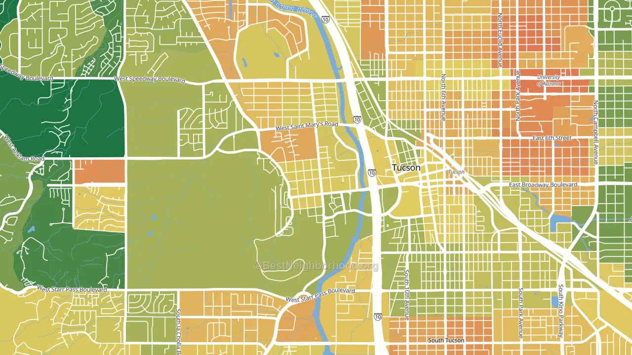
Menlo Park leans heavily Democratic by roughly 46 points: about 73% of voters vote Democratic and 27% Republican.
[sc name="abovemapcta"]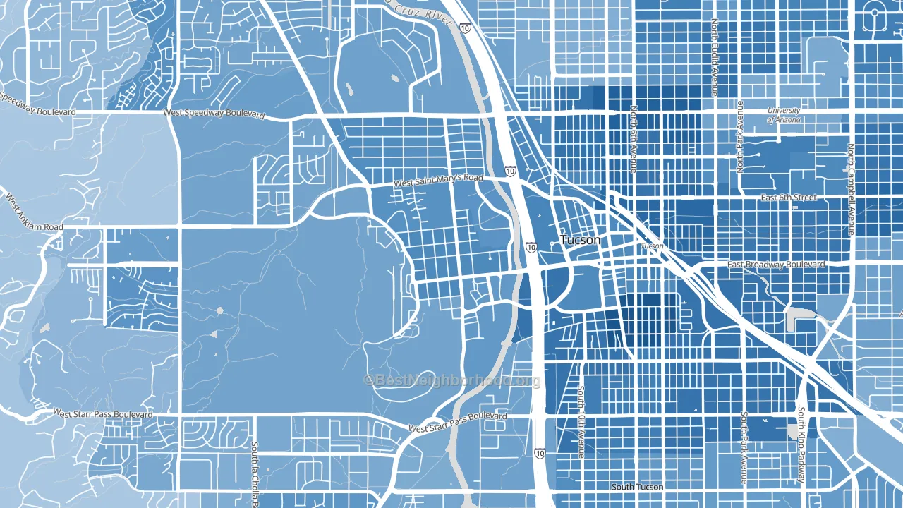 [bestneighborhood_map_controls]
About 49% of adults in Menlo Park typically vote, below the U.S. average of about 62%. Among adults in Menlo Park, ~36% vote Democratic, ~13% Republican, and ~51% don't vote. The map below shows estimated turnout by block group.
 [bestneighborhood_map_controls]
How Menlo Park compares
Among neighborhoods within 5 miles, Menlo Park leans more Democratic than 15 of 22 neighbors.
Menlo Park runs about 52 points more Democratic than Arizona as a whole. Arizona leans Republican overall, while Menlo Park is one of the few Democratic-leaning pockets.
Why Menlo Park leans the way it does
This analysis examined 14,881 data points per neighborhood to find what predicts political lean and turnout. The items below are a few correlations that stood out for Menlo Park, not a ranked or complete list of what matters most.
Menlo Park votes against the grain of Arizona. Arizona leans Republican overall, while Menlo Park runs about 52 points more Democratic. A high never-married share predicts Democratic voting, and about 53% of adults in Menlo Park have never been married, above 86% of neighborhoods.
Cancer-screening access and voter turnout
Places with low colon-cancer-screening access tend to turn out at a lower rate; Menlo Park, Tucson, AZ sits in the bottom quarter nationally on this measure. Cancer screening does not drive turnout; it reflects income, insurance, and healthcare access.
Why turnout in Menlo Park looks the way it does
Areas with limited routine healthcare access turn out at lower rates. Menlo Park is in the bottom quarter nationally for routine-care measures such as insurance coverage, preventive screenings, and dental visits. The dental-visit rate here is about 48%, about 6 points below the Arizona average of 54%. Crowded housing lines up with lower turnout, and about 7% of homes in Menlo Park have more than one occupant per room, above 85% of neighborhoods. High-crime urban areas turn out at lower rates, and Menlo Park sits in the top 15% on a violent-crime measure. Learn more about the findings and methodology on the political spectrum map.
[one_half]Nearby Neighborhoods
- Armory Park, Tucson, AZ D+59
- West University, Tucson, AZ D+58
- Tucson Park West, Tucson, AZ D+37
- Rincon Heights, Tucson, AZ D+57
- North University, Tucson, AZ D+56
- Westside Development, Tucson, AZ D+27
- South Park, Tucson, AZ D+38
- Keeling, Tucson, AZ D+38
- Santa Cruz Southwest, Tucson, AZ D+32
- Sam Hughes, Tucson, AZ D+59
Neighborhoods with Similar Populations
- Harbour Island, Tampa, FL R+4
- Fashion District, Los Angeles, CA D+61
- River Park, Port St. Lucie, FL R+19
- Whiteaker, Eugene, OR D+62
- Ingrams Corner, East Providence, RI D+13
- The Island, Logan, UT Even
- Lansingville, Youngstown, OH D+40
- Downtown Corona, Corona, CA D+17
- Kensington, Tulsa, OK D+21
- Neshaminy Valley, Bensalem, PA Even
Sources and methodology
Precinct-level voting records used to fit the model come from Arizona Secretary of State, Elections, distributed by the Voting and Election Science Team. Demographic inputs come from the U.S. Census Bureau (ACS 5-year estimates and the 2020 Decennial Census). Health and environmental inputs come from the CDC (PLACES and the Environmental Justice Index). Land cover comes from the USGS and EPA. Election-day and lead-up weather come from PRISM 4km daily grids and the NOAA Global Historical Climatology Network. Mail-voting and election-administration patterns come from the MIT Election Lab's Survey of the Performance of American Elections. Block-group crime detail comes from CrimeGrade. Internet data and modeling support provided by ISPreports.org.
Modeling and analysis by the BestNeighborhood data science team. Full methodology and findings: political spectrum map.
Methodology reviewed by the BestNeighborhood data team. Last updated May 2026.