university leans slightly Democratic by roughly 14 points: about 57% of voters vote Democratic and 43% Republican.
[sc name="abovemapcta"]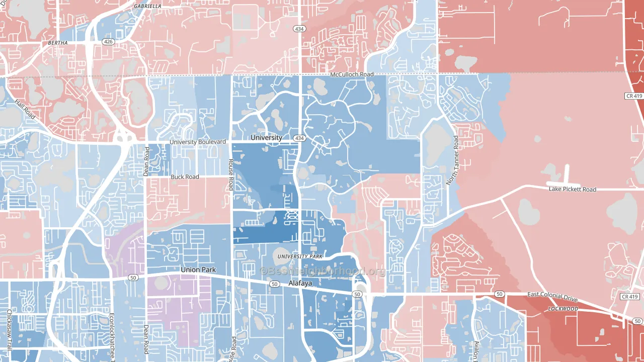 [bestneighborhood_map_controls]
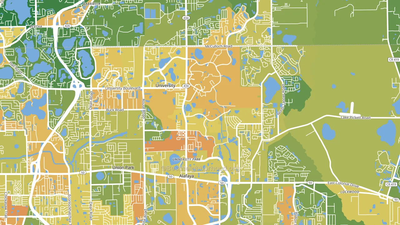
About 47% of adults in university typically vote, below the U.S. average of about 62%. Among adults in university, ~27% vote Democratic, ~20% Republican, and ~53% don't vote. The map below shows estimated turnout by block group.
 [bestneighborhood_map_controls]
How university compares
Among neighborhoods within 5 miles, university leans more Democratic than 4 of 5 neighbors.
university runs about 27 points more Democratic than Florida as a whole. Florida leans Republican overall, while university is one of the few Democratic-leaning pockets.
Politics vary noticeably by block within university. The west side runs the most Democratic (D+22) and the east side runs the most Republican (R+7), a spread of about 29 points.
Why university leans the way it does
This analysis examined 14,881 data points per neighborhood to find what predicts political lean and turnout. The items below are a few correlations that stood out for university, not a ranked or complete list of what matters most.
Areas with many never-married adults vote Democratic. About 78% of adults in university have never been married, far above similar-sized neighborhoods (around 45%). university runs against the grain of Florida, a Democratic-leaning pocket in a Republican-leaning state.
Preventive-care access and voter turnout
Places with limited routine preventive-care access tend to turn out at a lower rate; university, Orlando, FL sits below the national average on this measure. Dental visits do not drive turnout; the rate reflects income, insurance, and healthcare access, which line up with who votes.
Why turnout in university looks the way it does
Areas with limited routine healthcare access turn out at lower rates. university is in the bottom quarter nationally for routine-care measures such as insurance coverage, preventive screenings, and dental visits. Renters vote less often than owners, and about 75% of households in university rent, compared to around 41% in nearby neighborhoods. Learn more about the findings and methodology on the political spectrum map.
[one_half]Nearby Neighborhoods
- Sussex Place, Alafaya, FL D+26
- Stonemeade, Alafaya, FL D+6
- Legacy Place, Alafaya, FL D+13
- Huckleberry Fields, Alafaya, FL Even
- Spring Isle, Alafaya, FL D+11
- Woodlands-Orlando, Orlando, FL D+23
- Stoneybrook, Alafaya, FL Even
- Avalon Park Northwest Village, Alafaya, FL D+5
- Avalon Park Village, Alafaya, FL Even
- Hibiscus, Azalea Park, FL D+10
Neighborhoods with Similar Populations
- Greater Greenspoint, Houston, TX D+42
- Northside, Fort Worth, TX D+17
- North Ironbound, Newark, NJ D+5
- Sawtelle, Los Angeles, CA D+50
- Pico-Robertson, Los Angeles, CA D+59
- North Arlington, Arlington, TX D+28
- Inwood, Manhattan, NY D+47
- Rego Park, Queens, NY D+4
- Medical, Houston, TX D+41
- West Los Angeles, Los Angeles, CA D+40
Sources and methodology
Precinct-level voting records used to fit the model come from Florida Division of Elections, distributed by the Voting and Election Science Team. Demographic inputs come from the U.S. Census Bureau (ACS 5-year estimates and the 2020 Decennial Census). Health and environmental inputs come from the CDC (PLACES and the Environmental Justice Index). Land cover comes from the USGS and EPA. Election-day and lead-up weather come from PRISM 4km daily grids and the NOAA Global Historical Climatology Network. Mail-voting and election-administration patterns come from the MIT Election Lab's Survey of the Performance of American Elections. Block-group crime detail comes from CrimeGrade. Internet data and modeling support provided by ISPreports.org.
Modeling and analysis by the BestNeighborhood data science team. Full methodology and findings: political spectrum map.
Methodology reviewed by the BestNeighborhood data team. Last updated May 2026.