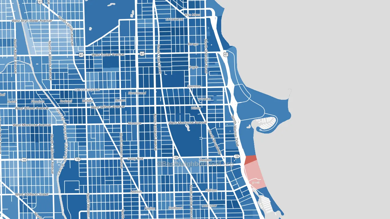
Uptown is a Democratic stronghold. About 88% of voters here vote Democratic and 12% Republican.
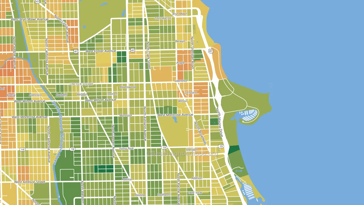
About 55% of adults in Uptown typically vote, below the U.S. average of about 62%. Among adults in Uptown, ~49% vote Democratic, ~7% Republican, and ~44% don't vote. The map below shows estimated turnout by block group.
How Uptown compares
Among neighborhoods within 5 miles, Uptown leans more Democratic than 33 of 36 neighbors.
Uptown runs about 66 points more Democratic than Illinois as a whole.
Politics vary noticeably by block within Uptown. The northwest side is the most Democratic-leaning (D+82) and the east side is the least Democratic-leaning (D+66), a spread of about 16 points.
Why Uptown leans the way it does
This analysis examined 14,881 data points per neighborhood to find what predicts political lean and turnout. The items below are a few correlations that stood out for Uptown, not a ranked or complete list of what matters most.
Areas with high college attainment vote Democratic. About 64% of adults in Uptown hold a bachelor's degree, about 35 points above the U.S. average of 28%. A high never-married share predicts Democratic voting, and about 58% of adults in Uptown have never been married, above 92% of neighborhoods.
Walkability and Democratic lean
Places with a highly walkable street grid tend to lean Democratic; Uptown, Chicago, IL sits in the top quarter nationally on this measure. A walkable street grid does not change how people vote; it mostly reflects how urban a place is.
Why turnout in Uptown looks the way it does
Renters vote less often than owners. About 70% of households in Uptown rent, about 45 points above the U.S. average of 25%. Learn more about the findings and methodology on the political spectrum map.
Nearby Neighborhoods
- Asia on Argyle, Chicago, IL D+73
- Pine Grove, Chicago, IL D+71
- West Ravenswood, Chicago, IL D+74
- Cuyler, Chicago, IL D+76
- Andersonville, Chicago, IL D+84
- Lake View, Chicago, IL D+70
- North Center, Chicago, IL D+67
- Edgewater, Chicago, IL D+71
- Roscoe Village, Chicago, IL D+70
- Lincoln Square, Chicago, IL D+54
Neighborhoods with Similar Populations
- M Streets, Dallas, TX D+25
- St Charles, Waldorf, MD D+66
- North Cheyenne, Las Vegas, NV Even
- Sycamore, Fort Worth, TX D+39
- Playa Vista, Los Angeles, CA D+46
- Oak Lane, Philadelphia, PA D+87
- Frankford, Philadelphia, PA D+56
- Wheaton-Glenmont, Wheaton, MD D+51
- Central City, Los Angeles, CA D+45
- North Torrance, Torrance, CA D+20
Sources and methodology
Precinct-level voting records used to fit the model come from Illinois State Board of Elections, distributed by the Voting and Election Science Team. Demographic inputs come from the U.S. Census Bureau (ACS 5-year estimates and the 2020 Decennial Census). Health and environmental inputs come from the CDC (PLACES and the Environmental Justice Index). Land cover comes from the USGS and EPA. Election-day and lead-up weather come from PRISM 4km daily grids and the NOAA Global Historical Climatology Network. Mail-voting and election-administration patterns come from the MIT Election Lab's Survey of the Performance of American Elections. Block-group crime detail comes from CrimeGrade. Internet data and modeling support provided by ISPreports.org.
Modeling and analysis by the BestNeighborhood data science team. Full methodology and findings: political spectrum map.
Methodology reviewed by the BestNeighborhood data team. Last updated May 2026.