Asia on Argyle is a Democratic stronghold. About 86% of voters here vote Democratic and 14% Republican.
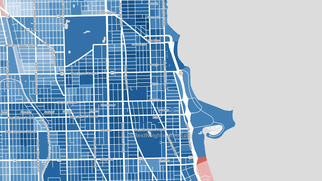
About 50% of adults in Asia on Argyle typically vote, below the U.S. average of about 62%. Among adults in Asia on Argyle, ~43% vote Democratic, ~7% Republican, and ~50% don't vote. The map below shows estimated turnout by block group.
How Asia on Argyle compares
Among neighborhoods within 5 miles, Asia on Argyle leans more Democratic than 24 of 31 neighbors.
Asia on Argyle runs about 62 points more Democratic than Illinois as a whole.
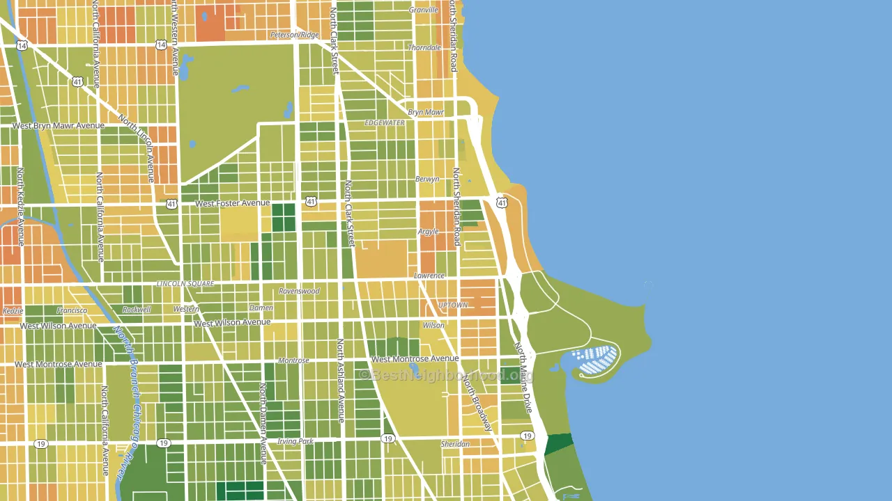
Politics vary noticeably by block within Asia on Argyle. The northwest side is the most Democratic-leaning (D+88) and the southeast side is the least Democratic-leaning (D+65), a spread of about 23 points.
Why Asia on Argyle leans the way it does
This analysis examined 14,881 data points per neighborhood to find what predicts political lean and turnout. The items below are a few correlations that stood out for Asia on Argyle, not a ranked or complete list of what matters most.
Areas with many never-married adults vote Democratic. About 55% of adults in Asia on Argyle have never been married, modestly above similar-sized neighborhoods (around 45%).
Walkability and Democratic lean
Places with a highly walkable street grid tend to lean Democratic; Asia on Argyle, Chicago, IL sits in the top quarter nationally on this measure. A walkable street grid does not change how people vote; it mostly reflects how urban a place is.
Why turnout in Asia on Argyle looks the way it does
Renters vote less often than owners. About 72% of households in Asia on Argyle rent, about 47 points above the U.S. average of 25%. Learn more about the findings and methodology on the political spectrum map.
Nearby Neighborhoods
- Uptown, Chicago, IL D+77
- Andersonville, Chicago, IL D+84
- Edgewater, Chicago, IL D+71
- West Ravenswood, Chicago, IL D+74
- Pine Grove, Chicago, IL D+71
- Cuyler, Chicago, IL D+76
- Lincoln Square, Chicago, IL D+54
- Bowmanville, Chicago, IL D+64
- Ravenswood Gardens, Chicago, IL D+78
- Lake View, Chicago, IL D+70
Neighborhoods with Similar Populations
- Sunset Hill, Seattle, WA D+70
- Central West End, St. Louis, MO D+69
- Downtown, Atlanta, GA D+60
- Ellsworth, Elmwood Park, IL D+7
- Pleasure Ridge Park, Louisville, KY R+2
- Original Town, Carrollton, TX D+13
- Grogan's Mill, The Woodlands, TX R+8
- Liberty Heights, Springfield, MA D+34
- West of Twin Peaks, San Francisco, CA D+62
- Nestor, San Diego, CA D+19
Sources and methodology
Precinct-level voting records used to fit the model come from Illinois State Board of Elections, distributed by the Voting and Election Science Team. Demographic inputs come from the U.S. Census Bureau (ACS 5-year estimates and the 2020 Decennial Census). Health and environmental inputs come from the CDC (PLACES and the Environmental Justice Index). Land cover comes from the USGS and EPA. Election-day and lead-up weather come from PRISM 4km daily grids and the NOAA Global Historical Climatology Network. Mail-voting and election-administration patterns come from the MIT Election Lab's Survey of the Performance of American Elections. Block-group crime detail comes from CrimeGrade. Internet data and modeling support provided by ISPreports.org.
Modeling and analysis by the BestNeighborhood data science team. Full methodology and findings: political spectrum map.
Methodology reviewed by the BestNeighborhood data team. Last updated May 2026.