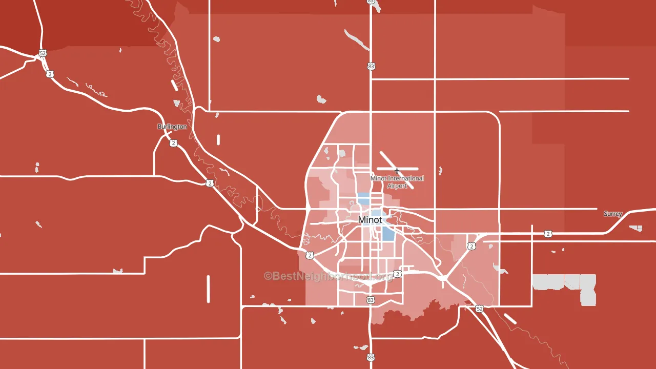
Ward County leans heavily Republican by roughly 32 points: about 34% of voters vote Democratic and 66% Republican.
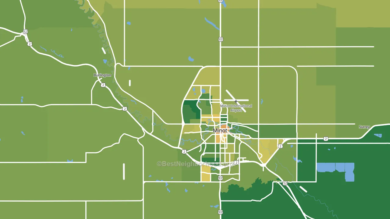
About 70% of adults in Ward County typically vote, above the U.S. average of about 62%. Among adults in Ward County, ~24% vote Democratic, ~46% Republican, and ~30% don't vote. The map below shows estimated turnout by block group.
How Ward County compares
Among counties within 50 miles, Ward County is the least Republican-leaning.
Ward County runs about 4 points more Democratic than North Dakota as a whole.
Politics vary noticeably by city within Ward County. The west side is the most Republican-leaning (R+64) and the east side is the least Republican-leaning (R+28), a spread of about 36 points.
Why Ward County leans the way it does
This analysis examined 14,881 data points per county to find what predicts political lean and turnout. The items below are a few correlations that stood out for Ward County, not a ranked or complete list of what matters most.
Ward County votes Republican even though it is densely developed (about 67%, far above the North Dakota average of 12%). State and regional patterns outweigh the Democratic lean that density usually predicts here.
Food insecurity and voter turnout
Places with low food insecurity tend to turn out at a higher rate; Ward County, ND sits in the bottom tenth nationally on this measure. Food insecurity does not directly drive turnout; it reflects economic hardship, which lines up with lower voting.
Why turnout in Ward County looks the way it does
Areas with high high-school completion turn out at higher rates. About 95% of adults in Ward County have completed high school, above 90% of counties. Learn more about the findings and methodology on the political spectrum map.
Nearby Counties
- McHenry County, ND R+61
- Renville County, ND R+65
- Mountrail County, ND R+35
- Bottineau County, ND R+50
- McLean County, ND R+51
- Pierce County, ND R+47
- Sheridan County, ND R+69
- Burke County, ND R+76
- Mercer County, ND R+65
- Oliver County, ND R+67
Counties with Similar Populations
- Iberia Parish, LA R+24
- York County, VA R+3
- Columbia County, FL R+44
- Greene County, TN R+62
- Portage County, WI R+7
- Troup County, GA R+11
- Klamath County, OR R+33
- Greenwood County, SC R+18
- Blue Earth County, MN R+6
- Boone County, IN R+19
Sources and methodology
Precinct-level voting records used to fit the model come from North Dakota Secretary of State, Elections, distributed by the Voting and Election Science Team. Demographic inputs come from the U.S. Census Bureau (ACS 5-year estimates and the 2020 Decennial Census). Health and environmental inputs come from the CDC (PLACES and the Environmental Justice Index). Land cover comes from the USGS and EPA. Election-day and lead-up weather come from PRISM 4km daily grids and the NOAA Global Historical Climatology Network. Mail-voting and election-administration patterns come from the MIT Election Lab's Survey of the Performance of American Elections. Block-group crime detail comes from CrimeGrade. Internet data and modeling support provided by ISPreports.org.
Modeling and analysis by the BestNeighborhood data science team. Full methodology and findings: political spectrum map.
Methodology reviewed by the BestNeighborhood data team. Last updated May 2026.