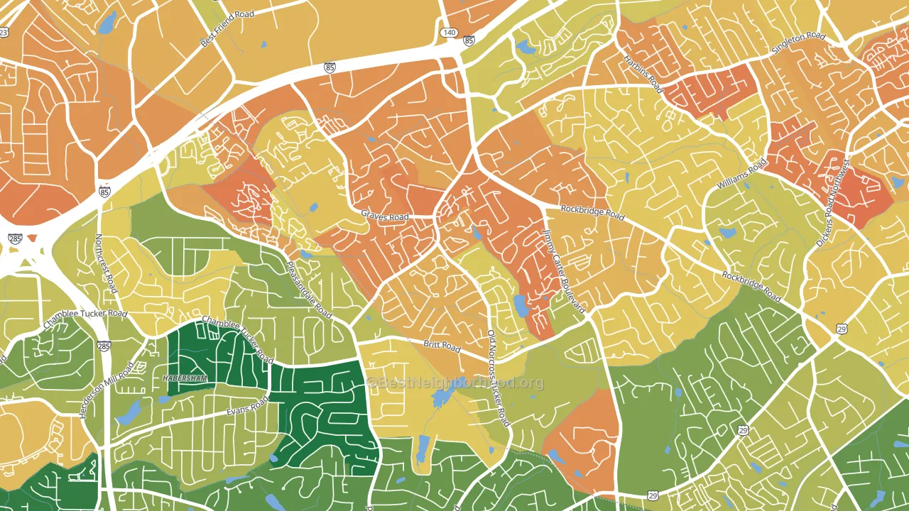
Wedgewood leans heavily Democratic by roughly 34 points: about 67% of voters vote Democratic and 33% Republican.
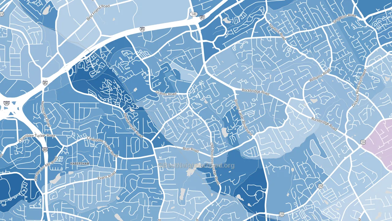
About 35% of adults in Wedgewood typically vote, below the U.S. average of about 62%. Among adults in Wedgewood, ~23% vote Democratic, ~12% Republican, and ~65% don't vote. The map below shows estimated turnout by block group.
How Wedgewood compares
Wedgewood runs about 36 points more Democratic than Georgia as a whole. Georgia is roughly evenly split, and Wedgewood sits clearly on the Democratic side.
Why Wedgewood leans the way it does
This analysis examined 14,881 data points per neighborhood to find what predicts political lean and turnout. The items below are a few correlations that stood out for Wedgewood, not a ranked or complete list of what matters most.
Wedgewood votes against the grain of Georgia. Georgia is roughly evenly split, while Wedgewood runs about 36 points more Democratic. A high never-married share predicts Democratic voting, and about 56% of adults in Wedgewood have never been married, above 90% of neighborhoods.
Population density and Democratic lean
Places with high population density tend to lean Democratic; Wedgewood, Tucker, GA sits in the top quarter nationally on this measure.
Why turnout in Wedgewood looks the way it does
Areas with limited routine healthcare access turn out at lower rates. Wedgewood is in the bottom quarter nationally for routine-care measures such as insurance coverage, preventive screenings, and dental visits. The dental-visit rate here is about 45%, about 11 points below the Georgia average of 56%. High food insecurity lines up with lower turnout, and about 38% of adults in Wedgewood report food insecurity, above 92% of neighborhoods. Learn more about the findings and methodology on the political spectrum map.
Nearby Neighborhoods
- Villas at Norcross, Norcross, GA D+55
- Plymouth Colony, Atlanta, GA D+45
- Adams Crossroads, Duluth, GA D+28
- Perimeter Center, Sandy Springs, GA D+33
- The Meadows, Sandy Springs, GA D+29
- Winnona Park, Decatur, GA D+69
- Trowbridge Square, Sandy Springs, GA D+62
- Morningside-Lenox Park, Atlanta, GA D+46
- Oakhurst, Decatur, GA D+77
- Buckhead, Atlanta, GA D+23
Neighborhoods with Similar Populations
- Brookwood, Acworth, GA Even
- North Side Hill, Eau Claire, WI D+22
- West Gate, Sudley, VA D+17
- Marquette, Muskegon, MI D+43
- Bedford Hills, Lynchburg, VA R+3
- Hidden Hills, Jacksonville, FL R+8
- Paradise Park, Emeryville, CA D+80
- Sheridan Hollow, Albany, NY D+71
- Highland Oaks, St. Petersburg, FL D+79
- Oaks, Garland, TX D+7
Sources and methodology
Precinct-level voting records used to fit the model come from Georgia Elections Division, distributed by the Voting and Election Science Team. Demographic inputs come from the U.S. Census Bureau (ACS 5-year estimates and the 2020 Decennial Census). Health and environmental inputs come from the CDC (PLACES and the Environmental Justice Index). Land cover comes from the USGS and EPA. Election-day and lead-up weather come from PRISM 4km daily grids and the NOAA Global Historical Climatology Network. Mail-voting and election-administration patterns come from the MIT Election Lab's Survey of the Performance of American Elections. Block-group crime detail comes from CrimeGrade. Internet data and modeling support provided by ISPreports.org.
Modeling and analysis by the BestNeighborhood data science team. Full methodology and findings: political spectrum map.
Methodology reviewed by the BestNeighborhood data team. Last updated May 2026.