Welleby leans Democratic by roughly 22 points: about 61% of voters vote Democratic and 39% Republican.
[sc name="abovemapcta"]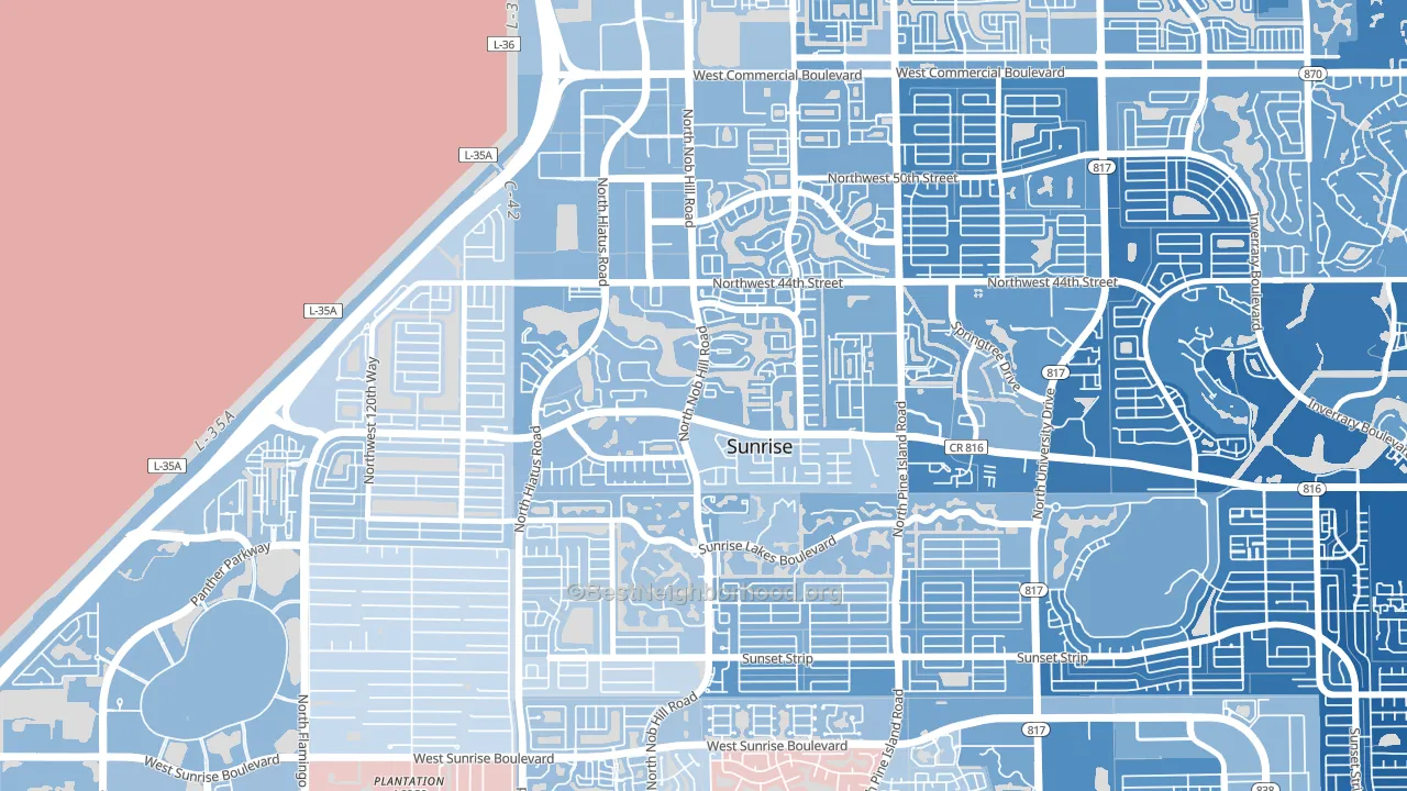 [bestneighborhood_map_controls]
About 57% of adults in Welleby typically vote, near the U.S. average of about 62%. Among adults in Welleby, ~35% vote Democratic, ~22% Republican, and ~43% don't vote. The map below shows estimated turnout by block group.
 [bestneighborhood_map_controls]
How Welleby compares
Among neighborhoods within 5 miles, Welleby leans more Democratic than 3 of 9 neighbors.
Welleby runs about 34 points more Democratic than Florida as a whole. Florida leans Republican overall, while Welleby is one of the few Democratic-leaning pockets.
Politics vary noticeably by block within Welleby. The east side is the most Democratic-leaning (D+28) and the southwest side is the least Democratic-leaning (D+14), a spread of about 13 points.
Why Welleby leans the way it does
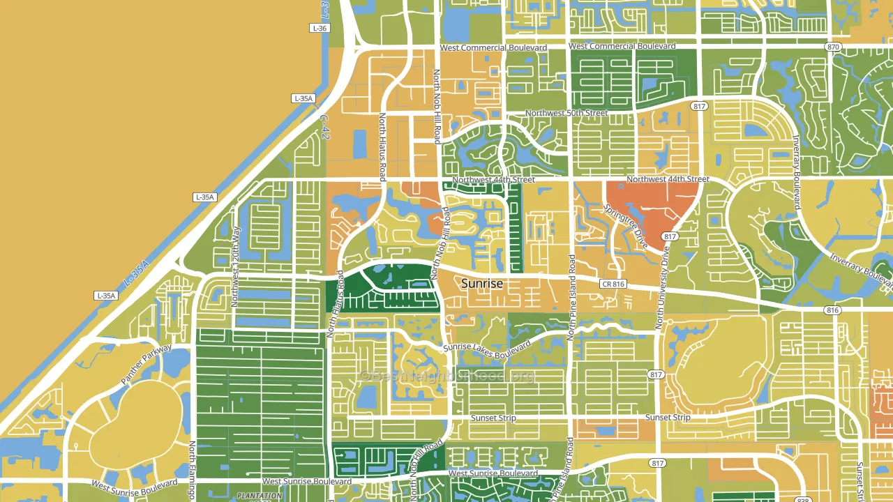
This analysis examined 14,881 data points per neighborhood to find what predicts political lean and turnout. The items below are a few correlations that stood out for Welleby, not a ranked or complete list of what matters most.
Welleby votes against the grain of Florida. Florida leans Republican overall, while Welleby runs about 34 points more Democratic.
Park access and Republican lean
Places with low park coverage tend to lean Republican; Welleby, Sunrise, FL sits in the bottom quarter nationally on this measure. Park access does not change how people vote; it tends to track denser, higher-income areas.
Why turnout in Welleby looks the way it does
Areas with limited routine healthcare access turn out at lower rates. Welleby is in the bottom quarter nationally for routine-care measures such as insurance coverage, preventive screenings, and dental visits. Learn more about the findings and methodology on the political spectrum map.
[one_half]Nearby Neighborhoods
- Westwood Community-North, Tamarac, FL D+18
- Sunrise Golf Village East, Sunrise, FL D+52
- Savannah, Sunrise, FL D+14
- Woodville, North Lauderdale, FL D+51
- Northwood, Tamarac, FL D+20
- Lauderdale Lakes West Gate, Lauderdale Lakes, FL D+65
- North Lauderdale Estates, North Lauderdale, FL D+59
- Lauderdale North Park, North Lauderdale, FL D+57
- Shadow Wood, Coral Springs, FL D+26
- Downtown North Lauderdale, North Lauderdale, FL D+51
Neighborhoods with Similar Populations
- Jackson Park, Milwaukee, WI D+24
- Deep Creek South, Chesapeake, VA D+4
- Edison Historic District, Pomona, CA D+36
- Huffman-O'Malley, Anchorage, AK D+18
- Greater Fifth Ward, Houston, TX D+63
- New City, Chicago, IL D+54
- Fells Point, Baltimore, MD D+70
- Near East, Dallas, TX D+24
- Schiller Park, Buffalo, NY D+72
- Six Forks, Raleigh, NC D+27
Sources and methodology
Precinct-level voting records used to fit the model come from Florida Division of Elections, distributed by the Voting and Election Science Team. Demographic inputs come from the U.S. Census Bureau (ACS 5-year estimates and the 2020 Decennial Census). Health and environmental inputs come from the CDC (PLACES and the Environmental Justice Index). Land cover comes from the USGS and EPA. Election-day and lead-up weather come from PRISM 4km daily grids and the NOAA Global Historical Climatology Network. Mail-voting and election-administration patterns come from the MIT Election Lab's Survey of the Performance of American Elections. Block-group crime detail comes from CrimeGrade. Internet data and modeling support provided by ISPreports.org.
Modeling and analysis by the BestNeighborhood data science team. Full methodology and findings: political spectrum map.
Methodology reviewed by the BestNeighborhood data team. Last updated May 2026.