West Slope is a Democratic stronghold. About 78% of voters here vote Democratic and 22% Republican.
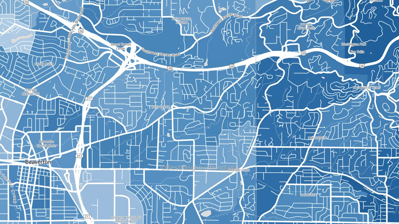
About 86% of adults in West Slope typically vote, above the U.S. average of about 62%. Among adults in West Slope, ~67% vote Democratic, ~19% Republican, and ~14% don't vote. The map below shows estimated turnout by block group.
How West Slope compares
Among neighborhoods within 5 miles, West Slope leans more Democratic than 15 of 27 neighbors.
West Slope runs about 42 points more Democratic than Oregon as a whole.
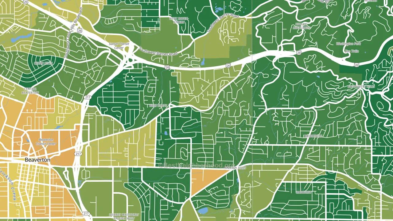
Politics vary noticeably by block within West Slope. The southeast side is the most Democratic-leaning (D+63) and the northwest side is the least Democratic-leaning (D+51), a spread of about 12 points.
Why West Slope leans the way it does
This analysis examined 14,881 data points per neighborhood to find what predicts political lean and turnout. The items below are a few correlations that stood out for West Slope, not a ranked or complete list of what matters most.
Areas with high college attainment vote Democratic. About 63% of adults in West Slope hold a bachelor's degree, about 34 points above the U.S. average of 28%.
Park access and Democratic lean
Places with heavy park coverage tend to lean Democratic; West Slope, Beaverton, OR sits in the top quarter nationally on this measure. Park access does not change how people vote; it tends to track denser, higher-income areas.
Why turnout in West Slope looks the way it does
Areas with strong routine healthcare access turn out at higher rates. West Slope is in the top quarter nationally for routine-care measures such as insurance coverage, preventive screenings, and dental visits. The dental-visit rate here is about 73%, about 13 points above the U.S. average of 60%. Learn more about the findings and methodology on the political spectrum map.
Nearby Neighborhoods
- Garden Home-Raleigh Hills, Portland, OR D+55
- Raleigh West, Beaverton, OR D+46
- Bridlemile, Portland, OR D+61
- Hayhurst, Portland, OR D+68
- Denny Whitford, Beaverton, OR D+43
- Cedar Hills-Cedar Mill North, Beaverton, OR D+42
- Vose, Beaverton, OR D+39
- Central Beaverton, Beaverton, OR D+48
- Cedar Hills-Cedar Mill, Portland, OR D+49
- Forest Park, Portland, OR D+52
Neighborhoods with Similar Populations
- Downtown Detroit, Detroit, MI D+62
- Woodstock, Jacksonville, FL D+56
- Fox Point, Providence, RI D+75
- Wildwood, Ann Arbor, MI D+78
- Greenville South Broadway Historic District, Greenville, OH R+41
- Far West Eugene, Eugene, OR D+46
- Chevy Chase-Ashland Park, Lexington, KY D+44
- Huntington-Jefferson, Virginia Beach, VA Even
- Pacheco, Redding, CA R+39
- Oxford Hunt, Charlotte, NC D+22
Sources and methodology
Precinct-level voting records used to fit the model come from Oregon Secretary of State, Elections Division, distributed by the Voting and Election Science Team. Demographic inputs come from the U.S. Census Bureau (ACS 5-year estimates and the 2020 Decennial Census). Health and environmental inputs come from the CDC (PLACES and the Environmental Justice Index). Land cover comes from the USGS and EPA. Election-day and lead-up weather come from PRISM 4km daily grids and the NOAA Global Historical Climatology Network. Mail-voting and election-administration patterns come from the MIT Election Lab's Survey of the Performance of American Elections. Block-group crime detail comes from CrimeGrade. Internet data and modeling support provided by ISPreports.org.
Modeling and analysis by the BestNeighborhood data science team. Full methodology and findings: political spectrum map.
Methodology reviewed by the BestNeighborhood data team. Last updated May 2026.