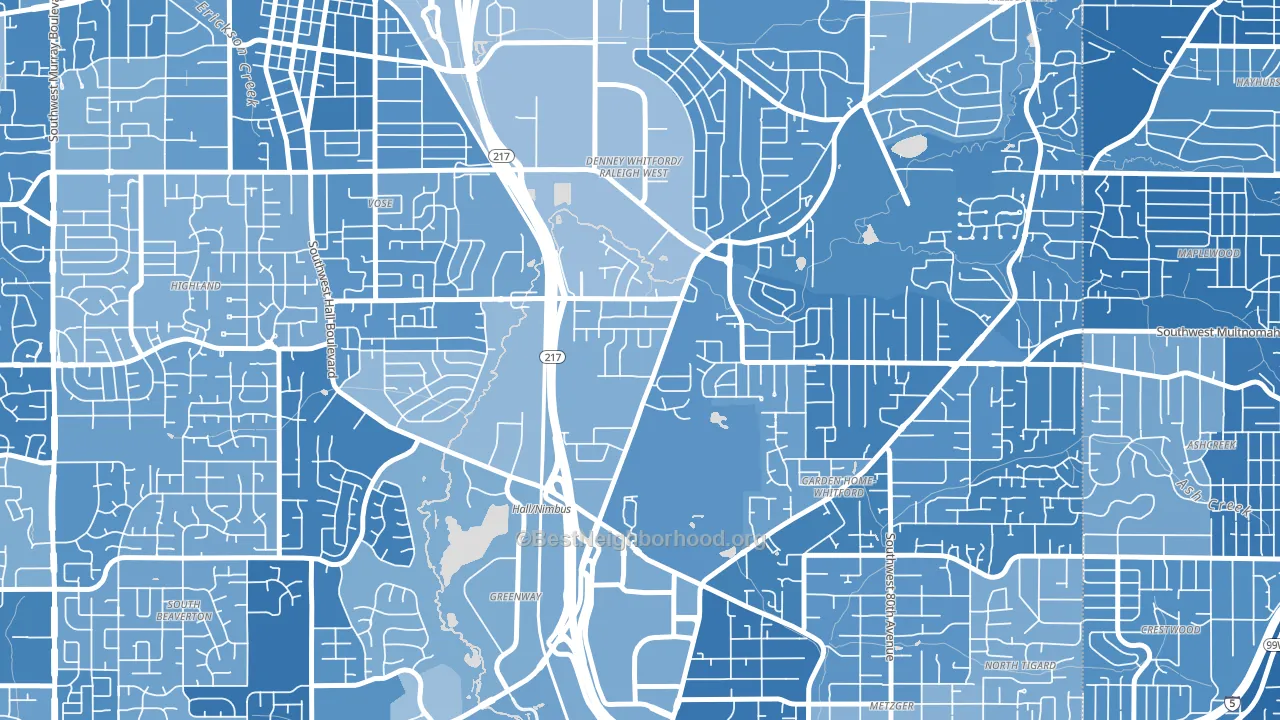
Denny Whitford leans heavily Democratic by roughly 44 points: about 72% of voters vote Democratic and 28% Republican.
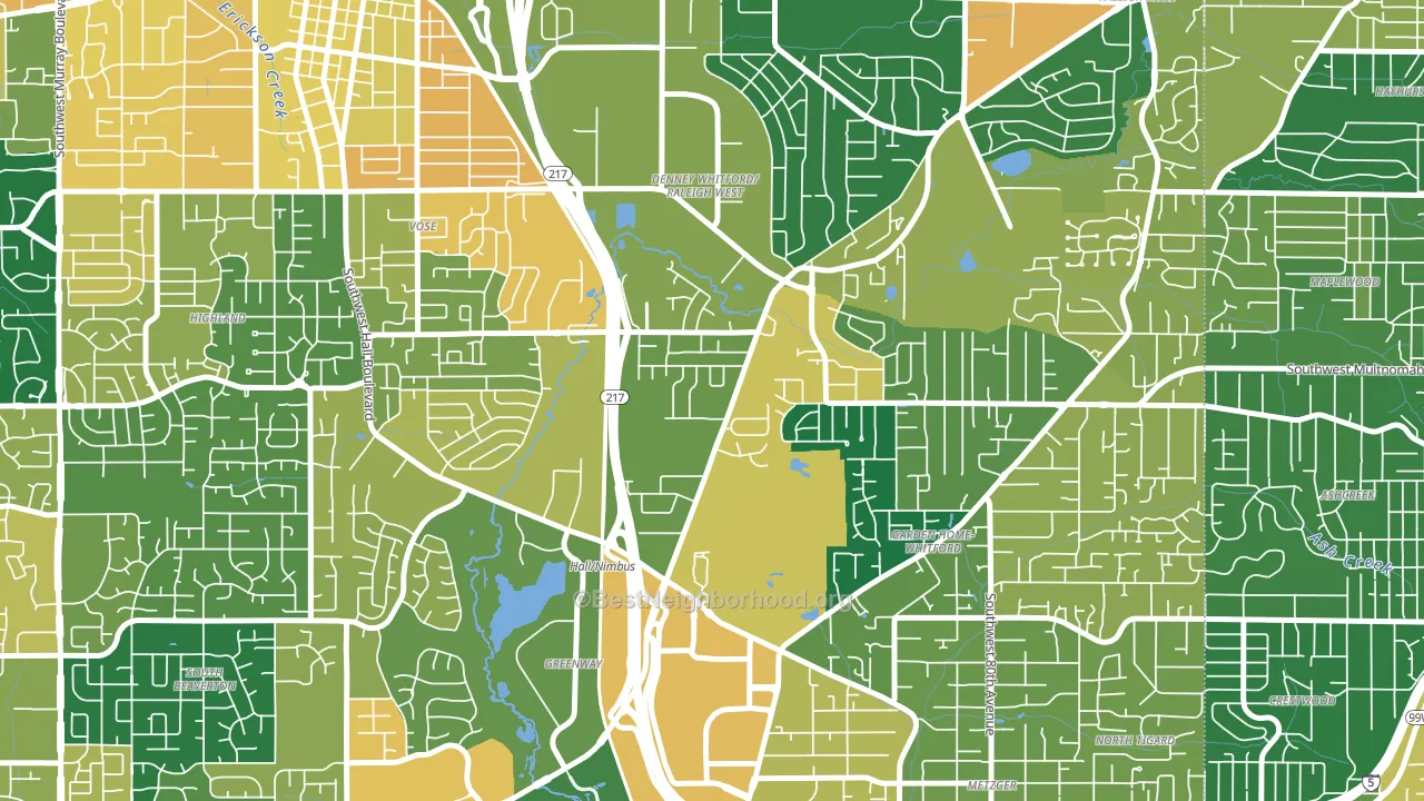
About 82% of adults in Denny Whitford typically vote, above the U.S. average of about 62%. Among adults in Denny Whitford, ~59% vote Democratic, ~23% Republican, and ~18% don't vote. The map below shows estimated turnout by block group.
How Denny Whitford compares
Among neighborhoods within 5 miles, Denny Whitford leans more Democratic than 13 of 27 neighbors.
Denny Whitford runs about 29 points more Democratic than Oregon as a whole.
Politics vary noticeably by block within Denny Whitford. The east side is the most Democratic-leaning (D+52) and the northwest side is the least Democratic-leaning (D+38), a spread of about 14 points.
Why Denny Whitford leans the way it does
This analysis examined 14,881 data points per neighborhood to find what predicts political lean and turnout. The items below are a few correlations that stood out for Denny Whitford, not a ranked or complete list of what matters most.
Dense areas vote Democratic. More than 99% of residents in Denny Whitford live in densely developed areas, about 64 points above the U.S. average of 36%.
Walkability and Democratic lean
Places with a highly walkable street grid tend to lean Democratic; Denny Whitford, Beaverton, OR sits in the top quarter nationally on this measure. A walkable street grid does not change how people vote; it mostly reflects how urban a place is.
Why turnout in Denny Whitford looks the way it does
Turnout in Denny Whitford sits close to the national pattern. Routine healthcare access, homeownership, education, and food security all land near their national averages here. Learn more about the findings and methodology on the political spectrum map.
Nearby Neighborhoods
- Raleigh West, Beaverton, OR D+46
- Vose, Beaverton, OR D+39
- Garden Home-Raleigh Hills, Portland, OR D+55
- Greenway, Beaverton, OR D+43
- Highlands, Beaverton, OR D+38
- Central Beaverton, Beaverton, OR D+48
- South Beaverton, Beaverton, OR D+41
- West Slope, Beaverton, OR D+56
- Maplewood-Ashcreek, Portland, OR D+61
- Hayhurst, Portland, OR D+68
Neighborhoods with Similar Populations
- Hollywood, Munster, IN D+16
- West Willow, Ypsilanti, MI D+70
- Arrowview, San Bernardino, CA D+15
- Goshen, Augusta, GA D+9
- McGilvra, Mercer Island, WA D+52
- Center Square, Albany, NY D+75
- Sharon Heights, Menlo Park, CA D+63
- Carlen, Mobile, AL Even
- Bradley Estates, Milwaukee, WI D+66
- Hedrick Acres, Tucson, AZ D+53
Sources and methodology
Precinct-level voting records used to fit the model come from Oregon Secretary of State, Elections Division, distributed by the Voting and Election Science Team. Demographic inputs come from the U.S. Census Bureau (ACS 5-year estimates and the 2020 Decennial Census). Health and environmental inputs come from the CDC (PLACES and the Environmental Justice Index). Land cover comes from the USGS and EPA. Election-day and lead-up weather come from PRISM 4km daily grids and the NOAA Global Historical Climatology Network. Mail-voting and election-administration patterns come from the MIT Election Lab's Survey of the Performance of American Elections. Block-group crime detail comes from CrimeGrade. Internet data and modeling support provided by ISPreports.org.
Modeling and analysis by the BestNeighborhood data science team. Full methodology and findings: political spectrum map.
Methodology reviewed by the BestNeighborhood data team. Last updated May 2026.