Wilkinson County leans Republican by roughly 22 points: about 39% of voters vote Democratic and 61% Republican.
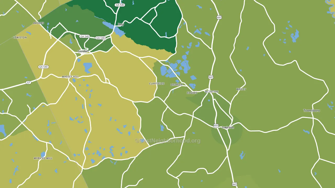
About 76% of adults in Wilkinson County typically vote, above the U.S. average of about 62%. Among adults in Wilkinson County, ~30% vote Democratic, ~46% Republican, and ~24% don't vote. The map below shows estimated turnout by block group.
How Wilkinson County compares
Among counties within 50 miles, Wilkinson County leans more Republican than 8 of 20 neighbors.
Wilkinson County runs about 20 points more Republican than Georgia as a whole.
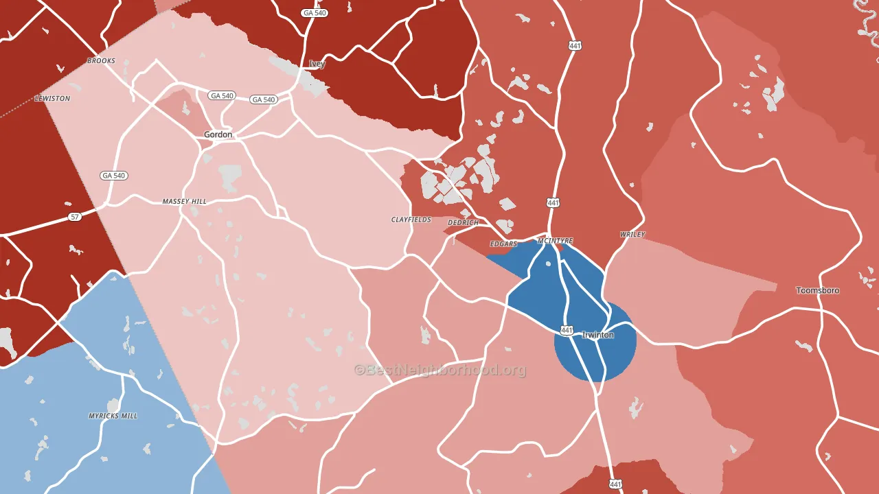
Politics vary noticeably by city within Wilkinson County. The north side is the most split-leaning (R+66) and the southwest side is the least split-leaning (R+2), a spread of about 63 points.
Why Wilkinson County leans the way it does
This analysis examined 14,881 data points per county to find what predicts political lean and turnout. The items below are a few correlations that stood out for Wilkinson County, not a ranked or complete list of what matters most.
Areas with low college attainment vote Republican. About 12% of adults in Wilkinson County hold a bachelor's degree, about 12 points below the Georgia average of 24%.
Walkability and Republican lean
Places with a low walkability score tend to lean Republican; Wilkinson County, GA sits in the bottom quarter nationally on this measure. A walkable street grid does not change how people vote; it mostly reflects how urban a place is.
Why turnout in Wilkinson County looks the way it does
Homeowners vote more often than renters. About 82% of households in Wilkinson County own their home, about 9 points above the Georgia average of 73%. Limited routine healthcare access lines up with lower turnout, and Wilkinson County sits in the bottom quarter on routine-care measures. Learn more about the findings and methodology on the political spectrum map.
Nearby Counties
- Twiggs County, GA R+22
- Baldwin County, GA Even
- Jones County, GA R+41
- Bibb County, GA D+33
- Washington County, GA D+3
- Laurens County, GA R+19
- Bleckley County, GA R+42
- Hancock County, GA D+32
- Houston County, GA R+4
- Putnam County, GA R+26
Counties with Similar Populations
- Livingston County, KY R+64
- Catahoula Parish, LA R+50
- Alger County, MI R+17
- Richmond County, VA R+33
- Caldwell County, MO R+59
- Dawson County, MT R+55
- Stillwater County, MT R+57
- Phelps County, NE R+58
- Greene County, IA R+39
- Kemper County, MS D+23
Sources and methodology
Precinct-level voting records used to fit the model come from Georgia Elections Division, distributed by the Voting and Election Science Team. Demographic inputs come from the U.S. Census Bureau (ACS 5-year estimates and the 2020 Decennial Census). Health and environmental inputs come from the CDC (PLACES and the Environmental Justice Index). Land cover comes from the USGS and EPA. Election-day and lead-up weather come from PRISM 4km daily grids and the NOAA Global Historical Climatology Network. Mail-voting and election-administration patterns come from the MIT Election Lab's Survey of the Performance of American Elections. Block-group crime detail comes from CrimeGrade. Internet data and modeling support provided by ISPreports.org.
Modeling and analysis by the BestNeighborhood data science team. Full methodology and findings: political spectrum map.
Methodology reviewed by the BestNeighborhood data team. Last updated May 2026.