Young County is a Republican stronghold. About 17% of voters here vote Democratic and 83% Republican.
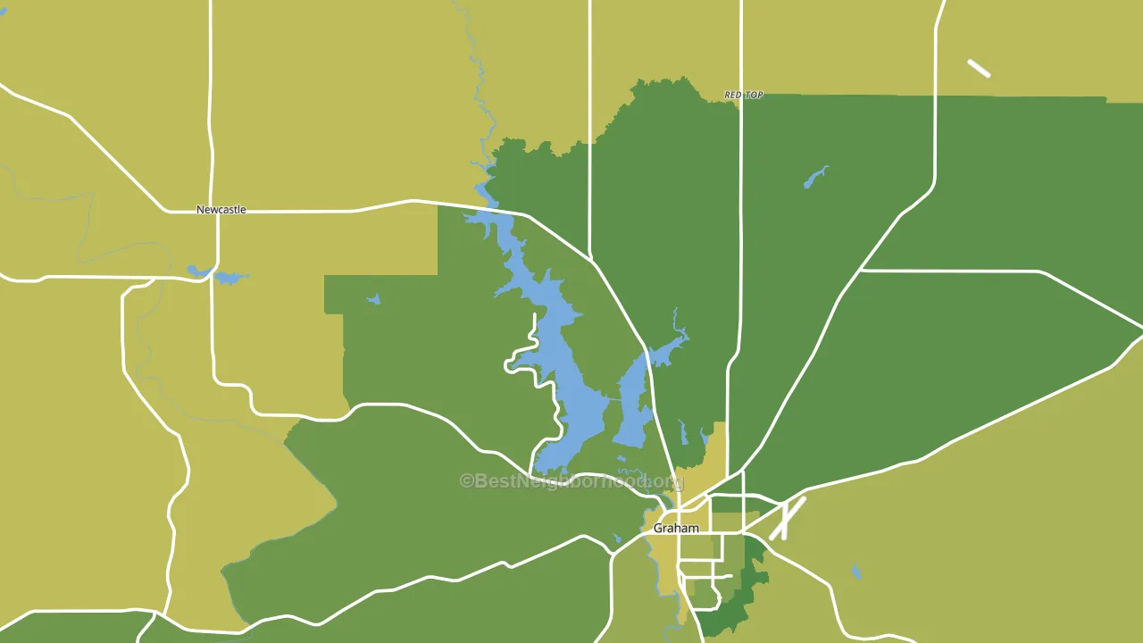
About 71% of adults in Young County typically vote, above the U.S. average of about 62%. Among adults in Young County, ~12% vote Democratic, ~59% Republican, and ~29% don't vote. The map below shows estimated turnout by block group.
How Young County compares
Among counties within 50 miles, Young County leans more Republican than 1 of 6 neighbors.
Young County runs about 52 points more Republican than Texas as a whole.
Politics vary noticeably by city within Young County. The west side is the most Republican-leaning (R+85) and the southeast side is the least Republican-leaning (R+60), a spread of about 25 points.
Why Young County leans the way it does
This analysis examined 14,881 data points per county to find what predicts political lean and turnout. The items below are a few correlations that stood out for Young County, not a ranked or complete list of what matters most.
Young County votes Republican even though it is densely developed (about 50%, modestly above the Texas average of 35%). State and regional patterns outweigh the Democratic lean that density usually predicts here.
Paved land cover and Democratic lean
Places with extensive paved surfaces tend to lean Democratic; Young County, TX sits in the top quarter nationally on this measure. Paved ground does not change how people vote; it mostly reflects how urban and built-up a place is.
Why turnout in Young County looks the way it does
Areas with limited routine healthcare access turn out at lower rates. Young County is in the bottom quarter nationally for routine-care measures such as insurance coverage, preventive screenings, and dental visits. Learn more about the findings and methodology on the political spectrum map.
Nearby Counties
- Jack County, TX R+74
- Throckmorton County, TX R+76
- Stephens County, TX R+68
- Palo Pinto County, TX R+62
- Archer County, TX R+76
- Baylor County, TX R+66
- Clay County, TX R+74
- Shackelford County, TX R+74
- Wichita County, TX R+31
- Eastland County, TX R+67
Counties with Similar Populations
- Gilchrist County, FL R+68
- Haywood County, TN D+13
- Attala County, MS R+13
- Schuyler County, NY R+23
- King William County, VA R+38
- Avery County, NC R+52
- Unicoi County, TN R+57
- Bertie County, NC D+19
- Kalkaska County, MI R+42
- San Juan County, WA D+50
Sources and methodology
Precinct-level voting records used to fit the model come from Texas Secretary of State, Elections Division, distributed by the Voting and Election Science Team. Demographic inputs come from the U.S. Census Bureau (ACS 5-year estimates and the 2020 Decennial Census). Health and environmental inputs come from the CDC (PLACES and the Environmental Justice Index). Land cover comes from the USGS and EPA. Election-day and lead-up weather come from PRISM 4km daily grids and the NOAA Global Historical Climatology Network. Mail-voting and election-administration patterns come from the MIT Election Lab's Survey of the Performance of American Elections. Block-group crime detail comes from CrimeGrade. Internet data and modeling support provided by ISPreports.org.
Modeling and analysis by the BestNeighborhood data science team. Full methodology and findings: political spectrum map.
Methodology reviewed by the BestNeighborhood data team. Last updated May 2026.