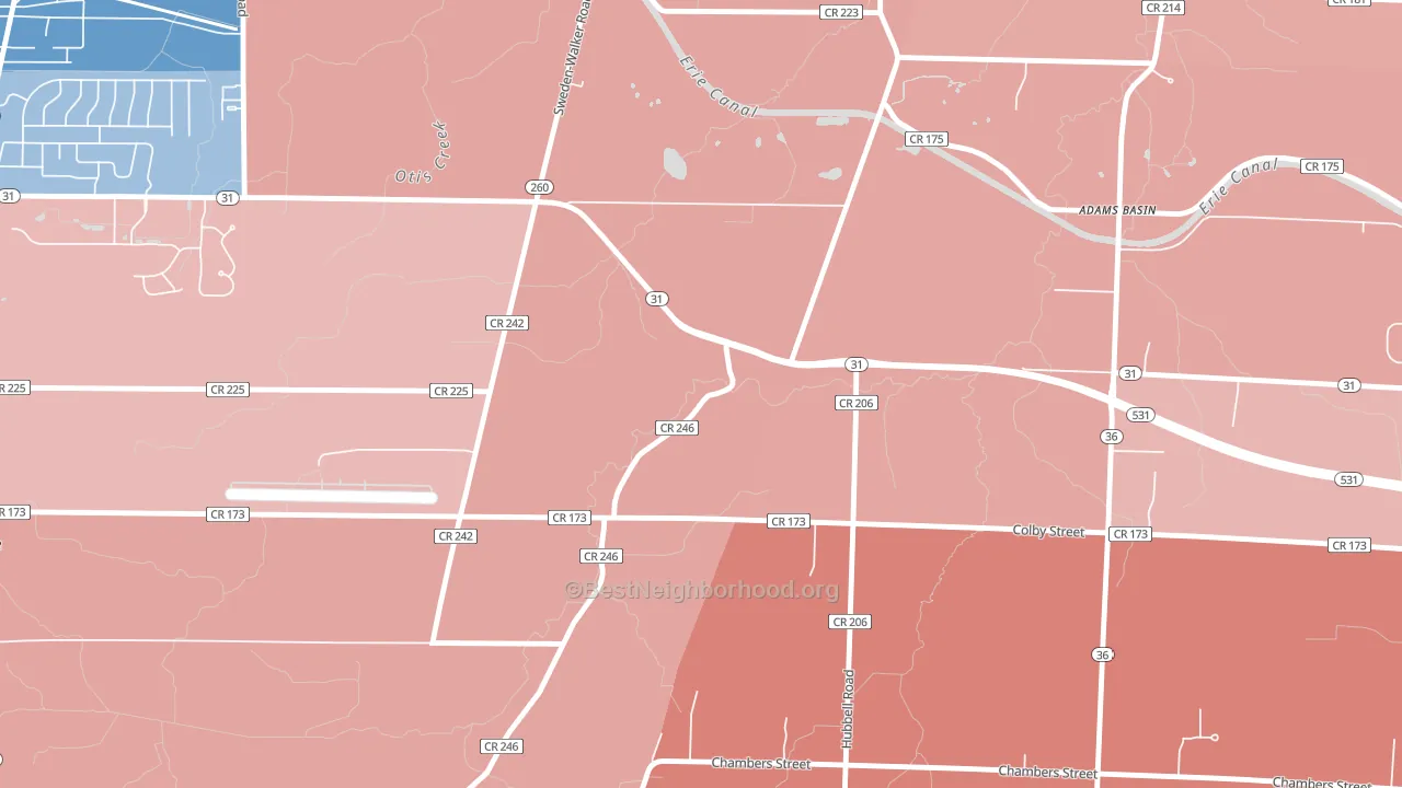
Adams Basin leans Republican by roughly 22 points: about 39% of voters vote Democratic and 61% Republican.
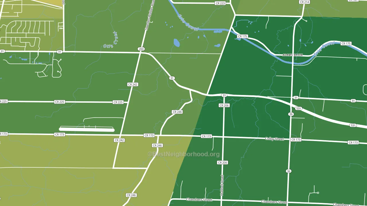
About 87% of adults in Adams Basin typically vote, above the U.S. average of about 62%. Among adults in Adams Basin, ~34% vote Democratic, ~53% Republican, and ~13% don't vote. The map below shows estimated turnout by block group.
How Adams Basin compares
Among cities within 25 miles, Adams Basin leans more Republican than 40 of 97 neighbors.
Adams Basin runs about 35 points more Republican than New York as a whole. New York leans Democratic overall, while Adams Basin is one of the few Republican-leaning pockets.
Why Adams Basin leans the way it does
This analysis examined 14,881 data points per city to find what predicts political lean and turnout. The items below are a few correlations that stood out for Adams Basin, not a ranked or complete list of what matters most.
Adams Basin votes against the grain of New York. New York leans Democratic overall, while Adams Basin runs about 35 points more Republican.
Cancer-screening access and voter turnout
Places with high colon-cancer-screening access tend to turn out at a higher rate; Adams Basin, NY sits in the top tenth nationally on this measure. Cancer screening does not drive turnout; it reflects income, insurance, and healthcare access.
Why turnout in Adams Basin looks the way it does
Areas with strong routine healthcare access turn out at higher rates. Adams Basin is in the top quarter nationally for routine-care measures such as insurance coverage, preventive screenings, and dental visits. The dental-visit rate here is about 72%, about 12 points above the U.S. average of 60%. Learn more about the findings and methodology on the political spectrum map.
Nearby Cities
- Town Pump, NY R+26
- Garland, NY R+30
- Brockport, NY Even
- Sweden Center, NY R+23
- Spencerport, NY R+14
- Clarkson, NY R+28
- Parma Corners, NY R+22
- West Chili, NY R+22
- Churchville, NY R+15
- Parma Center, NY R+29
Cities with Similar Populations
- Honey Hill, NC R+23
- Alpers, OK R+56
- Honora, GA R+51
- Newville, NY R+47
- Grand Lake Stream, ME R+36
- Middlebrook, AR R+70
- St. Michael, NE R+69
- Smith Grove, TX R+41
- Denio, NV R+72
- Mud Mills, NY R+31
Sources and methodology
Precinct-level voting records used to fit the model come from New York State Board of Elections, distributed by the Voting and Election Science Team. Demographic inputs come from the U.S. Census Bureau (ACS 5-year estimates and the 2020 Decennial Census). Health and environmental inputs come from the CDC (PLACES and the Environmental Justice Index). Land cover comes from the USGS and EPA. Election-day and lead-up weather come from PRISM 4km daily grids and the NOAA Global Historical Climatology Network. Mail-voting and election-administration patterns come from the MIT Election Lab's Survey of the Performance of American Elections. Block-group crime detail comes from CrimeGrade. Internet data and modeling support provided by ISPreports.org.
Modeling and analysis by the BestNeighborhood data science team. Full methodology and findings: political spectrum map.
Methodology reviewed by the BestNeighborhood data team. Last updated May 2026.